Wednesday 8 May 2013

Exam Prep Evaluation

Throughout the course of this project, my ideas have changed from my first intentions, for example, I started out wanting to create 'movement and light' photographs, as I was particularly inspired by the work of Brad Carlile. I thought that this could relate to the exam theme of inside, outside and in-between because you could take a photograph of an outside setting, and combine it with a photograph of something inside creating a double exposure, but also use light and even edit colours in on photoshop to create the in-between part - having both outside and inside photographs but using something in-between the two layers of photographs to create something new and distinctive. I then went on to explore the idea of 'inner character', as I was inspired by the work of Eve Arnold and also Carsten Witte. This related to the exam theme of inside, outside and in-between as you could take a photograph of a person wearing different outfits, the outside but still try and capture their personality, the inside. I think that the in-between part could be related to the choice of setting(s) for the photographs, which could also be suggesting something about the 'inner character' of the model. I decided not to go with this idea, as throughout the course I have already researched and focused on portraiture, and self portraiture and I wanted to move away from this to create something completely new for my final exam outcome. The idea that I decided to go with was 'the everyday' as I felt that this gave me the most options in terms of a final outcome, and wasn't a limited idea (for example, I didn't have to have a model in the picture if I decided not to, whereas with 'inner character' I would have done). I was particularly inspired by the work of artists such as William Eggleston and Jorma Puranen as they took the everyday, and everyday subjects such as cars, planes and even the sunrise/sunset and distorted it further so that suddenly it was something new, and not something out of the everyday, but it was at the same time, and I found this really interesting and wanted to explore it further. 

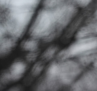
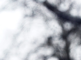
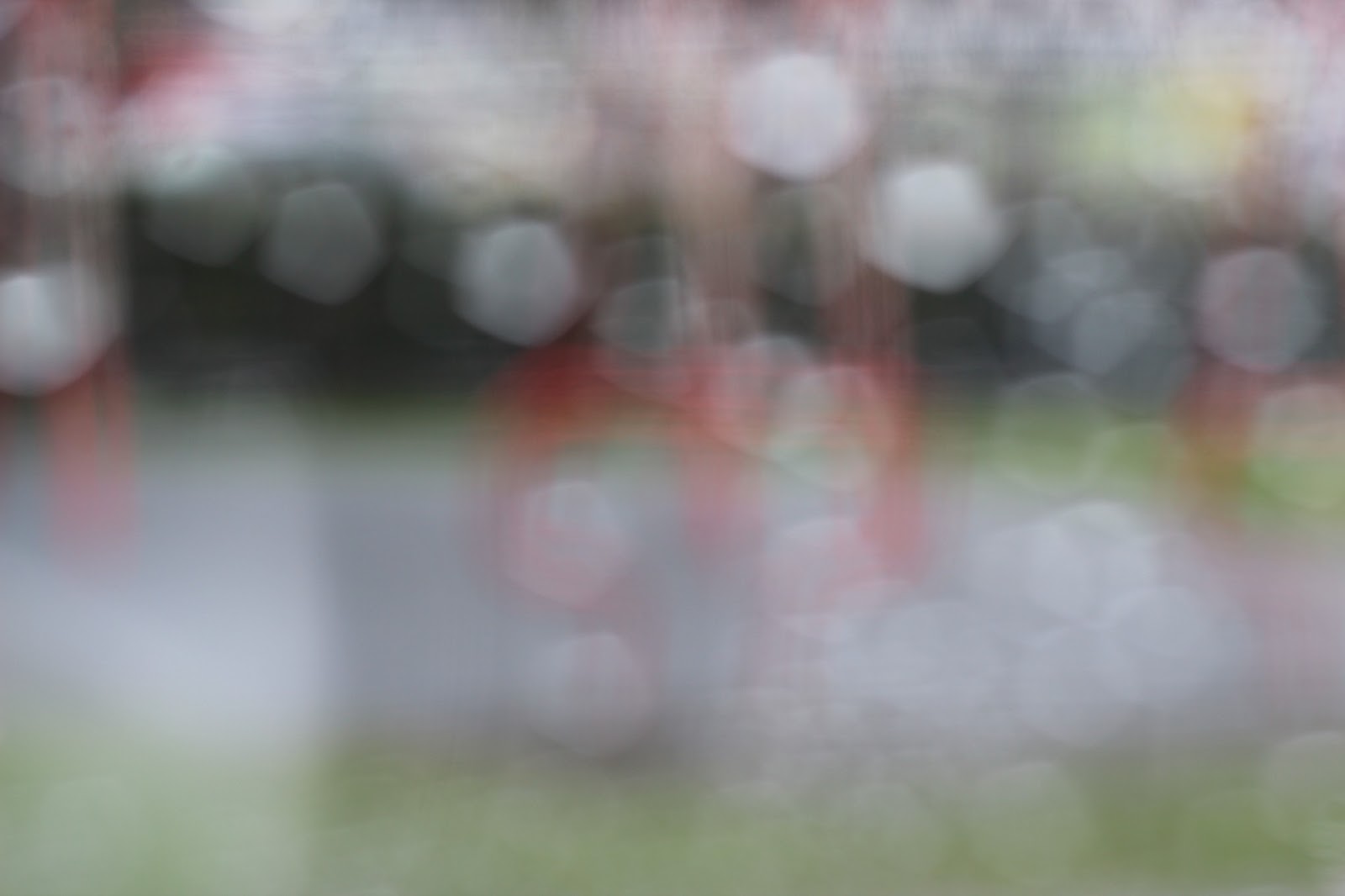
I experimented a lot throughout this project, which I think that I really needed to do to help me decide what would work best for my final outcome. Inspired by Jorma Puranen, linked above, I decided to look at how water can distort an image, which is a simple yet effective technique. 


Above is one of my favourite pieces by the artists, Jorma Puranen. I created several of my own versions, one of which is shown below:


Although my photographs aren't as vibrant or contrasted as the ones that I have researched, I like how simplistic they are, and it really makes the viewer think about what the photograph is of. At the beginning when I was looking at movement and light, I experimented a lot with 3D photograph editing on photoshop. I really enjoyed this technique, and it is another form of distortion, however I'm glad that I chose not to continue with it, as I felt that I couldn't further my development any more. More recently, I experimented with the technique of cyanotypes, which is something that I really enjoyed. I used thick paper to create the ones linked, but I think that it would be interesting to try it out with fabric, as I think that it would look really effective. Overall with experimentation, I think that I explored a wide range of methods and techniques, bringing variety into my work. 

To begin with, I found the exam theme inside, outside, and in-between difficult as I felt that you could do almost anything and it would relate to the theme in someway, which although may be good at times, it makes it harder to narrow down your ideas to what you want to do for your final outcome. I enjoyed the prep work as this allowed me to develop my ideas further and to see what would work and what wouldn't for my final outcome, for example I was able to work out timings better for the photo transfer using the 'mod podge', as this was a material that I hadn't used before. I think that if the glass photo transfer works after being left for as long as possible (roughly 24 hours) I think that it will have been a successful final outcome and I think that my mounted sheet of dark room prints will also be good. Overall, I have enjoyed this exam theme as once I had my final outcome idea, I was inspired to take lots of pictures so that I had a wide variety to chose from for my final outcome and mounted sheet.


Wednesday 1 May 2013

How does the idea of distortion relate to the theme : inside, outside and in-between?

Lately, I have been looking at and researching different types of distortion, both in photography and fine art (a fine art example - Gerhard Richter). I have personally really enjoyed researching this idea, as I think that it has helped my experiments to become more interesting and it's also something that I haven't explored very much before, so it is completely different to my previous work and research. Out of the several themes that we were allowed to chose from for this topic ;

-movement and light
-space
-inner character
-the five senses
-the everyday

I finally decided to go with the theme of 'the everyday', after exploring some of the other ones at the beginning of the project, for example, 'movement and light'. Although I enjoyed the concept of movement and light, and I enjoyed experimenting with it, I decided that it would be better for me to go with the idea of 'the everyday' for my exam piece, as this was something that I hadn't looked at before, and therefore, as I mentioned earlier, was something new and different.

When I was creating darkroom prints, I placed some glass over the paper as it was being exposed, to make sure the paper was lying completely flat, but as I was developing the image, I saw that the glass actually had lots of scratches on it, but I thought that this made the image look more distinctive, which was a starting point for the idea of distortion, shown here.

I think that my photographs, and the photographs that I have researched relate well to the exam theme of 'inside, outside and in-between', due to the subject matter of my photographs. For example, a lot of my images have been of the outdoors - tree branches, the textures of the ground (grass, bridle paths, pebble beaches) relating to the outside part of the theme. The inside part is how I've edited, changed and distorted my images either in photoshop or in the darkroom. The in-between is the distortion between the negative and the paper, for example, the scratched glass, or the handmade negative method placed on the photo paper, which has water or salt on it to enhance the image. The theme doesn't have to be taken literally, and this is what I wanted to show with my work.


Tuesday 30 April 2013

Cyanotypes

Cyanotype : A photographic blueprint.


I created these cyanotypes by taking the paper with the chemicals on it outside, laying it flat on the ground in direct sunlight, then taping acetate on top and pouring on black ink and using a paintbrush to splatter it. I left this one for about 6 minutes before returning to the dark room to wash it. The paper starts off green and then turns blue when you wash the chemicals off. As you can see, the second one (pictured below) didn't work as well, and I think that this is because as I was pouring the ink onto the acetate, it wasn't actually taped down properly, and briefly moved as it was quite breezy that day. You can see that I actually got some of the ink onto the paper. However, I think that this experience was overall helpful and I think that it almost looks like it is being held under a UV light, or something of that sort. I think that it would be quite interesting to try this out using fabric, a thin one like cotton or something similar, as you would be able to see through it a little bit, and therefore would distort the image even more.


Monday 29 April 2013

Cutting Technique - Enhance and Distort Photographs


As I can't develop colour prints in the college darkroom, I got the photographs printed and decided to distort them myself without using darkroom techniques or photoshop. I scratched into the prints, cut parts out and overall I think that this technique worked well, and has helped me to further my distortion experiments. When scratching onto the prints, I used a circular motion, so that it looked like the scratches were wrapping around the objects, for example the tree shown above. I thought that this looked distinctive and added to the effect. I also created more subtle scratches, for example on the table in the last photograph. I thought that this would make the viewer really study the image. 

Wednesday 24 April 2013

Gerhard Richter

'Clouds (Pink)'

'Clouds (Blue)'

Gerhard Richter was born in 1932 in Dresden, and is a painter. Although this isn't photography, Richter uses a similar distortion technique to the ones I've been photographing and experimenting with, where he has a slightly blurred effect to his paintings. I particularly like the pink clouds above, as they have a 'dreamy' quality to them which is something that I want to replicate in my own photographs. The blue one has a slightly 'haunting' quality to it. I find this work really inspiring as these two photographs are of the same thing - clouds (at different times and positions however) yet they look completely different. This is something that would be good to try and recreate myself with my own work, perhaps taking photographs of an object that relates to my current work, for example trees, but take the photograph several times at different points throughout the day, for example, one in the morning, one in the early afternoon, and one in the evening when the sun is setting. I also like how there are the two lines in both images. It makes it seem more like a painting than a photograph, however it makes it seems like a 'series of three' piece or a 'puzzle', which is something that I want to explore for my final outcome with pieces of glass. 

The paintings have a grainy effect to them which I really like as this makes this makes the detail more intricate and also makes you think about whether it is a photograph or a painting, as some photographs have a grainy effect to them. This effect is more visible on the darker painting, the blue one, which could be symbolising how different the night is from the day time. I think that this relates well to the current exam theme of Inside, Outside and In-between, as the painting is of an outside setting, painted onto a canvas that will be displayed inside, but it brings the in-between space between people and the sky closer, so that they are able to see the little details of the sky, such as the different tones, the colours of the sky throughout the day, and the shadowing. 


Monday 22 April 2013

Dark Room Experiments

For my recent rolls of film, I have been developing my distortion experiments. I took the photographs with the same technique that I did with the digital - spray acetate or clear plastic with water and held it up in front of the camera lens, focusing on that so that the items that the photographs are of are out of focus, and the water creates a bokeh effect.

In the dark room, not only did I create prints of just the photographs themselves, but I also placed scratched glass on top of the photo paper as I exposed the photograph. This added to the distortion and is a simple yet effective way to develop my experiments. Just by moving the piece of glass around the paper, you could get a different scratched effect each time you made a new print, even if you were using the same negative, which is something that I really enjoyed doing. You could have a series of prints that were the same image, but by using different pieces of scratched/texture glass, you could create entirely new images every time. On one of the prints, you can see water droplet marks. Before exposing the print, I put a little bit of water on top of the glass. This is a simple way to experiment with the selective developing technique, as it doesn't ruin the paper before it is exposed as the water is on the glass. Here are some of my prints:


When I was making prints of all of the photographs, I used 5 as the setting for the filter, and the light setting was 8. 

Experiments: Liquid Emulsion

Liquid emulsion is a technique that I really like to use when creating prints. By using liquid emulsion, you can expose your photograph onto almost any kind of material - from regular paper, card, texture paper, fabric, and even glass. To create this effect, take the material that you want to use and paint the liquid emulsion onto it. You then have to leave it to dry before exposing it - make sure it is completely dry. Part of the paper was still damp when I exposed it and you can see in the bottom right hand corner that it is faded and pale, however this actually helped to distort the image further. Expose it like you normally would, but perhaps try creating a test strip with slightly longer exposures, for example for normal test strips I use 1 second intervals, but for liquid emulsion you might want to use 3 or more second intervals.  I like this technique because it creates a rough edge/effect to the photograph, especially if not all of the material has been covered equally. This also adds to the distorted idea that I am currently exploring.

The test strip didn't work so well, as I think the exposure intervals were too long, so I shortened it and it worked quite well.


The below image is the test strip, and as you can see, it didn't work, however the final print turned out well and because of the photograph that I took (the water droplets), it created an interesting bokeh, blurred effect which looks quite ghostly. I particularly like the rough appearance to the image, as when I painted on the liquid emulsion, it was perfect (mainly because I painted it on in the dark room, and it was harder to see). You can see the brush strokes very clearly and I also layered up the liquid emulsion, so you get a varied surface for the photograph to be exposed onto.

Friday 19 April 2013

Photo Transfer onto Glass : Final Outcome Idea

Images and inspiration and idea from here.


Photo transfer is an old technique, and fairly simple to create. On the blog linked above, I saw that she had tried out photo transfer onto glass, and I have to say that I really love how this looks. She used beach glass to create it, which gives the images a rough and cloudy effect.

How to create this technique :

Print off your image onto regular inkjet paper (if it's a dark room print, scan it in and print it off in the same way)

Trim and stick the photograph face down onto the glass with 'Mod Podge'

Allow to dry and then the paper in water before rubbing the paper off of the glass.

Not only will this transfer the image onto the glass, but it also gives it a ghostly quality to it.

I think that this would be a really creative final outcome piece for me, as not only is is something new that I haven't done with any of my other outcomes, but the technique itself adds to the idea of distortion. The outcome would be distorted even if I hadn't distorted the original image, which is something that I think looks really interesting.

Thursday 18 April 2013

Photo Transfer


Although for my final outcome, I want to do photo transfer onto glass, I decided to first try it out on paper, to see how the technique worked, and to give me an idea on how long to let the 'mod podge' dry for. I got the tutorial here, but the method to creating this is fairly simple:

-Print off your image onto paper (it works best with an ink jet printer, as I tried it with a laser printer and it didn't work as well). I used photographs that were quite vibrant in their colours so you might want to edit it a bit before you print it off. Then get the material that you want to transfer your image onto, in my case I used sketchbook paper.

-Cut the image to size and apply 'mod podge' to the image - I used a paintbrush and applied a couple of layers before then sticking the image face down onto the sketchbook paper. I left it to dry for a few hours, before returning. I think that this technique would work best if you left it to dry overnight, as I tried this technique several times, and before I had not left it for very long, and there for it hadn't worked very well.

-I then just took a clean sponge and got it damp, before pressing it onto the image. When the paper was then damp, I began to use my finger to rub off the paper. You have to be careful not to ruin the sketchbook paper, as this can easily happen when the paper is wet. As you can see in the photographs above, not all of the paper came off, leaving a white, cloudy look to the image, which personally I really like as it distorts the image further.

Overall, I really liked this technique, and will definitely be using it in my exam.

Tuesday 16 April 2013

Exam Review

The themes that I am currently working on for the inside, outside and in-between exam topic is the everyday. I originally intended to do portraiture, however I felt that this was similar to previous work that I had done, and so I changed my idea to the everyday, as although it is a simplistic theme, it can be explored in many ways which is something that drew me to the idea. I think that my most successful experiment has been with distortion, which is something that I want to continue with and develop with for my exam. 


I think that this technique has worked particularly well for my experiments and to further my developments I could look at using different coloured inks as apposed to just water, and perhaps experiment with the 'colour splash' techniques so the background is in black and white and the ink is the only thing in colour, or the other way around. I plan to refine my ideas further by also experimenting with black and white film, and perhaps even colour film. An artist that I have researched in relation to this idea is Jorma Puranen, who is a photographer that inspired me as he has also used the technique that I have shown above. To recreate a piece to be more like his, I would use experiment with both cool tone and warm tone colours, and simpler surroundings/objects to focus on. What I love about his work is that he uses textures and distortion to make the photographs look like an oil painting:


In the two weeks before the exam, I want to really use my lesson time wisely by taking full advantage of dark room, and really experimenting with distortion for example, using scratched glass and creating handmade negatives by using cellophane, salt and washing up liquid to create interesting techniques. I also think that overlaying the cellophane can make the photograph appear fragmented where the ends of the cellophane meet. I also want to experiment more with using other materials to create photographic prints, for example, using liquid emulsion and also using different types of paper (for example, coloured paper, card, graph paper, textured paper). Also experimenting with building on top of my photographs, for example by using fabrics, paints, and more. Not only will this add to my collection of experimentations, but it will also help me to decide on how I want to present my final outcome - what do I want to do with the final negatives/photographs? For example, I might keep it simple and just pin the photographs onto card or foamboard, so that they stand out without a busy background taking attention away from the photographs themselves, or I could print the photographs onto fabric and create some sort of installment.

Monday 15 April 2013

Digital Distortion


Over the Easter holidays, I visited Orlando, Florida, and I decided that with the photographs that I took, it would be interesting to use Photoshop/Gimp to distort them to see how they turned out. I tried lots of different experiments, such as the LOMO effect of gimp, as well as changing colours and adding light orbs to distort them. I personally really like the middle one, as it is the most distorted and makes the viewer wonder about what the photograph could be of (Hogsmeade Village). The photographs above were taken at The Wizarding World Of Harry Potter at Universal.


For the above photograph, taken at the Magic Kingdom at Walt Disney World, I experimented with the lomography effect of gimp, as well as adding a slight neon outline, which you can see if you look closely, especially at the Magic Kingdom itself, as well as the statue of Walt and Mickey.
This photograph above was taken at SeaWorld, and I didn't do much to this when editing, but if you look close up, you can see a slight mosaic effect. 

Wednesday 27 March 2013

Torn Collage / Cubomania Collage


Above is the video for the 'torn collage' technique. I worked in a group of three other people, and we ripped up photocopies of photographs and allowed them to drop onto the paper. We then stuck the majority of them down so that they wouldn't move when we added more to the paper. We squirted paint all over in green, blue and yellow to create a contrast as well as adding texture which I think looked cool and also made the artwork look more random and spontaneous. Someone in my group then decided to take some tape and use it to drag the paint around the paper, which looked quite different and added to the messy look. Overall, I personally really liked this technique and I think that it distorted the photographs in an interesting and unique way, and it would look different every time that you tried it. I think that if I were to recreate this technique just by myself, I'd use my own images that related to my current theme/work and I'd like to experiment more with colour and create 3D layers with it (for example, paint). It could also be interesting to experiment with other materials, such as fabric - such as ribbon to be comparable to the paint, or lace, to distort how the viewer perceives the torn photographs.


Above is the video for the 'cubomania collage' technique. Again, using photocopies of photographs that had been provided, I cut them up into squares and placed them fairly randomly on the yellow card. If I were to try this again, I think I'd chose more relevant pictures (again, like before) and I would experiment more with colour and perhaps place it on different fabrics like silk which would reflect light when making the collage, which could bring an interesting feel to the image. It would also be worth playing around with the timings of the stop motion, as this could make the same artwork seem different depending on the timings.

Overall, I really liked trying out these techniques, and it has made me think about experimenting more with colour, as well as different ways that photographs could be presented - not just on photo paper. I also really liked using the iMotion HD app on the ipads, and would definitely consider using them again to create stop motion animations of the process in which I went through to to create the art piece. Again, this is helping me to experiment with other possible ways of presenting my final outcome for my exam piece.

Wednesday 20 March 2013

Creating Filters : Distortments

^original photograph
^enhanced photograph
^original photograph

^enhanced photograph

^original photograph

^enhanced photograph
^original photograph

^enhanced photograph


To begin with, I cropped these images to make them harder to see what the image is actually of, as this is the first way that I was able to distort the image (other than by using the water filters). Then, on photoshop I played around with the saturation, the contrast, and the lighting settings. I think that this creates an interesting look to the photographs, and distorts them in a really unique way. Overall, I really like the effect, for example, in the second sets of photographs, in some ways the tree branches look like the eiffel tower, which I think looks quite cool.

When taking these photographs, I was mainly thinking about cropping them done to a smaller size on photoshop afterwards, rather than having the larger original photographs, as I think that the photographs look more distorted this way.

Tuesday 19 March 2013

Creating Filters


I took these photographs on a digital SLR camera. I cut up photograph sized pieces of acetate and got a spray bottle of water and sprayed the water onto the acetate, held up the acetate in front of the camera lens and took the picture. I made the photograph out of focus so that the water droplets created the bokeh effect which is something that I really like to experiment with. In these photographs, I kept the photograph full sized, instead of cropping it, but it would be interesting to see what they would look like cropped, as I feel that this would distort the image even more, making it harder to know what the photograph is about, which is something that I want to create.