Friday 21 September 2012

Photoshop : HDR effect

HDR effect on photoshop.

-open your image (crop it if needed, as I did)
-duplicate the layer in case you make a mistake
-go to image --> adjustments --> shadows/highlights
-set highlights to about 50%
-set shadows to about 30%
-click show more options
-set midtone contrast to about +50
-play around with colour correction if you want
-set tonal width to about 50%, but play around with it until you're happy
-set radius to about 30 pixels, but again, play around with it until you're happy
-click ok
-take original photo and duplicate
-drag it above the edited layer
-go to filter --> other --> highpass
-set it to about 10 pixels
-go to image --> adjustments --> desaturate
-change layer to overlay
-go to layer --> new adjustment layer --> colour balance then play around with highlights, midtones and shadows until you're happy.

Final image :

Tuesday 18 September 2012

Photoshop : Instagram Nashville effect

-Open up the image on photoshop
-Duplicate the layer
-Uncheck the first layer
-Go to the colour bar above and type in these numbers - 257, 217, 173
-It will produce a light brown/orange colour.
-Create a new layer and fill the layer with that colour.
-Then change the layer type to Multiply.
-Select the duplicate layer
-Open up the curves box
-Green = Output = 37
-Blue = Output = 133
-Open the levels box
-In the middle box type in 1.36
-In the right box type in 236
-Open the brightness and contrast box
-Brightness = 6
-Contrast = 51
-Open the curves box again
-Green = Input = 13
-Blue = Input = 88
-Open the brightness and contrast box again
-Brightness = -6
-Contrast = 33
-Open the curves box again
-Red = Output = 4
-Blue = Output = 14


I personally love this technique as I really love the original Nashville effect on the Instagram app, and I will definitely incorporate this technique into my future photographs.


Photoshop : Vignette effect


Using a photoshop tutorial on youtube, I took one of my photographs from my summer project and tried two different vignette effects.

Vignette effect 1 :
-Open the picture on photoshop
-Using the elliptical marquee tool create the oval shape starting near the edge of the picture.
-Right click, and then invert selection
-Create a new layer
-Fill the outer space using the bucket tool with black
-Deselect
-Go to Filter --> Blur --> Gaussian Blur
-Play around with the amount of Gaussian Blur until you are happy with the effect.

Vignette effect 2:
-Go to Filter --> Lens Correction
-Click on custom
-Then play around with the Vignette slider bar until you are happy.

I personally prefer the second effect, as I think that it looks more natural.


Wednesday 12 September 2012

Jana Williams : Research


Jana Williams is a photographer based in Southern California. She specialises in wedding photography, but also does lifestyle photography. Although I'm not going to do wedding photography for my project, I found the photographs inspiring and I couldn't help but love how she photographs the models. In a lot of photographs she pays close attention to the details of the dress which is why I can relate these photographs to my chosen theme of fashion.

There are several meanings behind these photographs. As they are wedding photographs, there is a strong sense of romance in the pictures, as well as elegance.

Again, like the two other artists I have analysed, there is a dreamy effect to the photographs. I think the dreamy effect particularly works well with these photographs as it adds romance to the wedding theme. I chose these photographs for fashion, as in the second photograph particularly, you can see the detail of the dress very well, which is something that I will bear in mind when taking my own photographs - to make sure you get the details of the outfits in. It makes it more interesting, seeing the delicate pattern of the lace. The locations for these photographs is also interesting. I noticed, when looking through Jana's photographs, that in every single photograph she had taken, the location was always very beautiful and they work well with the theme of the photograph.

These pictures have definitely inspired me for my own work - to think about the location, keeping the lighting soft, and also to focus on the details of the outfit, as I think that these will all help me to create a good fashion photograph.

Emily Soto : Research


These photographs were taken by Emily Soto, who specialises in fashion photography, as well as celebrity and lifestyle photography. She is based in Southern California. In 2011, she received a "Best of Photography" award from Sigma. These photographs are from a collection on her website called Book I and her pictures are often used in fashion magazines. I personally prefer the photographs from Book I, as there have a more whimsical fairy-like feel to them, compared to in Book II where they are more high fashion photographs.

Emily Soto's work has a similar theme - fashion (the obvious one) but also a whimsical, dreamy theme to a lot of her photographs. You could also say that these relate to the theme of Portraiture, as well as Fashion.

One thing that I particularly love about Emily Soto's work, is the dreamy, blurred effect to her photographs. I like how if there are any objects in front of the model, they are blurred out, so just the model is noticed, but the objects are not forgotten. A lot of her photographs have pink tones to them (unlike the blue tones of the work of Tina Patni) which I really like as they give the photographs a more girly feel to them. The styling of the outfits also makes them feel 'princess-y', which again adds to the fairytale feel. 

I picked these photographs because they inspire me. I am particularly interested in recreating the fairytale feel to my own pictures in the future for this project, as I find them interesting to look at, and playing with the different colours could create different yet interesting effects.

Tina Patni : Research


These photographs were taken by Tina Patni, a photographer who specialises in fashion and beauty photographs. These photographs are from a collection on her website called Fashion 3 - the third portfolio of her fashion work. Fashion 3 is my personal favourite collection of her work. Tina Patni works with lots of different designer brands, creating advertising photographs for them, the main brand being Louis Vuitton, however I don't think that the photographs above were for a specific brand. I chose to analyse these pictures as I find the work inspiring and would like to recreate similar photographs for my own project.

I think that all of Tina Patni's work has a similar and obvious theme - fashion and beauty. Her work could also be related to the theme of Portraiture, which is interesting. When looking on her site, there were no titles for any of the pictures.

When I first saw these pictures, I was instantly drawn to them as I found them very inspiring. The photographs have a dreamy effect to them - due to the lighting coming from behind the model and the whole picture being slightly blurred. I found this interesting as it is very effective and reminds me of fairytale inspired photographs (also because of the outfits). To me, the models in the pictures almost look doll-like, again reminding me of fairytale, child-like scenes. I was also drawn to the photographs because they have blue tones to them, something that I personally love to do to my own photographs. The colours also complement each other nicely.

Overall, I personally am really inspired by the work of Tina Patni, and after looking through her collection of photographs on her website, I really liked all of them, and am inspired to use some of her techniques in my own work.


Tuesday 11 September 2012

Fashion Moodboard


1 and 2 :Emily Soto
3 : Annie Leibovitz
4 and 5 : Jonda Spurbeck
6 : Nick Knight
7 : Tim Walker
8 : Tina Patni
9 : Peter Schiazza
10 : Rodney Smith
11 : Tina Patni
12 : Tina Patni
13 : Tina Patni

I find all of these photographs inspiring and I think that they will be helpful to me during this project and my chosen theme of Fashion.

Monday 10 September 2012

The Enhanced Image Project

This project will be exploring darkroom techniques related to enhancing your images. This could involve vignetting, toning, bleaching and even painting your photographs. I think that it will be an interesting topic, and I'm excited to explore the different techniques.


Stacey Page

Stacey Page is an artist that takes a vintage photograph and stitches into it to create a new and modern image:


I created my own version by printing a photograph that I had taken of some costumes (relating to my chosen theme of fashion) at the Warner Brothers Harry Potter Studio Tour onto photographic paper (which works much better than regular printer paper as it doesn't rip as easily). I used a berry red colour thread as I thought that this would go well with the pinks of the outfits, but also slightly contrast with the pinks at the same time. I also think that with it being red, it makes it more visible to the viewer.


I didn't have a particular pattern in mind when stitching onto the photograph, I was mainly experimenting. I enjoyed this technique and I think that it would be an interesting effect for future projects and perhaps incorporating sequins for a more colourful effect.

Rebecca Chew

Rebecca Chew is an artist thats work is based of creating 3D art pieces :


I recreated my own version by making an origami crane :


I decided to create an origami crane as I think that it distorts the image in a way that viewers would find interesting and would be intrigued to find out what the image was, which makes the work effective. 
 I don't think that mine turned out too well, as you can see, and I found this quite difficult to do. I did however enjoy it and it will be something that I keep in mind for future projects. I used one of my own pictures for this, but you can't really see the photo as origami.

Stephen J Shanabrook

Stephen J Shanabrook is an artist that distorts images by squashing, and misshaping them to create interesting yet slightly horrible new images :


I recreated this technique by using one of my own images :


and it turned out like this :


Personally, I don't particularly like the effect that it gives. It's interesting yes, but I don't find it inspiring for my future projects. I prefer the picture as it's original.


Thursday 6 September 2012

Michelle Thompson

Cent Magazine - Strange Paradises

Michelle Thompson is an illustrator, and has worked internationally with a variety of clients, such as the Royal Mail, BBC, Penguin Books, and many others. When I saw this piece pictured above, titled 'Strange Paradises' which was featured in Cent Magazine, I couldn't help but like it. My first thought when I saw it was that I could relate it to my fashion theme, with the image of the shoes, which is also repeated in the background. I also like the border like feel to the picture, with a variety of colours and textures, as well as a variety of images.

I found a picture of a dress, and really liked it, so I cut it out and painted on it with different acrylic paints. I then photographed it and opened it on photoshop, where I added photos of shoes and added a texture of a picture of a  glittery hair bow :


This is my finished edit :


I also added some brushes that I installed on photoshop. I personally like the overall effect.


Wednesday 5 September 2012

Greg Sand


Greg Sand is an artist and photographer who "explores the issues of existence, time and death". He works mainly with digital photography. I think that this style of art is creative and effective - the use of weaving two images together to create one, however it is not my favourite. I created my own version using two photos that I found on google :


Here is the version I created:


I don't think that it turned out too well, as perhaps I should've chosen pictures that were similar, rather than the completely contrasting pictures. I think it looks interesting, but isn't something that I would do again.

Amy Friend

Amy Friend is a Canadian artist best know for her art that involves creating many tiny little dots so that when the picture is held up to the light, you can see it shining through the holes, creating an interesting effect. I like this idea as I feel it creates a 'fairy-like' effect, which I think would work well of my chosen theme of fashion.


I think that this specific picture looks quite ghostly and haunting, as the picture appears old, and is in black and white. I feel like the dots on the water look like little fairies, or something giving a mystical feel to the picture, which is very inspiring. Below I used the same technique on one of my pictures. I held it up to the light at two different angles to show you how it looks :


William Hatch Crosby

William Hatch Crosby is an artist/illustrator currently based in Brookyn, NY. He is also known for doing Art Department work in the Film and Television industry. As you can see from the image above, William designs often include intricate patterns in bright colours. I personally really like his work as I find it interesting as well as unique. I like how in the picture above, the original photograph has darker colours, and not a lot going on, but then the vibrancy of the pink really makes it stand out. I decided to create my own version by using an advert from a fashion magazine (helping me to relate the work of William Hatch Crosby to my fashion theme!)


To create this, I used several different colours of acrylic paint, and also used different paint brushes to create slightly different shapes and lines, which I found created an interesting and unique effect. I particularly like this type of art as I feel like you could transform any photograph into something completely new. I plan to use this technique in some of my work later on in the year.

Summer Photographs


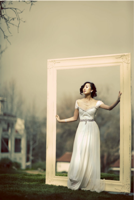
Recently, I asked my friends (Camilla, Laura and Stella) to help me out with my photography project by being the 'models' in my pictures. As my chosen theme is fashion, I wanted to capture their personality through their outfits. I didn't ask them to wear anything crazy, just to dress how they normally would. I didn't just want a plain white wall as a background, so I decided to use the fields by the aerodrome near to where I live. I also used natural lighting, with no flash or anything (if I had taken the pictures at home I would have used professional studio lighting, but I wanted to see how the images would turn out when taken with natural light). When I got home, I also edited them on photoshop.


This is the original version of the photograph. I like the background in this, but there is too much space above Camilla's head, so when I edited it in photoshop, I cropped it down to a better size. I also added some blue tones to the picture as I felt like it intensified the image that way.

This is the edited version.

This picture I decided not to edit. I quite like how it looked without being edited, I also like how there is a lot of space around the picture, with not much going on in it as it draws your attention to them.

This picture I decided to edit as there was slightly more space on the right hand side of the picture. I also added some blue tones again to this picture, but not as much as the one from earlier.

This is the edited version.

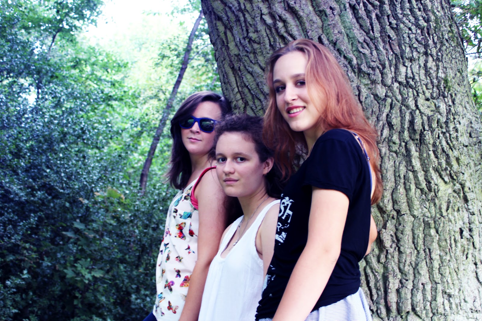
I edited this picture as I felt that the colours could be brighter and more vibrant, so I added some blue tones (I feel like adding blue tones in photoshop can really make a picture look better!)

Here is the edited version.

I decided to crop this picture as again I felt there was too much space surrounding the image. I also added blue tones.

Here is the edited verison.

I didn't want all of the grass or clouds to be in the picture so I cropped it, and also added blue tones.


Here is the edited version.


Thanks to Camilla, Laura and Stella for helping me out!