
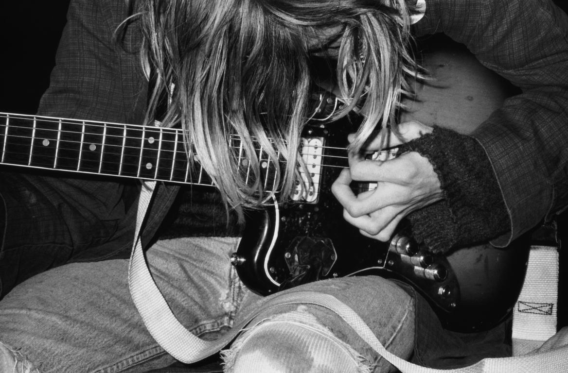
We visited the ICA gallery in London this week, to see the exhibition of Juergen Teller. I personally really liked this photograph above, which is of the famous musician Kurt Cobain from the band Nirvana. This photograph was taken in 1991 (a few years before his suicide) and is a digital c-type print. I particularly like how this photograph is in black and white, and I think that this could in someways refer to the singers depression. This is a medium close up shot so it shows mainly the guitar, which could also be symbolising the importance of music to Cobain and how the only thing that matters is his guitar. I like how his face is covered with his hair, as it makes it relatable for other musicians/guitar players.
I think that this shot was planned, however it looks natural and therefore spontaneous. It doesn't look too posed which I like, as I think that that would look too formal and that wouldn't create the same effect. I liked this photograph also because it relates well to my new chosen theme of portraiture. This photograph gives me inspiration to experiment with medium close up shots, so I'd be focusing on the person/people rather than them and the background as well, as I think that this would bring something new to my work. I like how the background isn't particularly visible, as it makes the viewer focus more on the musician himself, and again, this is something that I want to try and experiment with.
Throughout the exhibit, there were a variety of photographs, but I personally liked this one the best, as I thought it was simple, yet it was dramatic and effective, and seemed to tell a story. It makes you think about what song he was playing at the time - I would imagine that the artist used a fast shutter speed to capture the image as Cobain was playing the guitar. It makes you think about what he was thinking at the time that this photograph was taken - was he playing a song that expressed his emotions at that time?
The lighting in this photograph is fairly dramatic. I think that if it was a colour photograph, it wouldn't look as dramatic, however in the black and white, the tones are strong and effective. It helps to simplify the image itself, as there aren't any bright colours taking away the attention of the photograph of the whole. The print itself is contrasted and bold and I personally think that this technique works really well, and is something that I could replicate in both the darkroom, and digitally on photoshop.
Overall, I think that this piece is particularly expressive and unique, and it really makes the viewer think about the image itself, rather than the background being a distraction, etc... I like how it is in black and white, rather than colour as it makes the photograph really stand out, especially as the other photographs in the same room were bright, bold and vivid colours.