


After looking at all 8 themes from the V&A Theme Tours page, I have decided that I would like to focus of the Fashion theme. I want to do this as I already have a strong interest in Fashion, as well as Fashion Photography, which I think will help me a lot in researching the theme. I think that it would be fun to do fashion photography as it is a very creative theme withing art and you can use many different settings which would relate to a particular "outfit" or "look" and I think that it would be interesting to do that.
SAATCHI GALLERY - OUT OF FOCUS : PHOTOGRAPHY
Recently, I visited the Saatchi gallery to visit the Out of Focus photography exhibition. There were lots of different styles of photography in the gallery, which I found interesting towards my studies. My personal favourite piece from the gallery was called "Diorama of Paris" by Sohei Nishino (pictured below). When standing in back from it, it looks no more than an aerial shot of Paris, which at first I wasn't particularly impressed with. It was only when I got closer to the picture did I realise that the "aerial shot of Paris" was actually made out of tiny individual pictures from around Paris, (also pictured below) for example the Eiffel Tower and the Sacre Coeur cathedral. The in-depth detail into this picture is very effective and overall creates a very interesting piece.


My least favourite piece from the gallery were the photographs (untitled) by Luis Gispert, one is pictured below :

Analyses for the theme of FASHION.
ANNIE LEIBOVITZ.

Scarlett Johansson as Cinderella.
This photograph is by Annie Leibovitz, who is a well-known fashion photographer (I also studied some of her other Disney creations for my AS photography studies, such as Alice in Wonderland which inspired me for my exam piece). I take a lot of inspiration from her work, as they have simple ideas but are effective and interesting to look at. I particularly like this Cinderella one, as the model (Scarlett Johansson) really stands out with the blue of the dress from the dark stairs. I also like how you can see the castle in the background, and how it has a slight glow about it, which gives a feel of it not really being there. This photograph was used as part of an advertisement for Disney theme parks, and was used on billboards, hence the slogan "where every Cinderella story comes true". Although this photograph isn't supposed to be a fashion picture, I think that it works well for the theme, which is why I chose it. The lighting is interesting in this photograph, the blue dress appears to be glowing slightly, as well as the castle. I think that this helps to make sure that the background isn't distracting, and allows you to be able to notice the glass shoe on the staircase. I also like how the writing is fairly small in comparison to the rest of the photograph, as although it is noticeable, it isn't overly obvious, which I think creates an interesting effect.


TYPOGRAPHY PHOTOGRAPHS TUTORIAL.


This picture above was inspired by the seasons. I found images on trees and leaves throughout the different seasons to use in this picture. On the far left, I did Autumn, then Winter, then Spring and then Summer, which I think shows the cycle of the seasons nicely. I think that the 'grid effect' This piece of work was also inspired by the artist Lin Osborn who does similar pieces.
This is one of Lin's work :

Painting Nature.


JASON CHRISTOPHER.

'Ballerina Couture'
This photograph is by Jason Christopher. I personally really like this piece as I think that the setting works really well for the whimsical feel of the outfit. The piece is called Ballerina Couture, but because the dress is black, it makes it feel like a more gothic, darker side to the theme of Ballet, and I think that this is particularly effective. Jason is a fashion photographer based in LA, America. His work has often been described as classic and romantic. Although this photograph has a gothic feel to it with the colour of the dress, and the dead ground around the model, the fact that she is bare foot brings a sort of innocence to the picture.
DAN KENNEDY

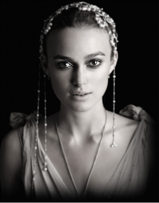
Keira Knightly.
This photograph was taken by Dan Kennedy, who is a celebrity and fashion photographer. I really like the use of lighting in this photograph - the light is shining on the right side of the photograph which creates a shadow on the left side of her face - perhaps to show two different 'sides' to Keira (perhaps in her personality) or to show that there is both light and dark in people, which I think makes an effective photograph. There is a simplistic feel to this image - the makeup has been kept simple, and although there are a lot of accessories, you don't get distracted by them because they are out of focus. I also like how this photograph is in black and white.
EMILY SOTO.


These photographs were taken by fashion photographer Emily Soto. I have only just discovered her work recently, but I really like her style of photography and I think that it will definitely inspire me for my own work next year. I like how each of these photographs have a specific colour theme, even if it's subtle, for example in the first picture there are earthy colours of greens and browns, the second picture of lilac and purples and in the last picture of pinks. Emily Soto has only been a fashion photographer for a couple of years but has already received a 'Best of Photography' award from Sigma. I really like how in the first photograph, although she is in the background of the photograph, the model is the main focus of the picture, and that the gravestone in the foreground is out of focus. I think that it makes the photograph seem more mysterious, and almost paparazzi-like as the picture is being taken from behind the gravestone, which again adds to the mysterious feel of the picture. In the last photograph, it looks like the model is wearing some sort of paper crown/tiara, which makes it seem like she wants to go back to her childhood of pink and princesses, which gives a child-like feel to the picture.
CLAIRE HARRISON


Claire Harrison is a fashion, hair and beauty photographer who is based in London. In the first photograph, I particularly like how the setting is old, and almost tired looking, as this makes the model stand out. I also like the use of setting in the second picture, as although the main focus of the photograph is the models, the background also has a lot going on in it. In the third picture, I particularly like how the model has been placed right in the centre of the image, and that there is a lot of space around her. Normally I think that if it is a plain background, too much space doesn't look good, but because there are soft, out of focus flowers and grass, it makes the whole surrounding and photograph seem whimsical, which I think works well.
TYPOGRAPHY PHOTOGRAPHS TUTORIAL.

The original picture of the one above is by Annie Leibovitz (who again, I studied in AS). This photograph relates well to the theme of fashion that I want to continue with next year. I made this on photoshop, but I don't think that it worked so well for me, as it is difficult to see the 'mermaids' in the photograph.
I started off by opening up the photograph on photoshop. I also had some text ready to use later on (my text was about fashion and the fashion industry). You need to split the image up into colours by going to Select > Colour Range > Shadows > Make sure it says 'selection' (and then click ok) > Copy the selection > Paste it (it will place it on a new layer). Then repeat the steps but instead of choosing Shadows choose Midtones. Then, select the two new layers and merge them together (you can also hide the background layer as this isn't needed). Create a new document for the text (20cm x 20cm with a resolution of 300 pixels per inch works best). Paste the text you had from the beginning into the new document in photoshop. Change the font and size to your liking (font size 30 works well). Turn the text into the brush by going to edit > define brush preset > name it > save it. Open up the brush window and create a new layer on your image. Select the brush (making sure that the brush is black) and fill over the image with the text. Feel free to change the sizes to make it look how you want it to. Now create a layer mask by clicking the layer mask tool on the brush window. It should appear as a white layer next to the text layer. Click back to layer 1 (shadows/midtones) Select all > copy > go back to text layer and click on layer mask > then paste selection on the layer mask > then deselect > invert image > go to the layer blending options > open gradient box > screen for the gradient mode > choose the colour gradient you want (as you can see I went for a multi-coloured effect > play around with it until you are happy with it. You can then erase parts of the image to create an interesting effect and to make the original image appear stronger. Then you're done!
EXPERIMENTAL WORK

*individual photographs are from google, but I created the composition of them*
This picture above was inspired by the seasons. I found images on trees and leaves throughout the different seasons to use in this picture. On the far left, I did Autumn, then Winter, then Spring and then Summer, which I think shows the cycle of the seasons nicely. I think that the 'grid effect' This piece of work was also inspired by the artist Lin Osborn who does similar pieces.
This is one of Lin's work :

I like how the photographs in this one are by colour, it makes it interesting and also stand out more. I also like how there is a gradient of colour, fading from red, to orange, to yellow, to green, to light blue, to dark blue and then finally to purple. It is interesting to work out what the everyday objects are in the photographs.
Painting Nature.


I was particularly inspired by the work of Norm as I like how the vibrant colours stand out from the greens and browns. I think that it also shows how nature can be bright and colourful even in the autumn and the winter when the leaves are turning brown. I used acrylic paint to paint the colours onto the leaves. I was fairly random with the colour choices but I like how they turned out in the end. I then took them outside and placed them on the ground and took pictures of them. The second picture was edited on my phone using Picfx and Instagram, which I think gave the photograph a nice effect. The pictures were also taken using my phone.

Experimenting with GIF animation on photoshop. To create this, I took about 10 photographs of the phone/headphones but moving the headphones each time I took a picture. I then added them as separate layers on photoshop and used the animation tool to create this.
How to make a GIF on photoshop :
-First you need a sequence of photographs which will need to be on separate layers (easiest way to do this is File > Scripts > Load Files into Stack).
-Select Windows > Animation. A box should then pop up.
-Click on the small tab at the bottom of the box that will say Duplicate This Layer.
-To add the second photo to the animation, hide the layer of the first image. You should now see the second photo. Duplicate the layer. Repeat this step until you have all of the photos you want in the animation box, and make sure that they're in order!
-Shift > Click all the box so that they're all selected in the animation box. Click on the time selector at the bottom left and you can decide how much time you want in between each photo. I chose 0.1 seconds.
-You can then change the size/contrast of the pictures if you so please. Save it and you're done!
JAMIE BECK


The animated GIFs above are by a famous photographer called Jamie Beck, who is most famous for her 'cinemagraphs', which are still shots that include animation within them. In the first picture, you can see the champagne swirling slightly in the glass. At first I didn't notice it, but once I did I found it a very interesting and create approach to photography. In the second and third pictures, you can see the model's hair moving in the breeze. In the fourth one, you can see the front of the mans bike moving, and you can also see the woman's skirt moving in the breeze. In the fifth cinemagraph, you can see the makeup artist applying the lip liner and the model blinking and moving her eyes. The sixth one shows another makeup artist applying eyeshadow to the model. I also like how you can see the hand moving at the front left of the picture, as it makes it more realistic. I think that all of these photographs are effective because it makes it feel like you are there when the photographer is taking the picture. It also makes it feel like a short film. I picked these particular photographs by Jamie Beck as for my A2 project I want to 'specialise' on fashion photography, and these photographs will definitely be a huge inspiration to me, and I also want to learn how to make cinemagraphs.
GERALDINE GEORGES


JAN VON HOLLEBEN

Jan von Holleben is a German artist best known for his photographs that are shot from above, creating a cool effect with the use of objects and setting. Below are two examples of pictures that I made with some other people during class. We used materials that we found around the art department and set it all up on the ground in the atrium of the college. We took other pictures of this set up too, to show the balloon flying away. It was fun to make and we had an interesting outcome.


MARKUS KISSON
'Dissected Polaroids'.

The picture above was created by Markus Kisson, who is best known for his pop-up art. I particularly like how the photograph is a polaroid which gives an old feel, but the technique of pop-up gives it a new feel also. I recreated my own versions below, using the pop-up technique:

I took this picture myself when I was in London and I like the interesting box effect in it, and also how the boxes and pop-ups are different sizes.

This picture was taken during the snow fall earlier this year. I then edited it in photoshop to create the effect of snow actually falling during the time that the photograph was taken. I then created more boxes and also layered the boxes which I think created an interesting effect.
ABIGAIL REYNOLDS

Abigail Reynolds is a photographer who is known for her origami cutting style. I created my own version by printing off two photographs that were the same size (in my case fashion pictures as that is the theme that I want to continue with next year). I then put them onto black sugar paper to make them more robust. I kept the background photo (the one that would show through the cut-outs). On the front photograph, I drew out a grid and started cutting out different sized triangles. Overall, I think that the picture looks effective, as the lighting in both the photographs are different.

(The final outcome)

(The back photograph)
Below are a couple of fashion photographs that I took of one of my friends Camilla. I personally think that the location works well, however the lighting is too bright in the background rather than the subject. Over the summer I plan to take and experiment with lots of fashion style photographs.

