
The exam theme is as follows :
-To explore the concept of Encounters, Experiences and Meetings in its broadest sense from animation to alternative photographic processes drawing upon Experiences, evoking emotion, synaesthesia and tactility.

This is just a quick mindmap of ideas that I could possibly use for my exam project, as well as a list of possible artists to look at that could help me find inspiration for my final outcome.

Photo links :
6. Dinner Party
9. Starbucks
10. Meeting
11. Hot Chocolate
12. Friends Shopping
13. Butterbeer
14. Family Lunch
16. Handshake
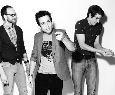
Here is a selection of pictures that I think relate well to the theme of Encounters, Meetings and Experiences. There are a variety of different pictures, from the famous film titled "Brief Encounters", to television shows such as "Poirot" (by Agatha Christie) to normal everyday encounters, meetings and experiences, such as meeting up with friends and family, as well as simply business meetings. This is a 'moodboard of inspiration'.

For this photograph, I added flower print texture on the top. I erased it from my face so that it would blend nicely into the background. I also added a bold white line around myself, and changed the layer to make it give a glow effect. I used photoshop to create these photographs.

For this one, I added 2 of my other pictures on top of this one and played around with the layer types to create these interesting and experimental pictures.. I used Photobooth on the college iMac's to take these pictures.
These two pictures are inspired by the Destroy Rankin project.

For this picture, I feel like it has been made to look like a cartoon. I added a green gradient to the background, and used a sketch effect to make it look like a drawing. I also made it black and white so that the green would stand out more and look bolder.
(click title to view website)
/

'The Hoosiers' for the Destroy Rankin Project
This piece was created in 2009 by the band The Hoosiers along with the artist Rankin for his project 'Destroy Rankin'. This particular piece was created using inkjet prints as well as digital illustration. The project involved many music artists destroying pictures of themselves that Rankin took of them. Some ripped up the photographs and stuck them back together, perhaps in a different order, some wrote over their faces, some added different prints, textures and fabrics. I particularly like this one by The Hoosiers because I like how they drew on little animals, such as the birds eating seeds from their hands, or little animals crawling up them. I like how each piece by each band/ music artist is original, as well as unique. They were given the chance to experiment and they all took the opportunity to make their photographs interesting. Some were inspired by artists they liked the work of, such as Damien Hirst. I also like how you can see the photographs before they were 'attacked' and, on the photographs which had several changes, you can see how they were changed, which I think is a good way of showing what was done to the photographs to make them look so different. The Hoosiers piece is my favourite, but I also like this one by The Feeling:


Overall, I really like this collection/series of work for the Destroy Rankin. I think that they're unique, original and I like how experimental people have been with they're photographs/pieces.
///Visiting London---


Experiences : Visiting London.
The other week, I hopped on a train into central London. I decided to visit the London Eye, as it's always good for taking pictures! I definitely think that it's an experience to be done - it wouldn't be such a tourist attraction otherwise! I enjoyed taking the pictures of the London Eye, because I think that it looks good and interesting from different angles and views. I also took a couple of pictures from the performing artists and the carrousel nearby, as I thought that the colours were fun and vibrant. These pictures were taken without a flash, and the natural lighting in the photographs reflects the weather that day - gloomy and dull, which normally I like my photographs to be bright with interesting light effects, but I actually really like how natural these photographs look.

I personally really like the work of Johan Thörnqvist as I like the illustrations that he does. For example, the one above, titled: huset på andra sidan gatan (in english - the house across the street), is interesting because of how each room has little people in it, and they're all doing something different, which creates variety. I also really like the soft colours in it, which also makes it have quite a cartoonish feel about it. What I also find interesting, is that you can see the 'city' in the background, but it's faded, so it makes us focus on the house, but shows us that it's not just a drawing of a house.


For these two photographs, the artist took the picture of the lemon tree on just his mobile phone, then imported it into an editing system to illustrate it. I like how it's just an ordinary snapshot photograph, but can be made into something interesting and artistic. Again, the illustrated version has a cartoon effect and feel to it, where he has turned the lemon tree into a 'lemon juice factory'. I couldn't find a name for this piece on the artists website (click the title to be taken to the site), but it is part of a series of his mobile phone photography-illustrations.
Here is a video showing how the artist creates and edits his illustrations:
Jonda Spurbeck


The style of fairytale photography really inspires me. There is something so magical about these types of pictures. This particular photograph was inspired by Cinderella. Jonda Sprubeck is mainly a wedding photographer, and as you can see from the shots above, the dress is actually a wedding dress, but the photographs have been made into a fairytale themed shoot, from the props and setting.
The reason why I have chosen fairytale themed artists, is because I think that they are a part of life cycles, as well as being childhood experiences which become memories. As a child you are told them many times and they stay with you for the rest of your life, and you pass the tales on as you get older.
Annie Leibovitz

Annie Leibovitz is also a fairytale photographer, but, unlike Jonda Spurbeck, she doesn't take wedding photographs themed to fairytales, she just focuses on the fairytales themselves. The photograph above is themed around The Little Mermaid. The use of editing makes this photograph incredibly effective. I like the use of setting, as you can see the palace in the background which would show people that it's not only a mermaid, but it is based on The Little Mermaid disney film.


This piece is themed around Alice in Wonderland and the teacups. It's easy to see which character is which from the costumes, and the setting of the twirling teacups in the forest (Wonderland). This series of Disney photographs are used for billboards and advertisements for Disney and Disney parks.


I have included these styles of pictures because this is my main idea for my final outcome. I have always been inspired by fairytales, and fairytale photography, so I thought - why not incorporate that into my final outcome? I have decided to create an Alice in Wonderland Mad Hatter style tea party, and by combining both digital and film prints, as well as a little help from photoshop, I want to create the effect of Alice being in two seats at once, (making it really seem like a Mad Hatter's tea party).
Shaped By War - Photographs by Don McCullin
at the Imperial War Museum, London.


We recently visited the Imperial War Museum in London to view the 'Shaped By War' by Don McCullin exhibition. as well as the 'The Storm Is What We Call Progress' exhibition by Ori Gersht. Both exhibitions were themed around people's experiences with war, and they were interesting to look at because the photographers captured the emotion in them really well. Ori Gersht had two films as part of the exhibition ( a still is pictured above ) as well as a collection of photographs. The photography from Shaped By War was moving, and I preferred it to "The Storm Is What We Call Progress", as I believe that there was more emotion being captured in his photographs, which made it more effective than the short films.
Tilt Shift Photography - Preparation and experimentation for my exam ideas.
Original photograph:

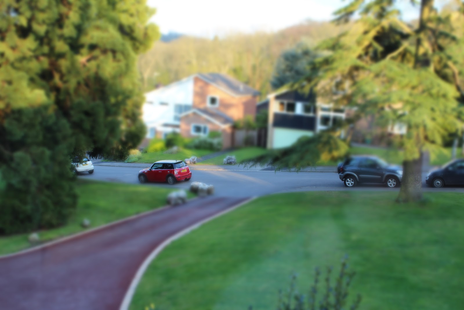
This photograph was taken from my window in my house. When looking up youtube tutorials on how to create the tilt-shift photography effect in photoshop (or in my case GIMP) I learned that photographs that have been taken from a high angle, and also a good distance away from the subject work best. I decided to take a picture of my neighbours car on the road as 1) it is from a higher angle and 2) I'm a good distance away from the subject.
To create this photograph, I duplicated the layer. Then, I created a 'mask layer' (the white box next to the main photograph on the layer titled Background copy). I made the layer blurry by going to filters>blur>gaussian blur>50.0. This will create the cartoonish effect.


You then have to select the Blend tool (often known as the gradient tool) and change the shape of the tool to Bi-linear. You must also keep the colour as black--->white for this to work. You then need to drag the blend tool on the part that you want to be in focus. It may take a few tries to get it exactly how you want it. You can then take the eraser tool like I did to go over a few objects (like part of the tree on the far left, which I didn't want to be in focus). Make sure you've done this on the mask layer part, otherwise it won't work.
I then played around with the colours a little (colours>curves>create an S type shape, or freestyle it until it's how you want it). The main point of a tilt shift is that it looks cartoonish, so by enhancing the colours and making them more vibrant, will create the cartoonish effect. It makes the focused object seem smaller, as well as it's out of focus surroundings.
I am going to use this technique in my exam final outcome.
By experimenting with my work like this, it has helped me to improve and develop my ideas, therefore making them to the best of my ability, as well as keeping them interesting.
Have you explored and developed your ideas imaginatively? How have you demonstrated this?
Yes, I have explored and developed my ideas imaginatively. I demonstrated this by taking my photographs and using photoshop to experiment with them, which developed my original ideas further and improved them.
Have you researched a diverse range of artwork and completed this on your blog? Who have you analysed? Is your analysis in-depth?
Yes,
I researched different artists including Rankin (for the 'Destroy
Rankin' project), Johan Thörnqvist, Jonda Spurbeck, Annie Leibovitz and
also the film director Tim Burton (for his adaptation of Alice in Wonderland). I think that my analysis's are in depth and detailed, exploring the artist's work and my opinions on them.
Have you experimented with a wide range of techniques both handmade and computer generated? Which techniques have you used?
I have experimented with a wide range of techniques both handmade and computer generated. As I said earlier, I have used photoshop to further the creativity
of my shots. I have also used different settings on my cameras to
create interesting effects and I've used different techniques during my
photography. I have used both film and digital prints.
Have you refined / developed your outcomes through experimentation? How?
Yes, I have developed and refined my outcomes during experimentation. I have done this by experimenting
with my work a lot, which helps me decide what piece should be my
'final' version of that particular piece. I think that by experimenting,
I can get my full potential rather than just leaving the photograph as
it is, or how it was taken on the camera automatically. By using
different settings on the camera and using editing software on the
computer, I have been able to developed my outcomes to make them better.
Have you written in detail about your experiments and developments on your blog and used this information to help you improve?
Yes,
whenever I post my work that has been experimented with, I always try
to write as much about how I experimented with it as possible. For
example, in this post, titled 'Experimenting' I wrote about how many layers I used, and that I used textures in it to create different effects, as well as changing the colours of the layers and textures.
Have
you taken imaginative leaps/ shown a sense of discovery/ willingness to
take risks in your work? If so how? If not, how can you do this?
Yes,
I think that I have been imaginative with my work, as I think that by
using different textures and creating the different layer types has been
a unique addition
to my photographs. I also think that my idea for my exam final outcome
risky as I think that I have chosen a difficult, but imaginative and
experimental idea.
Have you shown enthusiasm and imagination in your work? If so, how? If not, how can you make changes to do this?
I'm very enthusiastic about my work, and I think that this can be seen in my work and on my blog in general.
Have you created work that is exciting and original? If so, how? If not, what can you do to improve this area?
Yes, I believe that my work is exciting and original, especially with my exam idea of childhood memories of fairytales, in specific Alice in Wonderland, which is my personal favourite.
Have you annotated your blog thoroughly throughout?
Yes, everything I post is clearly annotated and explained.
Yes, everything I post is clearly annotated and explained.
Have you practised with your exam outcomes by creating mock-ups? Are your outcomes skilful/ well constructed?
I haven't practised with mock-ups yet, but I have taken a wide variety of photographs to choose from when I get to the exam. I have practiced different photoshop techniques on other photographs, but none yet from my exam ideas.
I haven't practised with mock-ups yet, but I have taken a wide variety of photographs to choose from when I get to the exam. I have practiced different photoshop techniques on other photographs, but none yet from my exam ideas.
Have you created an exam plan?
I
haven't written out my ideas, but I started describing them a little on
my blog page (the exam one). I plan to continue to write about my
ideas, and also further my ideas when I do write them out.
Dark Room Experimentations


 *
*

Pre-exam experimentation and preparation.


Dark Room Experimentations

For this photograph, I created a stencil with the word 'magic'. I thought that this was particularly effective, because the picture can just about be seen through the words, like magic! I overlayed the stencil several times to create the 'layered' effect, which I think worked well. I think that however it would have worked better if the stencil was larger, allowing more of the picture to be shown.

For this picture, I have actually uploaded it so that it's upside down. I did this because it makes it more of a challenge to work out what it is. This is a double exposure. I layered a picture of people walking in London (pictured below*) and then on top of that, is a picture of some flowers from my grandpa's garden. The exposure time for this was quite long - about 30 seconds.

This picture includes the same flower photograph as above, but instead of people walking, it is a picture of a building in London that I thought was quite unique a different - perfect for an experimental photograph! This also had a long exposure - about 27 seconds.

This photograph is a reversal of the one above. I like how the flowers in the black area are more visible than they are in the original double exposure.

This was a picture, again including the people walking in London, but I put a piece of a magazine in the negative carrier too. This didn't work quite as well as I had hoped, because the magazine paper was too thick, but I still think that this is an effective piece of work.

This is a reversal photograph of the people walking in London, again, upside down.

This is a picture of a tree, however when I was exposing the paper, I decided to put an actual flower on the paper, to create this cutout effect.

This is the original picture of the one above.
 *
*
This is the picture of people walking in London.

This, again is a picture of people walking in London, however before placing the photograph in the developer, I took a paintbrush and with the developer, painted on the photograph, then let the rest develop. Again, this is upside down.

I decided to do some experimenting on photoshop with my pictures. I gathered the pictures that I wanted to use (from previous coursework experiments) and made them smaller and different sizes so that not only would they fit on this one photo, but also to create variety. I created lots of different layers (As shown below) to get the desired effect. I used one sparkle texture twice, changing the colour each time (pink and green) and then also used a different sparkle texture which had a few pastel colours in it. I think that due to the colours used and the sparkles create a 'mystical' effect, which I think works well. This has helped to my experimentation with photoshop which will help to prepare me for my exam, in which I plan to add textures and play with the colours in the actual photographs.


16 layers in total.
I decided to do some experimenting on photoshop with my pictures. I gathered the pictures that I wanted to use (from previous coursework experiments) and made them smaller and different sizes so that not only would they fit on this one photo, but also to create variety. I created lots of different layers (As shown below) to get the desired effect. I used one sparkle texture twice, changing the colour each time (pink and green) and then also used a different sparkle texture which had a few pastel colours in it. I think that due to the colours used and the sparkles create a 'mystical' effect, which I think works well. This has helped to my experimentation with photoshop which will help to prepare me for my exam, in which I plan to add textures and play with the colours in the actual photographs.


Pre-exam experimentation and preparation.


Before my exam, I decided to experiment with my prints, so that when the time came to taking the exam, I'd know what would work and what wouldn't. The two pictures above didn't work as I had planned, but it helped me to know how to fix it. To create these prints, I put my digital print onto acetate, and then turned it into a photogram (during the exam I want to mix my digital and film prints in the darkroom). As you can see, these came out as negative images. I realise that when printing the photographs onto the acetate, I printed them as positives (therefore turning them into negative images). When it comes to my exam, I will know that I have to print them as negative images, so that in the darkroom they will become positive images.

For this experiment, I took one of my film slr prints, and overlapped it with two colour digital prints that were on acetate. I think that it created an interesting effect, as well as the mix of colour and black and white film.

For this one, I scanned in a page from my Alice in Wonderland book, and then turned it into a negative to use in the darkroom for my exam (I also made a print of a page from the chapter title A Mad Tea Party, which I thought was very suitable for my final idea). I think that this will work well in creating a wide range and variety of unique prints for my final outcome.
FINAL OUTCOME/PROJECT EVALUATION
The theme for this project was Encounters, Experiences and Meetings. I liked the theme of this project because it can be interpreted in many different ways. When I first thought about ideas for my final outcome, I was thinking along the lines of certain places that have meanings behind them, a group of friends, or even a drink. However, as I thought more about this, I found that this would not be challenging enough for me, which is why I came up with the idea of the childhood experiences of fairytales and storytelling. I chose to base my exam piece of the story of Alice in Wonderland, which is one of my personal favourites. I decided to the the Mad Hatter's tea party theme for my project. I set up playing cards, a pocket watch, cakes where I had written Eat Me with an icing pen, and I also set up fairy lights for it. I took both digital and film photographs to create variety when mounting them onto card. When it came to the exam, I had already scanned in pages from my copy of the Alice in Wonderland books, and turned them into negatives on acetate so that I could use them in the darkroom to create effective and dramatic prints. I also turned my digital prints into negative acetate pieces for this purpose too. In the darkroom, I found it difficult to double expose the shots (to create the 'blended' effect that I was looking for). At first, I realised that I was using acetate prints that were positives and not negatives, so the photographs came out as negatives when I used them in the darkroom to create my prints. I included some of these in my final piece however because I think that have a 'chaotic' feel about them - which is perfect for a Mad Hatter's Tea Party, and because it adds to my range of techniques and effects created for my final outcome. When it came to my digital prints, I used several techniques that involved Photoshop. For one of them, I blended a picture of myself dressed up as Alice with a picture of myself dressed up like the Mad Hatter, to create the effect of both characters being in the same shot. I was happy with the way that this turned out, as I think that it worked well. For the other digital shots, I put one picture on top of the others (using a new layer) and changed the layer type so that it created an effect of one image peeking through the other, adding to the 'chaotic' and almost 'magical' effect that I was aiming for with this final project. I didn't end up using the tilt-shift photography effect that I had practised early (and shown on my blog), as I didn't think that this would work as well as I thought it would, and the pictures that I had taken for my exam weren't quite right for the effect (they have to be high angle photographs). Overall, I think that I showed a wide range of techniques in my final outcome, as well as experimentation before my exam. I'm pleased with my outcome as it is just how I wanted it to be, and I also think that it reflects the theme of Encounters, Experiences and Meetings well. I believe that it can also work well with the mini exam theme of Life Cycles, as everybody goes through childhood and childhood stories are an important part of life cycles. I was inspired by a range of people, mainly Annie Leibovitz, Tim Burton and Jonda Spurbeck, who influenced me in my ideas and my work.
No comments:
Post a Comment