
Hello! Welcome to my photography blog! This blog shows my work from AS as well as A2. Enjoy!
Wednesday, 27 March 2013
Torn Collage / Cubomania Collage
Above is the video for the 'torn collage' technique. I worked in a group of three other people, and we ripped up photocopies of photographs and allowed them to drop onto the paper. We then stuck the majority of them down so that they wouldn't move when we added more to the paper. We squirted paint all over in green, blue and yellow to create a contrast as well as adding texture which I think looked cool and also made the artwork look more random and spontaneous. Someone in my group then decided to take some tape and use it to drag the paint around the paper, which looked quite different and added to the messy look. Overall, I personally really liked this technique and I think that it distorted the photographs in an interesting and unique way, and it would look different every time that you tried it. I think that if I were to recreate this technique just by myself, I'd use my own images that related to my current theme/work and I'd like to experiment more with colour and create 3D layers with it (for example, paint). It could also be interesting to experiment with other materials, such as fabric - such as ribbon to be comparable to the paint, or lace, to distort how the viewer perceives the torn photographs.
Above is the video for the 'cubomania collage' technique. Again, using photocopies of photographs that had been provided, I cut them up into squares and placed them fairly randomly on the yellow card. If I were to try this again, I think I'd chose more relevant pictures (again, like before) and I would experiment more with colour and perhaps place it on different fabrics like silk which would reflect light when making the collage, which could bring an interesting feel to the image. It would also be worth playing around with the timings of the stop motion, as this could make the same artwork seem different depending on the timings.
Overall, I really liked trying out these techniques, and it has made me think about experimenting more with colour, as well as different ways that photographs could be presented - not just on photo paper. I also really liked using the iMotion HD app on the ipads, and would definitely consider using them again to create stop motion animations of the process in which I went through to to create the art piece. Again, this is helping me to experiment with other possible ways of presenting my final outcome for my exam piece.
Wednesday, 20 March 2013
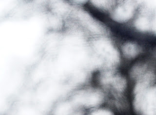
Creating Filters : Distortments
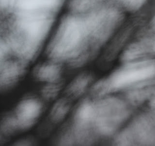
^original photograph

^enhanced photograph

^original photograph
^enhanced photograph

^original photograph

^enhanced photograph

^original photograph

^enhanced photograph
To begin with, I cropped these images to make them harder to see what the image is actually of, as this is the first way that I was able to distort the image (other than by using the water filters). Then, on photoshop I played around with the saturation, the contrast, and the lighting settings. I think that this creates an interesting look to the photographs, and distorts them in a really unique way. Overall, I really like the effect, for example, in the second sets of photographs, in some ways the tree branches look like the eiffel tower, which I think looks quite cool.
When taking these photographs, I was mainly thinking about cropping them done to a smaller size on photoshop afterwards, rather than having the larger original photographs, as I think that the photographs look more distorted this way.
Tuesday, 19 March 2013
Creating Filters


Monday, 18 March 2013
Jorma Puranen


I find this photograph above interesting, as it is another form of distortment, playing with shadows and how they can completely change the image. It would be interesting to see the photograph without the shadows, to see how they differ. I think that this photograph would have been made with double exposure, as the vibrancy of the flowers are slightly faded. The flowers and leaves also look dead, which gives a gothic feel to the image. The faded effect is interesting as it also looks like the technique from the previous image with the water/texture filter/layer. The photograph below relates to the first photograph more and makes the photograph look somewhat spooky, and what I really like about his photographs is that they look like oil paintings, and this can be created simply. Out of all of the images, I prefer the last photograph (below) as the cool blue colours give it an interesting look with the sun peaking out and bringing a vivid white lighting to it. I think that to further my own experiments and to develop my ideas more, I could try taking the photographs of the sun and clouds at different parts of the day to see how the lighting and cloud patterns differ, as I think that this could make quite a good collection/series of images.

William Eggleston

William Eggleston is an American photographer who was born in 1939. To begin with, he photographed only in black and white, but began to experiment with colour films 1965 and 1966 after being introduced to the medium by William Christenberry. Eggleston's work has been used for advertising for Marc Jacobs, as well as for album covers for bands such as Primal Screams album 'Give Out But Don't Give Up' as well as Jimmy Eats World's famous album titled 'Bleed American'.
I chose to analyse this particular photograph above as I found the shadows and reflections interesting and inspiring. I love how the light (which would appear to be natural light from the sun) shines through the window and we can see the colours of the drink on the table. This photograph looks like it was taken on an aeroplane from the shape of the window and the clouds outside. The models hand looks interesting in this photograph as we are not as to weather it is a man or a women - could it be the photographer himself? It creates an interesting shape as a shadow and this is a form of distortion, which I'm currently experimenting with myself. It wouldn't be too difficult to recreate either, and you could change the setting so for example on a bus or in a car that has one of those fold out tables.
This photograph has a vintage feel about it, probably because it is not a particularly modern piece, however this would be a technique to research and use in my own photographs - making the photograph look more vintage with the colours slightly faded. Below are some more examples of the faded effect:


I think that his photographs are interesting and unique, and can relate well to the theme of the everyday, which is what I plan to continue with. I also like how when there are people in his images, such as the ones above, you never see their faces, so there is a sense of anonymity about them, making them open to interpretation.
Photography Trip Photograph Experiments


When on the photography trip, I decided to take some photographs inspired by the portraiture theme. I really experimented with the depth of field, using a 50mm lens, with an aperture of f/1.8. I think that this worked well and created an interesting overall effect, and also makes the photograph look more professional.
Subscribe to:
Posts (Atom)