Tuesday, 16 April 2013

Exam Review

The themes that I am currently working on for the inside, outside and in-between exam topic is the everyday. I originally intended to do portraiture, however I felt that this was similar to previous work that I had done, and so I changed my idea to the everyday, as although it is a simplistic theme, it can be explored in many ways which is something that drew me to the idea. I think that my most successful experiment has been with distortion, which is something that I want to continue with and develop with for my exam. 


I think that this technique has worked particularly well for my experiments and to further my developments I could look at using different coloured inks as apposed to just water, and perhaps experiment with the 'colour splash' techniques so the background is in black and white and the ink is the only thing in colour, or the other way around. I plan to refine my ideas further by also experimenting with black and white film, and perhaps even colour film. An artist that I have researched in relation to this idea is Jorma Puranen, who is a photographer that inspired me as he has also used the technique that I have shown above. To recreate a piece to be more like his, I would use experiment with both cool tone and warm tone colours, and simpler surroundings/objects to focus on. What I love about his work is that he uses textures and distortion to make the photographs look like an oil painting:


In the two weeks before the exam, I want to really use my lesson time wisely by taking full advantage of dark room, and really experimenting with distortion for example, using scratched glass and creating handmade negatives by using cellophane, salt and washing up liquid to create interesting techniques. I also think that overlaying the cellophane can make the photograph appear fragmented where the ends of the cellophane meet. I also want to experiment more with using other materials to create photographic prints, for example, using liquid emulsion and also using different types of paper (for example, coloured paper, card, graph paper, textured paper). Also experimenting with building on top of my photographs, for example by using fabrics, paints, and more. Not only will this add to my collection of experimentations, but it will also help me to decide on how I want to present my final outcome - what do I want to do with the final negatives/photographs? For example, I might keep it simple and just pin the photographs onto card or foamboard, so that they stand out without a busy background taking attention away from the photographs themselves, or I could print the photographs onto fabric and create some sort of installment.

Monday, 15 April 2013

Digital Distortion


Over the Easter holidays, I visited Orlando, Florida, and I decided that with the photographs that I took, it would be interesting to use Photoshop/Gimp to distort them to see how they turned out. I tried lots of different experiments, such as the LOMO effect of gimp, as well as changing colours and adding light orbs to distort them. I personally really like the middle one, as it is the most distorted and makes the viewer wonder about what the photograph could be of (Hogsmeade Village). The photographs above were taken at The Wizarding World Of Harry Potter at Universal.


For the above photograph, taken at the Magic Kingdom at Walt Disney World, I experimented with the lomography effect of gimp, as well as adding a slight neon outline, which you can see if you look closely, especially at the Magic Kingdom itself, as well as the statue of Walt and Mickey.
This photograph above was taken at SeaWorld, and I didn't do much to this when editing, but if you look close up, you can see a slight mosaic effect. 

Wednesday, 27 March 2013

Torn Collage / Cubomania Collage


Above is the video for the 'torn collage' technique. I worked in a group of three other people, and we ripped up photocopies of photographs and allowed them to drop onto the paper. We then stuck the majority of them down so that they wouldn't move when we added more to the paper. We squirted paint all over in green, blue and yellow to create a contrast as well as adding texture which I think looked cool and also made the artwork look more random and spontaneous. Someone in my group then decided to take some tape and use it to drag the paint around the paper, which looked quite different and added to the messy look. Overall, I personally really liked this technique and I think that it distorted the photographs in an interesting and unique way, and it would look different every time that you tried it. I think that if I were to recreate this technique just by myself, I'd use my own images that related to my current theme/work and I'd like to experiment more with colour and create 3D layers with it (for example, paint). It could also be interesting to experiment with other materials, such as fabric - such as ribbon to be comparable to the paint, or lace, to distort how the viewer perceives the torn photographs.


Above is the video for the 'cubomania collage' technique. Again, using photocopies of photographs that had been provided, I cut them up into squares and placed them fairly randomly on the yellow card. If I were to try this again, I think I'd chose more relevant pictures (again, like before) and I would experiment more with colour and perhaps place it on different fabrics like silk which would reflect light when making the collage, which could bring an interesting feel to the image. It would also be worth playing around with the timings of the stop motion, as this could make the same artwork seem different depending on the timings.

Overall, I really liked trying out these techniques, and it has made me think about experimenting more with colour, as well as different ways that photographs could be presented - not just on photo paper. I also really liked using the iMotion HD app on the ipads, and would definitely consider using them again to create stop motion animations of the process in which I went through to to create the art piece. Again, this is helping me to experiment with other possible ways of presenting my final outcome for my exam piece.

Wednesday, 20 March 2013

Creating Filters : Distortments

^original photograph
^enhanced photograph
^original photograph

^enhanced photograph

^original photograph

^enhanced photograph
^original photograph

^enhanced photograph


To begin with, I cropped these images to make them harder to see what the image is actually of, as this is the first way that I was able to distort the image (other than by using the water filters). Then, on photoshop I played around with the saturation, the contrast, and the lighting settings. I think that this creates an interesting look to the photographs, and distorts them in a really unique way. Overall, I really like the effect, for example, in the second sets of photographs, in some ways the tree branches look like the eiffel tower, which I think looks quite cool.

When taking these photographs, I was mainly thinking about cropping them done to a smaller size on photoshop afterwards, rather than having the larger original photographs, as I think that the photographs look more distorted this way.

Tuesday, 19 March 2013

Creating Filters


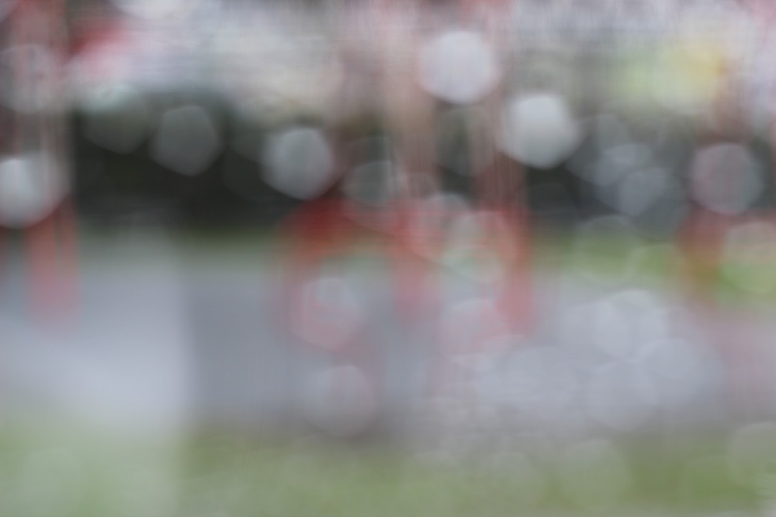
I took these photographs on a digital SLR camera. I cut up photograph sized pieces of acetate and got a spray bottle of water and sprayed the water onto the acetate, held up the acetate in front of the camera lens and took the picture. I made the photograph out of focus so that the water droplets created the bokeh effect which is something that I really like to experiment with. In these photographs, I kept the photograph full sized, instead of cropping it, but it would be interesting to see what they would look like cropped, as I feel that this would distort the image even more, making it harder to know what the photograph is about, which is something that I want to create.

Monday, 18 March 2013

Jorma Puranen


Jorma Puranen (born in 1951) is a Finnish photographer based in Helsinki, whose work involves a lot of experimenting. I like this particular piece above as it is something that I have been experimenting with myself. The use of water makes the photograph look almost like an oil painting. The colours in this particular photograph as strong and contrasted, and I love how the clouds fade from white to pink (from right to left). The photograph itself is simplistic, being of a sunset/sunrise but I think that it works better with this technique, rather than the photograph being complex with a lot going on in the frame, and with a lot of detail as I don't think that this would work as well with the technique which is something to bear in mind when I take more of my own photographs. My favourite part of the image is the bright yellow streak, as this draws the viewers attention. This technique also creates the idea of perhaps the photograph was taken through a window on a rainy day, which is another form of distortment and makes the viewer think about how the image was created, making it thought provoking and therefore more effective. The material used (whether it was water or not) appears to be quite smooth, as apposed to the approach that I decided to take of water droplets/splatters. There are many different ways in which the distortment can be presented and this would be an interesting thing to explore in greater detail. I could also try using oil, ink, vaseline, washing up liquid and more which would all create something different, even if you placed them in the same place and in the same way each time. I could also try applying the liquids with a paintbrush, to create a streaked effect, rather than a splatter/rain droplet effect. This relates particularly well to the exam theme of inside, outside and in-between as it is a photograph of an outside setting, the filter of distortion is the in-between, and the camera could be considered the inside, or if perhaps the photograph was taken from looking through a window, the subject of the photograph would be the outside, the window would be the in-between and the setting behind the window (most likely inside somewhere) would be the inside. 


I find this photograph above interesting, as it is another form of distortment, playing with shadows and how they can completely change the image. It would be interesting to see the photograph without the shadows, to see how they differ. I think that this photograph would have been made with double exposure, as the vibrancy of the flowers are slightly faded. The flowers and leaves also look dead, which gives a gothic feel to the image. The faded effect is interesting as it also looks like the technique from the previous image with the water/texture filter/layer. The photograph below relates to the first photograph more and makes the photograph look somewhat spooky, and what I really like about his photographs is that they look like oil paintings, and this can be created simply. Out of all of the images, I prefer the last photograph (below) as the cool blue colours give it an interesting look with the sun peaking out and bringing a vivid white lighting to it. I think that to further my own experiments and to develop my ideas more, I could try taking the photographs of the sun and clouds at different parts of the day to see how the lighting and cloud patterns differ, as I think that this could make quite a good collection/series of images.