Showing posts with label effects. Show all posts

Friday, 15 February 2013

3D Photoshop Effect

original photograph

3D photograph outcome


step by step guide is here.

This was inspired by two artists. I decided to pick the skeleton photograph inspired by Carsten Witte and the 3D effect was inspired by Brad Carlile. I think that this 3D effect works particularly well with the skeleton makeup as it makes it look more interesting and 'ghostly'. I also think that it works with my two chosen themes - 'movement + light' and also 'inner character'.


Another example-


Carsten Witte


Carsten Witte is a 48 year old photographer who attended the Bielefeld school of photography. He really experiments with the use of shadows in his photographs. The photograph mainly relates to the starting theme of the five senses, however I think that it also relates well to the inner character theme. 

This photograph is very different from work I've seen before, as it incorporates the skeleton into the photograph. I created my own version below using makeup, but this one looks like it could be either double exposure with an image of a skull, or could have been drawn on to the model - either on set or edited in. I think that this would be an interesting photograph to add the 3D photography effect to. This photograph is from a collection titled 'Intuition', which features several photographs of women with this skeletal effect. What is interesting about this series, is that the skeleton art work is only on their faces, rather than continuing onto the rest of their bodies. 


 With these images, I feel like there is a juxtaposition between the innocence of the models - the fact that their hair is away from the face, and that they are not clothed, with the harshness of the skeleton pattern on their faces. I like how these shots are all close up head shots, as it creates a flow within the series, showing that there are similarities between each photograph, rather than just the skeletal features, as the models are different in every picture. With the harsh lighting, there are lots of shadows created, and the face has a strong contour to it. The lighting almost creates distortions to the face which is an interesting technique and something that wouldn't be too difficult to recreate myself. The use of the black background is interesting as the model's face appears to fade into the background, with the use of the lighting. 

Overall, I personally really like these images and I think that they are effective and unique. Although they are mainly related to the theme of the five senses, I think that they can relate to portraiture/inner character also, and in some ways they could also relate to my other chosen theme of movement and light, due to the extreme lighting conditions. 


For my personal experiments, I used black eyeliner and eyeshadow to create this skull effect. Although it doesn't quite replicate the work of Carsten Witte, I think that it works well. I think that to improve this, I should have used harsher lighting to create the effect of shadows and distortion.

my own experimentations :

black and white

colour
creating an effect similar to the original photographs.

Wednesday, 13 February 2013

Eve Arnold


Eve Arnold (April 21, 1912 - January 4, 2012) was an American photojournalist who is best known for her photographs of many of the iconic figures who shaped the second half of the twentieth century, including Marilyn Monroe (pictured above). She has also photographed people such as migrant workers and disabled Vietnam war veterans, so there is a range of styles throughout her work. The majority of her work is black and white, however in the early 1960s when she moved to London, England and was working for The Sunday Times, she began to make use of colour photography more and more. I personally really love her work, especially her collection of photographs of Marilyn Monroe as I think that they really capture her expression and mood at the time. The photograph above was taken behind the scenes on the set of The Misfits (1961). Although the photograph is in black and white, it still captures the details of the image. I also particularly like how Marilyn is the only thing in focus in this image, as it makes the viewer think about the setting and what it is and where she is - I think that this is an interesting technique that Arnold has used. 

This photograph doesn't seem too posed either. It looks like it was taken when she was walking, or just looked up to the camera, rather than the photograph being set up and staged. It appears more natural which I think is something to think about when taking my own photographs. The black and white effect also adds to this. These photographs really work with the 'inner character' theme as you get to see her as herself, even though she is dressed to play the part of somebody else. In this photograph (and the collection as a whole also) the lighting is very soft, which again makes the photograph seem more natural, because if the lighting was harsh and bright, the photographs would seem staged, as if the artist had spent a long time setting up the outfit, setting, lighting, camera angle etc... instead of it being a snapshot. Snapshot photography also makes it work look more like photographs that are taken for memories rather than a magazine or a portfolio - which, again, makes them appear more natural. 


I think that it would have been interesting to take pictures of the same actor/actress but over a long period of time where they're in different costumes for different roles, as you would be seeing the same person in each of the pictures, but they would look different in all of them. It would also be an interesting way of documenting their time on set when they were being filmed. It would also be showing all of the different types of roles that they portrayed in that time frame of their career. 


Throughout the collection, the artist has used different camera angles for different picture. For example, the photograph shown above is a portrait from the waist up, but there is also quite a bit of space above her head. In the first photograph below, it is a close up, and the background is dark so that you only see Marilyn (I also like how in this photograph, her hair appears to be fading into the darkness as this makes the photograph seem more dramatic and perhaps even slightly gothic). 


I think that inner character is an interesting theme to explore and I plan to combine it with the movement + light theme to create a unique final outcome. If I were to recreate photographs like this, I would perhaps double exposure the image with colourful lights, such as fairy lights, to combine both the black and white portrait with the colourful light (perhaps using the bokeh technique). Overall, I think that this collection is very inspirational for work that I want to create for this project. 


More photographs from the same collection:


Monday, 11 February 2013

Brad Carlile


Brad Carlile is a contemporary photographer, who is most well known for his extreme use of colour in his photographs, such as the one above. His photographs almost have a 3D effect, which is something that I'd like to try and recreate and experiment with in my own photographs. The extreme use of colour is interesting and grabs the attention of the viewer. It appears unnatural yet it is appealing to the eye. In this photograph (as well as the other photographs from his collection), there appears to be some use of double exposure, if you look at the chair. This could be because of a slow shutter speed when using the different lighting, or he could have just used double exposure to create an interesting effect. 

In a lot of his photographs from this collection, he uses a mirror to show the rest of the image. I think that the use of the mirror is important as it reflects more light - rather than just taking the picture of the bed. It also makes the room appear bigger and more colourful, and we can also see more of the room. It's almost like an illusion. The photographs are from a collection titled Neon Hotel Interiors, and there are several different styles of interiors, but they still all have the interesting lighting - making them relatable. 


"Each image takes two or three days to create from three to nine exposures at different times of the day. All work is done in camera on film and no colored bulbs or gels are used" 


Although these photographs are dramatic, intense and bold, I feel like they are still quite simplistic in what is actually in the photograph. They would be quite easy to recreate as the room is fairly normal. If you were creating it in camera, you could use different coloured lights, and if you were creating it in photoshop, you could add in colours and change the layer types so that they look more 'natural'. 


I also really like how in the room, although there are several lamps/lights, only one is turned on (in the mirror reflection). This brings a warmer glow to the photograph and makes the setting appear more real, even though there are lots of strong and vibrant colours everywhere. 


Overall, I personally really like his artwork. I think that the use of colour is interesting as well as unique, and can make a fairly boring and basic setting detailed and will captivate the viewers' attention. I think that you could incorporate this technique into any setting, and change the colours if you wanted a particular theme or make it reflect the surroundings in the photograph. I think that it is an interesting new way to do light painting, rather than just photographing traffic at night on a slow shutter speed, or using a laser pen to draw or spell out words. It is something that I am interested in recreating myself, and perhaps even going on to explore 3D photography. 


It would also be interesting to experiment with different settings using this effect, and perhaps even looking at portraiture with either just the model with all of the colours or just the setting. I think that it would also be worth experimenting with different colour palettes - perhaps one using bold colours and the other using just pastels, or something like that. 

More photographs from the collection:


Monday, 7 January 2013

Ghost Photography Experimentations

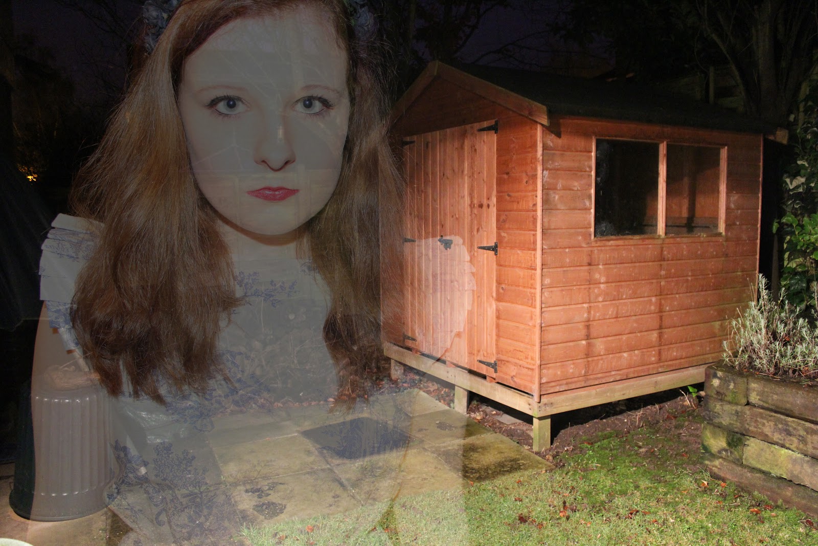
 For this experiment, I decided to try out the ghost photography technique. I took photographs and created a double exposure technique in photoshop. Some of the photographs I took were over exposed as this helped to give a more 'ghostly' effect when I double exposed the images:


For the three photographs above, I took the pictures outside at night time. I thought that this added a unique and mysterious effect as well as creating a more gothic feel to the photograph. I played around with using the flash on my camera - which did give a ghostly effect, however I preferred using the outside light, as this gave a slightly softer effect.

To create this effect in photoshop, open up your two images, and copy and paste one into the other as a new layer. Then change the opacity to around 50%, however this will change depending on your chosen photographs. For some of the images I also changed the layer type to screen, as this gave a more over exposed effect which I think made the ghost effect better and more interesting, as it was harder to see the 'ghost'.


For the two photographs above, I took this photographs inside using softbox lighting. I put them quite close as this gave a harsher effect - which made everything look slightly more doll like - relating to the fairytale idea. The second photograph is more faint which I think creates a more ghost like effect - it also creates the idea of two separate ghosts rather than just one in the background, which I think is interesting.

For the photograph above, I again blended the two images and then added a dark blue layer on top, and changed the layer type to overlay, for a vintage effect. I also then played around with the curves which created a bit more of a blue tone to the image:


This photograph above is simple and is just of the flower headband that I was wearing. I thought it was a contrasting image as it combines both the black and gothic feel with the plain and 'innocent' white background and porcelain skin.

Sunday, 25 November 2012

Shooting Plan

This is my shooting plan for my first roll of film. There are 24 exposures on this film.


My four ideas were originally : modern fairytales, lookbook style, ghost photographs and personality style photographs.

I decided not to continue with the personality style photographs, as I felt that this wasn't a particularly strong idea, and I would rather use the last six exposures to improve my other ideas to make them stronger.

Thursday, 1 November 2012

Final Outcome Idea and Plans


Above is the mindmap for my final outcome.

Below is the moodboard I created for my final outcome:


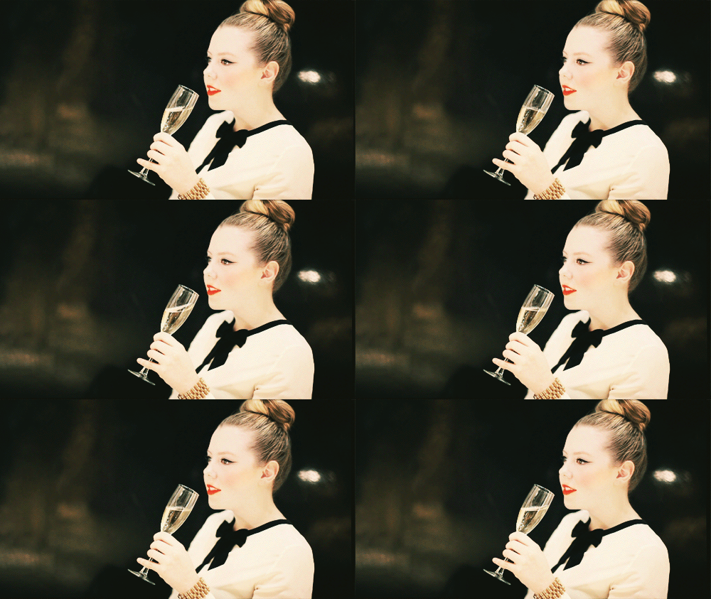
For this moodboard, I collected images that I had previously looked at and researched throughout the project. Although my final outcome idea is not exactly going to be like any of these pictures, I have taken inspiration from certain aspects of each image. For example in the first image, (the black and white one), I paid particular attention to the use of the depth of focus - how the model is the only thing in focus in the image, and the background is very blurred which is an effect that I like. A lot of the images are closeups of the models face and also shows the top part of the outfit (often a collar) which is something that I think looks effective as well as interesting.

Links of artists from left to right.

1) Emily Soto
2) Peter Schiazza
3) Tina Patni
4) Julie Cockburn
5) Tina Patni
6) Emily Soto
7) Emily Soto
8) Jonda Spurbeck
9) Tina Patni
10) Jonda Spurbeck
11) Curtis Mann
13) Tina Patni
14) Tina Patni
15) Tina Patni


Friday, 12 October 2012

In-depth review of experimental work so far

AS to A2

When we started the AS to A2 project, we were looking at all the possible themes that we could choose from : Landscape, Architecture, Contemporary, Fashion, Portraiture, Victorian, Figure Studies and Documentary. We researched different artists within these themes, such as Cindy Sherman for Contemporary, and Helen Starkey for Contemporary. We then had to choose which theme that we wanted to continue with, so I decided to pick the theme fashion, as I have a strong interest in fashion photography.

I started looking at artists such as Annie Leibovitz:

I found the work of Annie Leibovitz very inspiring, as I like how the main theme was Disney (for advertising) but fashion is/can be incorporated into it.

I also looked at the work of Emily Soto, a photographer that I found whilst researching for the project:

 I also found her work very inspiring, as I liked the fairytale feel to her images, which is something that I would like to reflect in my own work (which I did for my AS final outcome - Alice in Wonderland). 

We then moved onto a photoshop experiment called Typography. This work wasn't inspired by anyone in particular, but was interesting to learn. I used a photograph by Annie Leibovitz, (like above but a different disney image):

I thought that this idea was interesting, but it didn't really work for me. You couldn't see too much of the image, just the mermaids which although makes the viewer focus on them, it wasn't the desired outcome. Overall, I probably wouldn't use this technique again.


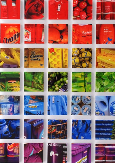
Next, we looked at the work of Lin Osborn:

 I liked the use of similar colours as well as objects, but I found it difficult to relate it to my chosen theme, so I used images related to different seasons, rather than fashion. This is my version:

If I used this technique again, I would probably pick images related to the theme such as images of similar fashion accessories, however I don't think that I'll be using this technique again.

We then looked at a technique called 'Painting Nature' inspired by Norm Magnusson:

I created my own version:


I thought that this technique was interesting, however it doesn't particularly relate to my chosen theme of fashion, therefore I probably won't be using this technique in my future work.

We then learned how to make GIFs on photoshop. This was a technique that I personally really enjoyed and can see myself using this technique in the future, however I would like to do it more in the style of a cinemagraph, inspired by the artist Jamie Beck.
My GIF:
Jamie Beck's cinemagraph:

Then, we looked at the artist Geraldine Georges:

I personally disliked the work of Geraldine Georges as I didn't find it particularly inspirational. I won't be using this technique again. I recreated my own version on photoshop :


 I also created one not on photoshop:


I also looked at the work of Jan Von Holleben who is famous for his photographs that are shot from above (aerial views):

 In groups during class we created our own versions :


I don't particularly like this technique so I most likely won't be using this technique again.

We then moved on to looking at the work of Markus Kisson, and his collection titled 'Dissecting Polaroids' 
 
I didn't really like this technique either, as I didn't find it particularly interesting or effective. To me, it doesn't seem like the artist spent very much time on it. Here is my version :

Next, I looked at the work of Abigail Reynolds, which I personally really liked :


I found this technique really interesting as you could use contrasting images to create an overall creative effect, and you can play around with the positioning of the cut outs.
Here is my version using images related to my chosen theme : fashion

Although I don't think that this version is that great, I think that if I used better pictures it would have a better outcome.


SUMMER ASSIGNMENT

The first artist that I looked at for my summer assignment was Quentin Jones. This work involves different images made into a collage:

 Here is my version where I got several images from magazines and put them together on paper and then added galaxy textures on top in photoshop:


Overall, I like this work and might be inspired to use this in my final piece.

The next artist we had to look at was William Hatch Crosby. I really liked his work as I found it interesting experimenting with different colours, brushes and patterns. :

 I created my own version by using a hair care advertisement in a fashion magazine :


 I think that I'll definitely be using this technique in the future.

Then, I looked at Amy Friend who uses a pinhole technique in her work with lighting behind the image to create a star-like effect:

 Here, I tilted my image slightly as you can see the light shining through better:

 I really like this idea as it creates almost a fairytale like effect, which I want to include in my future images.

Then I looked at Greg Sand. who uses a weaving technique in his work:

 I think his version looks really interesting and effective, but I think that I picked the wrong images to weave together. I probably wouldn't use this technique as I didn't really enjoy creating it:

We then had to look at the work of Michelle Thompson, who incorporates graphic design with photography :

Here's my version :


I thought that this technique was really fun as well as interesting and I will think about using it in further work.

I then researched the work of Stephen J Shanabrook who distorts his images to give them a new look and feel :

 I really didn't like this as I thought it made the images look ugly and I much preferred them in their original format.


Rebecca Chew's work is mainly based on changing the shape of an image, for example by using origami:

 I think that her work looks creative and effective, but on mine you can't really see the image. Perhaps if I used a different image it might have worked better, but it didn't this time:

Stacey Page uses embroidery in her images and works by creating layers and layers of different colours to create an overall more interesting image:

 Here is my version, which is related to my chosen theme of fashion:

 I like this technique however I'm not sure how I would continue it or make it better for future work.

ENHANCED IMAGE PROJECT

We first learned how to vignette an image on photoshop using two different methods :


I really liked this technique as it gave a softer effect - I prefer the second one as the first one is harsher and bolder.

We also did this in the darkroom :


Again, I prefer the second and softer version.

We then learned how to edit a photograph to give the Instagram Nashville effect, which I personally really loved :


I will definitely be using this technique in the future as I think that it looks really good and creative and I like the blue and yellow tones that it gives.

We also learned how to create an HDR effect on photoshop. I didn't really like this as I think that it made the image look really harsh, and I personally prefer softer photographs:


We were then taught how to highlight areas of particular interest in our dark room experiments :


I really liked this technique as I tried to create a sort of 'bubble' effect, which I think worked effectively. I would like to use this technique again when developing my photographs.

In the dark room, we also did press printing :


I liked this as it creates a blurry, dreamy and imperfect effect which I thought worked really well. You could use objects related to the photograph to press print with. I'd like to use this technique again.

We then used a technique called dodging :

I don't think it worked that well for me but I still liked the effect that it gave.

We looked at the work of Leslie David, who is known for layering paint on top of images:


I really didn't like how mine turned out as I think it looked messy, and the colours all merged together to create a murky brown green colour which I didn't really want. I don't think that this work is that good.

Man Ray's work involves solarisation - a technique that I really enjoyed doing:

My version :


I really think that I'll be using this technique again in the future as it creates an almost x-ray effect which I found interesting to look at.

As part of our photoshop experiments, we learned how to tone the images :

I actually think that this technique is a bit boring and simple, so I didn't really find it that inspiring.

In the darkroom, we learned how to create handmade negatives which I think would be interesting to layer over photographic negatives to add more texture and depth to the images:


I think that they look good in both positive and negative.