Showing posts with label photography. Show all posts

Friday, 11 January 2013

Mariell Amelie


Marielle Amelie is a London based photographer who focuses on self portraits. I personally am really inspired by her work, as my recent work has been fashion mixed with self portraits. I think that I could relate this style of photography to both gothic and fairytales whilst combining them to create a contrast. For example, I could find an idylic setting - but wear all black, or I could take the photograph in a graveyard when it's dark, but wear all white. I think that this would be interesting as it would make the viewer really think about the whole photograph and the elements within it. This artist also sometimes does ghost photography, which is also what I am inspired by, so perhaps I could combine that also.

I think that this work is particularly interesting because of the settings that she uses as well as the outfits. For example, in the third image, the sheer cape that she is wearing is being blown to the right, but as it is sheer we can see the background through it - making it again appear ghostly and mysterious. Throughout the pictures I've noticed that although it is the same person, she has taken over different personas in a subtle way, especially over the years of her self-portraiture.

In the first two images, they are set at night, so you can't always see the background, however the artist has picked what she wants to be lit in the image, so she almost has more control over the what is shown in the picture, whereas the third picture is set during the day and is therefore lit, however it makes the photograph seem more 'innocent'.

In the second picture I think that it would be fairly easy to recreate with the technique of light painting, which is something that I might try. I think that it looks interesting and effective, and adds colour to the shot. It could be interesting the make the photograph black and white and to have just the light painting in colour. I think that you could combine both the gothic and innocent fairytale effect to the same image.

Overall, I really like the work of Marielle Amelie as I think that it is unique and interesting. I find it inspiring for self portraiture and plan to take inspiration from this for my final outcome. 

Wednesday, 12 September 2012

Jana Williams : Research


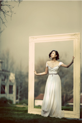
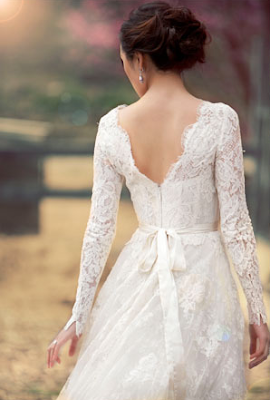
Jana Williams is a photographer based in Southern California. She specialises in wedding photography, but also does lifestyle photography. Although I'm not going to do wedding photography for my project, I found the photographs inspiring and I couldn't help but love how she photographs the models. In a lot of photographs she pays close attention to the details of the dress which is why I can relate these photographs to my chosen theme of fashion.

There are several meanings behind these photographs. As they are wedding photographs, there is a strong sense of romance in the pictures, as well as elegance.

Again, like the two other artists I have analysed, there is a dreamy effect to the photographs. I think the dreamy effect particularly works well with these photographs as it adds romance to the wedding theme. I chose these photographs for fashion, as in the second photograph particularly, you can see the detail of the dress very well, which is something that I will bear in mind when taking my own photographs - to make sure you get the details of the outfits in. It makes it more interesting, seeing the delicate pattern of the lace. The locations for these photographs is also interesting. I noticed, when looking through Jana's photographs, that in every single photograph she had taken, the location was always very beautiful and they work well with the theme of the photograph.

These pictures have definitely inspired me for my own work - to think about the location, keeping the lighting soft, and also to focus on the details of the outfit, as I think that these will all help me to create a good fashion photograph.

Emily Soto : Research


These photographs were taken by Emily Soto, who specialises in fashion photography, as well as celebrity and lifestyle photography. She is based in Southern California. In 2011, she received a "Best of Photography" award from Sigma. These photographs are from a collection on her website called Book I and her pictures are often used in fashion magazines. I personally prefer the photographs from Book I, as there have a more whimsical fairy-like feel to them, compared to in Book II where they are more high fashion photographs.

Emily Soto's work has a similar theme - fashion (the obvious one) but also a whimsical, dreamy theme to a lot of her photographs. You could also say that these relate to the theme of Portraiture, as well as Fashion.

One thing that I particularly love about Emily Soto's work, is the dreamy, blurred effect to her photographs. I like how if there are any objects in front of the model, they are blurred out, so just the model is noticed, but the objects are not forgotten. A lot of her photographs have pink tones to them (unlike the blue tones of the work of Tina Patni) which I really like as they give the photographs a more girly feel to them. The styling of the outfits also makes them feel 'princess-y', which again adds to the fairytale feel. 

I picked these photographs because they inspire me. I am particularly interested in recreating the fairytale feel to my own pictures in the future for this project, as I find them interesting to look at, and playing with the different colours could create different yet interesting effects.

Tina Patni : Research


These photographs were taken by Tina Patni, a photographer who specialises in fashion and beauty photographs. These photographs are from a collection on her website called Fashion 3 - the third portfolio of her fashion work. Fashion 3 is my personal favourite collection of her work. Tina Patni works with lots of different designer brands, creating advertising photographs for them, the main brand being Louis Vuitton, however I don't think that the photographs above were for a specific brand. I chose to analyse these pictures as I find the work inspiring and would like to recreate similar photographs for my own project.

I think that all of Tina Patni's work has a similar and obvious theme - fashion and beauty. Her work could also be related to the theme of Portraiture, which is interesting. When looking on her site, there were no titles for any of the pictures.

When I first saw these pictures, I was instantly drawn to them as I found them very inspiring. The photographs have a dreamy effect to them - due to the lighting coming from behind the model and the whole picture being slightly blurred. I found this interesting as it is very effective and reminds me of fairytale inspired photographs (also because of the outfits). To me, the models in the pictures almost look doll-like, again reminding me of fairytale, child-like scenes. I was also drawn to the photographs because they have blue tones to them, something that I personally love to do to my own photographs. The colours also complement each other nicely.

Overall, I personally am really inspired by the work of Tina Patni, and after looking through her collection of photographs on her website, I really liked all of them, and am inspired to use some of her techniques in my own work.


Friday, 13 January 2012

End of Project Evaluation.

Throughout this 'Light' project, I have discovered interesting photographers during my research behind the theme. I have really enjoyed experimenting with light, especially light painting. I like the fact that this project really gave me a chance to properly experiment with both film and digital SLRs. This project also gave me a chance to make my photographs even better on photoshop, and I think that I created some really great effects on it, such as this piece :

I also learnt how to perfect light painting, working out which shutter speeds work best on my two cameras : Olympus OM 10 Film SLR camera, as well as my Canon EOS 600D digital SLR camera. When working with both, I found that the B setting worked best on my Olympus camera, which meant that I could keep the shutter open for as long as possible, although sometimes I kept it open for too long and the picture became over-exposed and not as detailed. With the Canon, I found that using the shutter speed of 10/1 second worked the best for that camera, and what I wanted to do with the shot. I used a red laser pen for my shots, and one of my favourites was this one :
However, I found that it didn't give me enough time to perfect my writing in the shot! I think that it gave a great effect, especially as I shot it in pitch black light. 

Throughout the project, the artists that I looked at various artists that inspired me; Janne ParviainenPablo Picasso and Patrick Rochon. I found there work interesting to research and helped me to experiment more in my own photographs. My favourite artist that I looked at this project was probably Janne Parvianinen, as I found the light paintings of the skeletons among a 'family gathering' really inspirational. 

Some things during this project didn't work, I sometimes found that my pictures weren't focused properly, so they came out blurry when developing them. I also found that working out the shutter speed for my light paintings was tricky - trying them at 5 seconds, 10 seconds and 20 seconds to see which worked best. I found that a different time worked best for each separate photograph, so it was difficult to work out which time worked with which photograph, and this took time, but for quite a few of my photographs, the timings worked well. For example, these ones didn't turn out quite right:

Using GlowDoodle

Using the digital SLRs. 

For the next project, I think that I will try and experiment a bit more with my work, and try and improve on the things that don't go so well, instead of just focusing on the photographs that have worked. I will also try and take a variety of different photos, including different locations, and light settings etc...


Monday, 9 January 2012

Photoshop Editing. Film to Digital.


These photos were taken using an Olympus OM 10 SLR film camera. I then scanned them in and edited them on photoshop, adding layers of pictures of Christmas trees that I took recently. The Christmas tree photographs were taken out of focus so that they created the 'twinkle' effect. I like how it looks over the top of these photographs. I chose the layer 'screen' to create this effect. Without the effects, the pictures weren't as interesting or defined. For example, in the top picture, it came out quite out of focus, but I did like the lighting in it, so I wanted to keep the photograph to use in my project. By adding the texture on top, it made the photograph more unique, and you don't focus as much on the blurriness of the picture. In the bottom photograph, the lighting doesn't appear very good. I thought that by adding the texture on top, it would make the lighting of it more interesting. The lines are from the windows that were lit up by the Christmas tree, and I think that they create an unusual yet interesting effect. I am happy with how the photographs came out in photoshop.

Get photoshop here!

Thursday, 5 January 2012

Light Painting : Digital

The following pictures were taken on a Nikon D3000. The Shutter speed used was 8/1 second. The Aperture was set to F/3.8 and the Focal Length was 22mm. The ISO speed was 400.


This picture was taken on a Canon EOS 600D. The Shutter Speed was 10/1 seconds and the Aperture was F/4.5. The Focal Length was 30mm and the ISO speed was 320. I used a EF-S18-55mm f/3.5-5.6 IS II lens.


I really enjoyed taking these photographs as I liked having the freedom to experiment. All of them except the last one were taken at College, but the last one was taken at home. I liked trying the different effects and I found that writing with a laser pen on the wall worked really well. I found out that on a film SLR camera, you don't want to keep the shutter speed open too long as it could over-expose the film, however on a digital SLR camera you can keep it open as long as you want, as there is no film to over-expose. I also liked how on the last one, the red laser pen appeared pink, which was due to changing some of the settings on the camera, which happened by me experimenting. I found, however, that sometimes I should have made the shutter speed longer as I rushed to get all of the writing in, so that could be an area to improve. 


This one above, for example, didn't work particularly well. I think the reason that it didn't work as well is because there was too much light source, therefore not showing the full effect of the laser pen drawing. I think that if it had been darker, the effect would have been much better. I do however like the effect of how the face has been blanked out which makes her seem emotionless, which I think is interesting.


Tuesday, 27 December 2011

The season of lights.

Canon
Canon EOS 600D
1/49 second
F/4.0
28 mm
2500
Dec 25, 2011, 6:25:01 PM
EF-S18-55mm f/3.5-5.6 IS II
22mm

Canon
Canon EOS 600D
1/41 second
F/4.0
25 mm
2000
Dec 25, 2011, 4:52:04 PM
EF-S18-55mm f/3.5-5.6 IS II
QuickTime 7.7
22mm

Canon
Canon EOS 600D
1/49 second
F/4.5
29 mm
1600
Dec 29, 2011, 4:20:40 PM
EF-S18-55mm f/3.5-5.6 IS II
22mm


Canon
Canon EOS 600D
1/25 second
F/5.6
55 mm
3200
Dec 29, 2011, 4:22:40 PM
EF-S18-55mm f/3.5-5.6 IS II
QuickTime 7.7
22mm


Canon
Canon EOS 600D
1/49 second
F/4.5
35 mm
1600
Dec 26, 2011, 10:51:30 AM
EF-S18-55mm f/3.5-5.6 IS II
22mm

Christmas is one of my favourite times of the year, especially because there are lots of great photographic opportunities. This year, I really enjoyed taking purposely out of focus pictures of the lights (for example, on a Christmas tree) as I think that it created a particularly effective soft blur which I thought looked interesting. I also really liked taking pictures of candles, as the flickering light created a warm glow to the picture, which I thought worked well with the theme of light. 


Tuesday, 13 December 2011

Light Painting : GlowDoodle

The following images were made using GlowDoodle.


This photograph was taken using CDs to create the technicolour effect, which I think worked really well 
and I like how it came out.


For this photograph, I used a red laser pen to draw lines on my face. You can pick up parts of my face (it also creates an interesting effect) as well as the light catching on my hair.


For this one, I used a blue UV light (which looks purple in the photographs). I placed the light under my face so it created an almost 'spooky' effect with the shadows, and I moved along the picture to create it 3 times. I then moved again with the light which creates the blurred light, which I personally really like.


For this one, I did the same as the one above, I just decided not to blur it to see how it came out. I like how the two left ones overlap slightly.


For this photograph, I used the same blue UV light as before, and quickly drew around my face, which brought with the line this interesting effect on my face. It makes my eyes look quite effective as well as how the light sits on my face. 


This photograph, however didn't work as well. The problem was that as I was taking the picture, someone else was taking one at the same time with a torch, which ended up overpowering the light I was  using, therefore not creating the effect that I wanted. 

Monday, 5 December 2011

Different Light Types.

Soft Light:
"refers to light that tends to "wrap" around objects, casting shadows with soft edges".
The softness of the light depends mostly on the following two factors:
Distance. The closer the light source, the softer it becomes.
Size of light source. The larger the source, the softer it becomes.
Soft light use is popular in cinematography and film.


Hard Light:
Hard light sources cast shadows whose appearance of the shadow depends on the lighting instrument.That is, the shadows produced will have 'harder' edges with less transition between illumination and shadow. The focused light will produce harder-edged shadows. Focusing a fresnel makes the rays of emitted light more parallel. The parallelism of these rays determines the quality of the shadows. For shadows with no transitional edge/gradient, a point light source is required.
When hitting a textured surface at an angle, hard light will accentuate the textures and details in an object.

Back Lighting:
Backlighting refers to the process of illuminating the subject from the back. In other words, the lighting instrument and the viewer are facing towards each other, with the subject in between. This causes the edges of the subject to glow, while the other areas remain darker. The backlight can be a natural or artificial source of light.


Front Lighting:
Front lighting is where there is either natural or studio lighting placed in front of the subject. This can create shadows on not only the face but also in the background. It puts more focus on the front of the subject.

Studio Lighting:
Studio lighting is where lighting is set up in a studio and the photographer can plan where they want the light to be, for example, on the left or right side, back lighting, front lighting, etc... It gives the photographer the freedom to experiment with lighting to see how the photographs come out.


Natural lighting:
Natural light is a photographers most accessible form of light. It can create quite magical effects (as shown in the example below) for instance, if the light is shining through the gaps in the trees. You can do all sorts of photography techniques: backlighting, front lighting and more just from using the sunlight. 

Torch lighting:
Torch lighting is when the photographer takes a torch and places it where they want the light source to be. It can create good effects and also can be very dramatic, as shown in the example below.

Laser photography:
Laser photography is mainly used for Light Painting. This is made by using a very slow shutter speed, and painting pictures with the laser pen. You can use different colours and make all sorts of pictures. For example, the light painting below is of Bambi, a famous Disney character.


Tuesday, 29 November 2011

SLR Tests : Olympus OM 10

This series of photographs was taken in the dark, without flash, and only using a torch for effective lighting. This was a fun experimental project as we had control of our own lighting. 
This is the contact sheet that I created. I was sharing my camera (Olympus OM 10) with a friend, and we were taking the pictures of each other. I think that an improvement that I could have made would be to straighten up the film strips so they fit better on the photo paper. I perhaps should have split them up so that you would be able to see all of the photographs on the film strip. 
Unfortunately, the process of scanning this in doesn't do this picture justice. I thought that the contrast in this picture was really clear and good, and I think that the torch light made a really nice effect. However, I think that this photograph came out darker during developing then I had hoped.
This picture was originally the same size as the photograph below, but I decided to crop it to just the person, and not showing the torch in the photograph, as I think that this worked better and looked more professional. The contrast isn't so clear on this, but I still like the effect that it creates.
This is with a darker contrast, and I think that it creates a nice effect, as you can really see the light that the torch is creating. However, I think that I prefer it when there is less contrast and the photograph is lighter, such as the one below. 
I personally really like this photo, as I think that although it is supposed to be much darker, I think that it works. 
This is one of my favourite photographs that I took during the lesson. Although it is a little blurry, I think that it creates a nice effect. I think that how her face is just lit up and she's looking away from the camera, looks really good.

Monday, 28 November 2011

Snapshot Photography : Photographs from the past.

 This photograph was taken last year when I visited Cornwall. It was a fairly sunny day, and to me, the lighting seemed just perfect for this photograph. 
I actually edited this photograph on photoshop and added a picture of a passing train on top for my previous theme, Journeys, however I think that it also works for the theme of Light as the light from the train creates and interesting effect. The picture is shown below :


~

 This photograph was taken during a walk in the Spring. I found an apple tree and decided to take some shots - this is just one of them, but I think that the way the light is hitting the leaves and the apples is really pretty. 
This photograph was taken on Halloween. I had carved a pumpkin and when it became dark outside, I decided to take a photograph of it. I think that this works well for our theme of 'Light' as you can just see the light from the candle in the pumpkin and there isn't another light source, which makes this quite 'spooky' - perfect for Halloween! This photograph appears slightly blurry but I think that is because there isn't a lot of light available. I wanted the only light source to be from the pumpkin, to give the full effect. 

All of these photographs were taken by myself on a Fujifilm Finepix Z camera. This camera is only 7.0 megapixels but I think that it can take good photographs if you take the time to focus it, and good lighting helps.