Showing posts with label fairytale. Show all posts

Friday, 11 January 2013

Mariell Amelie


Marielle Amelie is a London based photographer who focuses on self portraits. I personally am really inspired by her work, as my recent work has been fashion mixed with self portraits. I think that I could relate this style of photography to both gothic and fairytales whilst combining them to create a contrast. For example, I could find an idylic setting - but wear all black, or I could take the photograph in a graveyard when it's dark, but wear all white. I think that this would be interesting as it would make the viewer really think about the whole photograph and the elements within it. This artist also sometimes does ghost photography, which is also what I am inspired by, so perhaps I could combine that also.

I think that this work is particularly interesting because of the settings that she uses as well as the outfits. For example, in the third image, the sheer cape that she is wearing is being blown to the right, but as it is sheer we can see the background through it - making it again appear ghostly and mysterious. Throughout the pictures I've noticed that although it is the same person, she has taken over different personas in a subtle way, especially over the years of her self-portraiture.

In the first two images, they are set at night, so you can't always see the background, however the artist has picked what she wants to be lit in the image, so she almost has more control over the what is shown in the picture, whereas the third picture is set during the day and is therefore lit, however it makes the photograph seem more 'innocent'.

In the second picture I think that it would be fairly easy to recreate with the technique of light painting, which is something that I might try. I think that it looks interesting and effective, and adds colour to the shot. It could be interesting the make the photograph black and white and to have just the light painting in colour. I think that you could combine both the gothic and innocent fairytale effect to the same image.

Overall, I really like the work of Marielle Amelie as I think that it is unique and interesting. I find it inspiring for self portraiture and plan to take inspiration from this for my final outcome. 

Monday, 7 January 2013

Ghost Photography Experimentations

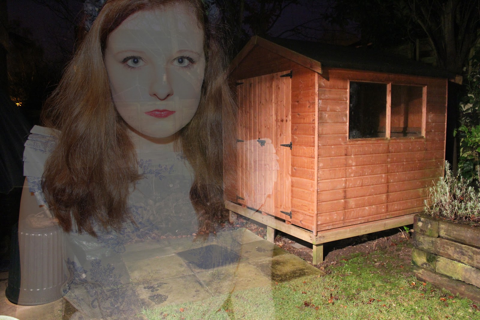
 For this experiment, I decided to try out the ghost photography technique. I took photographs and created a double exposure technique in photoshop. Some of the photographs I took were over exposed as this helped to give a more 'ghostly' effect when I double exposed the images:


For the three photographs above, I took the pictures outside at night time. I thought that this added a unique and mysterious effect as well as creating a more gothic feel to the photograph. I played around with using the flash on my camera - which did give a ghostly effect, however I preferred using the outside light, as this gave a slightly softer effect.

To create this effect in photoshop, open up your two images, and copy and paste one into the other as a new layer. Then change the opacity to around 50%, however this will change depending on your chosen photographs. For some of the images I also changed the layer type to screen, as this gave a more over exposed effect which I think made the ghost effect better and more interesting, as it was harder to see the 'ghost'.


For the two photographs above, I took this photographs inside using softbox lighting. I put them quite close as this gave a harsher effect - which made everything look slightly more doll like - relating to the fairytale idea. The second photograph is more faint which I think creates a more ghost like effect - it also creates the idea of two separate ghosts rather than just one in the background, which I think is interesting.

For the photograph above, I again blended the two images and then added a dark blue layer on top, and changed the layer type to overlay, for a vintage effect. I also then played around with the curves which created a bit more of a blue tone to the image:


This photograph above is simple and is just of the flower headband that I was wearing. I thought it was a contrasting image as it combines both the black and gothic feel with the plain and 'innocent' white background and porcelain skin.

Sunday, 6 January 2013

Norman Jean Roy


Norman Jean Roy is a fashion photographer whose work has been included in Vogue numerous times. This is a photograph of Florence Welch, from the band Florence and the Machine.  I like this photograph as it reminds me of the fairytale theme - with the lace on the dress, and the sword as well as the cape. I think that this is a more gothic feel to the fairytale theme, as the horse is black, instead of the typical white, and the clouds are grey instead of there being a clear sky. I love the use of gold and black accessories, as this shows that there is a recurring theme throughout the image.

The background is simple, and the sky is shown more than what's on the ground (such as trees, grass etc...). You can tell straight away that it has been shot for a high fashion magazine, just from looking at the shoes and the dress. There isn't a specific or obvious light source for this image, however I think that the light is from the left hand side, as this there are signs of light on the horse's chest/face, rather than the on the whole horse or the model. As the horse is rearing, it makes it seem more powerful - and the fact that there is a sword included in the image suggests power as well.

I like how there is intricate detail within the clothes, as this makes the fashion part of the image stand out more. The cape has been moved so that the viewer is able to see the dress clearly, as that is part of the advertising technique which is something to think about in my future photographs - showing the whole outfit. Also, the fact that the cape has been moved and the horses mane and the models hair are blowing suggests wind has been used for the photograph - adding to the idea of power. This technique also makes the photograph more dramatic.

Overall, I personally really like this photograph, as it shows the dress clearly which is feminine and lace which is mixed with the dramatic use of a sword and a horse. The photograph is interesting as the outfit works particularly well with the rest of the image. I like how just the model (and the horse) is lit and the background is dark. I find the background to be quite mysterious as you can't really see the ground (as I mention earlier this makes the model and the horse seem more powerful) and the clouds are dark.

Wednesday, 12 December 2012

Darkroom Experiments : Fairytales

For my first roll of film for this project, I decided to experiment with the bokeh technique that I had previously researched. The majority of my film was involving the lights so that I could see if I wanted to use it in my final outcome for this project, as well as general experimentation. I tried taking the photographs using different shaped filters, such as hearts and stars so that you would be able to clearly see that the lights had been changed.

For these two photographs, I created the double exposure effect in the dark room. These are both the same image, except the exposure on them in the darkroom is slightly different, creating two separate outcomes. I personally really liked how the double exposure worked, and I will definitely be using it in some way within my final outcome, perhaps by using a different shape to mirror the gothic theme that I am following.


For the third image, I decided to try out the solarisation effect, as it was something that I liked from the previous project. Although this one didn't work out too well, I think that the overall effect is interesting, especially with the lighting that I used - light only directed to one side of the face. This reminds me of the gothic theme, so I will try and experiment more with this technique on other photographs.

The final image is the same as the first and second one, however I decided to crop the image so that it really focused on the person and the clothes, as well as the stars. I think that this technique works well, but sometimes I prefer to have more of the background showing. Overall I think that it is an interesting technique to keep in mind.


Tuesday, 11 December 2012

Experimentation : Light and Layer Blending


I recently found a tutorial for different lighting effects for photoshop which you can find here.

I first tried it on a photograph from the Wildfox Couture photoshoot and also I think the first edit looks interesting, it's not something I think that I would try again. The second image was blended with another photograph from the same shoot, and I think that it turned out quite well and reminds me of the ghost style photographs I've looked at previously. Below is one of my own images, where I used some drip brushes (found on google) to create a contrasting effect of the black and white drips. I also think that this relates well to my gothic theme that I am doing.


Monday, 10 December 2012

Experimentation : The vintage photograph effect


I decided to experiment more with the vintage effect as I think that it works really well on photographs. This technique is similar to the Instagram Nashville effect I did a while ago, but is slightly different and creates a unique outcome.


To create this vintage effect, I used the tutorial from here and my version actually turned out slightly different to the example the tutorial used, but I actually like that my one is darker, as it adds to the gothic fairytale theme I am following. There were several different layers used to create the technique, but overall the outcome was easy to create and didn't take a lot of time to do. You could play around with the amounts of each layer to create something unique each time.

Overall, I really like this effect and I think that I will use it for my final outcome. I like how it can relate to the gothic fairytale theme that I have chosen and I also like the vignetting technique that I included in this photograph. I found it easy to create and I think that it is an simple yet dramatic effect to add to any photograph.


I then decided to turn the outcome into black and white and have just the green of the apple showing, which I thought made an interesting effect. I think that it would look better if it was more subtle, however. I did this by duplicating the layer and made the top layer black and white. I then used the eraser tool and rubbed out the image where the apple is, so that the colour showed through. I think that I will use this technique again as it draws more attention to a specific part of the chosen image.

Thursday, 29 November 2012

Digital Photographs - Fairytales

Above is the original image, and below is the edited version, where I added blue tones and mades the apple a slightly darker, more vibrant colour. I prefer the edited version as I think it makes the image look 'dreamier' and more fairytale like. 


Above is the original image, and below is the edited version. Like the first photograph, I prefer the edited version, as the colours are more vibrant and again the outcome is 'dreamier'. I also like how the blue of my hair is more vibrant. 


For the photograph of just the apple with the lipstick, I didn't edit it too much, I just darkened it a little to see if the colours would be more vivid. I think that it looks a little better, but I still like the original one as well.

The three photographs above were inspired by the fairytale Snow White - where she bites into the poisoned apple. I wanted to relate this to my chosen theme of fashion, so I wanted to show the lipstick, the hair and the nail varnish - although these aren't clothes, they are related to fashion. I think that this is a subtle reference to both fashion and fairytales, so it makes the viewer think about what the photograph is about, and what the meaning behind it is.


This photograph was inspired by Rapunzel - where she leans out of a window with her long hair flowing over the window sill. This one didn't work as well, mainly because my hair isn't very long! However, I think that this also has a subtle reference to both fashion and fairytales. This one is more related to hair and clothes, rather than makeup, unlike the previous photographs in this post.

 This photograph I edited to make it look like there were lights orbs in the photographs - to symbolise fairies for my fairytale theme. I personally really like how this photograph edit turned out.


Sunday, 25 November 2012

Shooting Plan

This is my shooting plan for my first roll of film. There are 24 exposures on this film.


My four ideas were originally : modern fairytales, lookbook style, ghost photographs and personality style photographs.

I decided not to continue with the personality style photographs, as I felt that this wasn't a particularly strong idea, and I would rather use the last six exposures to improve my other ideas to make them stronger.

Tuesday, 20 November 2012

Kirsty Mitchell

Kirsty Mitchell is a fashion photographer whose work heavily relates to the idea of fairytales. The photograph above is from a collection titled 'Wonderland' and the photographs were taken from 2009-2012. I particularly like the image above as the purple of the outfit stands out strongly against the green of the setting. A lot of her photographs from this collection seem to have a strong purple tone to them, whether it's in the outfits, the use of coloured smoke or props such as balloons. The use of the floral umbrella/parasol is interesting as it adds to the theme of the image.

There is a 'glow' coming from the wings of the outfit, which I would imagine would be from the use of back lighting - this is an interesting technique to add effect and makes the image more 'magical', which is something to think about with my own photographs. I like how there is a slight vignette effect to this photograph - this is exaggerated on the left hand side of the photograph, which makes the viewer think that they are peering to see the "fairy".  Where the image is darker, the plants seem to be dead (this is difficult to see however you can see that the plants are browner, whereas the plants where the model is are bright and vibrant). This could be symbolising that the part where the model is is a more positive place, showing that the clothes could make you feel more positive about yourself, perhaps.

I like how the outfit is extravagant and attention grabbing, whilst the background is simple yet defined. This makes the viewer automatically look straight at the model, rather than the background or the photograph as a whole being the main attention, which is particularly important in fashion photography as you want the focus to be on the clothes and the detail within them. The photograph as a whole seems to all be in focus, which is interesting as some of her other photographs from this collection have the model just in focus. This could be saying that everything in the photograph is important, but because the outfit is more colourful, it attracts more attention.

Also, I think the styling for the photograph works well with the theme - with the use of the parasol made out of flowers, and the dress almost looking too big for the model - is this a subtle way of referencing to Alice in Wonderland? Attached to the model there appear to be wings, however it could just be purple light to make the image seem more mystical. I think that every viewer could interpret it differently, which is something that I really like about this piece and also this artist.  

This reminds me a little bit of Alice in Wonderland, as the dress looks too big for the model (purposely) and so it looks like she is trying to hold it up. This reminds me of Alice in Wonderland as Alice changes sizes throughout the story, yet her dress doesn't. The model also looks small in comparison to the background if you look closely and so this could also be suggesting that the model is supposed to be a fairy, or something similar.

Going back to the lighting, not only do the wings seem to be lit up, but the umbrella made of flowers seems to be lit up slightly as well. This gives a 'magical' feel to the photograph and in relation to fairytales could be suggesting that the model in the photograph is a 'good' fairy rather than an evil character. Although this doesn't look like it's inspired by one particular fairytale, there are elements of several different fairytales, which is something to think about when I create my final outcome.

The wings almost look like smoke, which is a technique that Kirsty Mitchell uses in a lot of her other photographs from the collection, as shown below. I think that she does this because it makes the photograph seem 'dreamier' and more 'mystical', especially as it is coloured smoke. In the photographs from the collection, the models are always surrounded by nature - trees, fields, plants etc... This also makes the fairytale theme stand out as often fairytales are set around a forest, or in a garden.

Purple is a recurring colour in this collection. I think that it is particularly effective as it makes Kirsty Mitchell stand out as the photograph/artist, even though she is not in the photograph as it is her 'signature' technique throughout these photographs. Overall, I really like this artists work, and I find it very inspiring. She uses some interesting techniques which I think will inspire me in my future work.

Some more of Kirsty Mitchell's fashion photography:

Check out her website here.


Monday, 19 November 2012

Tim Walker


Tim Walker is a photographer best known for his fashion photographs. His work is also included a lot in the high fashion magazine Vogue. He has also started working on short films recently. The photograph I have chosen above I believe is inspired by Alice in Wonderland (from the man wearing hare ears), which relates well to one of my final outcome ideas of Fairytales. I think that this image is interesting as the main colour is pink - perhaps to create the girly, fairytale mood to the image. I also like the slight light orb on the right hand side of the image, also in pink, as I think that it creates a dreamier tone to the image, which is important for Fairytale themed photographs.

The setting of the photograph is interesting as although you can't see much of it, due to the photograph mainly focusing on the models, you can tell that it is set in a field with woodland surroundings, and the use of flowers adds to the idea of the Alice in Wonderland theme. I feel like this makes the image more realistic, but still keeps the mythical feel to it, which is an interesting take on fairytales.

The models take up the majority of the picture, as they are the main focus (as I mentioned before) but I think that the photograph would look better if it was taken slightly further away so that you could see more of the setting, as I think that that way the viewer of the image would have to think more about what the image is about.

The use of lighting is interesting, as it seems to be coming from the left hand side of the image, and from a high angle - perhaps this is suggesting that the source of this light is the sun? This could be to make it more realistic, rather than using studio lights face on. This is something to bear in mind when I take my own photographs.

The idea of the photograph has been modernised with the types of clothes that the stylist has chosen which is something to bear in mind for my own idea. I like how there is not too much going in the background - it has been kept simple so that you focus on the outfits. The models seem to look bored in the image, and it could be to make the viewers wonder why this is - perhaps it is suggesting a meaning behind the image?

I think that if I were to recreate something similar, I would use harsher light, and perhaps turn the photograph into black and white so that it appeared more gothic which is where I think my idea is leading. When making the photograph black and white, I would have to make sure that there was lots of intricate details on the clothing, as you wouldn't be seeing their colours, which is something that I will need to keep in mind. In the clothing in this image, there are lots of details such as ruffles in both outfits. The female model has blonde hair, which reminds me of Alice in Wonderland even more. I think that if I was taking digital prints, I could add light orbs as a new layer on photoshop, but have them in colour, which I think would give the image an interesting look. The makeup in this image is very simple and natural looking, which is something that is a repeated technique in fairytale photography. For my images, I think I might use dark makeup - these will show up in the black and white photography well and I could experiment with dodging and burning to create the right amount of darkness. This will also add to the gothic theme.

Overall, I really like this photograph as I like the use of the simple background, and how you the models are nearer the camera / the camera is more focused on them rather than what else is going on in the background, however the rest is not ignored. The colours are very soft which I think is important to think about. In my final outcome I might try experimenting with using different colours to create different effects, especially as I am thinking about creating gothic fairytales. As my film photographs will be in black and white, the colours that I choose will create a variety of tones in the photograph, rather than colours. I also need to think about how shadows will show up, so lighting is key.


Check out his website here.

Some more of Tim Walker's fashion photography here :