AS to A2
When we started the AS to A2 project, we were looking at all the possible themes that we could choose from : Landscape, Architecture, Contemporary, Fashion, Portraiture, Victorian, Figure Studies and Documentary. We researched different artists within these themes, such as Cindy Sherman for Contemporary, and Helen Starkey for Contemporary. We then had to choose which theme that we wanted to continue with, so I decided to pick the theme fashion, as I have a strong interest in fashion photography.
I started looking at artists such as Annie Leibovitz:
I found the work of Annie Leibovitz very inspiring, as I like how the main theme was Disney (for advertising) but fashion is/can be incorporated into it.
I also looked at the work of Emily Soto, a photographer that I found whilst researching for the project:
I also found her work very inspiring, as I liked the fairytale feel to her images, which is something that I would like to reflect in my own work (which I did for my AS final outcome - Alice in Wonderland).
We then moved onto a photoshop experiment called Typography. This work wasn't inspired by anyone in particular, but was interesting to learn. I used a photograph by Annie Leibovitz, (like above but a different disney image):
I thought that this idea was interesting, but it didn't really work for me. You couldn't see too much of the image, just the mermaids which although makes the viewer focus on them, it wasn't the desired outcome. Overall, I probably wouldn't use this technique again.
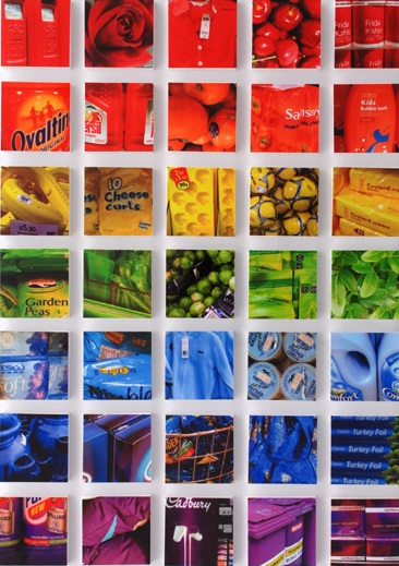
Next, we looked at the work of Lin Osborn:
I liked the use of similar colours as well as objects, but I found it difficult to relate it to my chosen theme, so I used images related to different seasons, rather than fashion. This is my version:
If I used this technique again, I would probably pick images related to the theme such as images of similar fashion accessories, however I don't think that I'll be using this technique again.
We then looked at a technique called 'Painting Nature' inspired by Norm Magnusson:
I created my own version:
I thought that this technique was interesting, however it doesn't particularly relate to my chosen theme of fashion, therefore I probably won't be using this technique in my future work.
We then learned how to make GIFs on photoshop. This was a technique that I personally really enjoyed and can see myself using this technique in the future, however I would like to do it more in the style of a cinemagraph, inspired by the artist Jamie Beck.
My GIF:
Jamie Beck's cinemagraph:
Then, we looked at the artist Geraldine Georges:
I personally disliked the work of Geraldine Georges as I didn't find it particularly inspirational. I won't be using this technique again. I recreated my own version on photoshop :
I also created one not on photoshop:
I also looked at the work of Jan Von Holleben who is famous for his photographs that are shot from above (aerial views):
In groups during class we created our own versions :
I don't particularly like this technique so I most likely won't be using this technique again.
We then moved on to looking at the work of Markus Kisson, and his collection titled 'Dissecting Polaroids'
I didn't really like this technique either, as I didn't find it particularly interesting or effective. To me, it doesn't seem like the artist spent very much time on it. Here is my version :
Next, I looked at the work of Abigail Reynolds, which I personally really liked :
I found this technique really interesting as you could use contrasting images to create an overall creative effect, and you can play around with the positioning of the cut outs.
Here is my version using images related to my chosen theme : fashion
Although I don't think that this version is that great, I think that if I used better pictures it would have a better outcome.
SUMMER ASSIGNMENT
The first artist that I looked at for my summer assignment was Quentin Jones. This work involves different images made into a collage:
Here is my version where I got several images from magazines and put them together on paper and then added galaxy textures on top in photoshop:
Overall, I like this work and might be inspired to use this in my final piece.
The next artist we had to look at was William Hatch Crosby. I really liked his work as I found it interesting experimenting with different colours, brushes and patterns. :
I created my own version by using a hair care advertisement in a fashion magazine :
I think that I'll definitely be using this technique in the future.
Then, I looked at Amy Friend who uses a pinhole technique in her work with lighting behind the image to create a star-like effect:
Here, I tilted my image slightly as you can see the light shining through better:
I really like this idea as it creates almost a fairytale like effect, which I want to include in my future images.
Then I looked at Greg Sand. who uses a weaving technique in his work:
I think his version looks really interesting and effective, but I think that I picked the wrong images to weave together. I probably wouldn't use this technique as I didn't really enjoy creating it:
We then had to look at the work of Michelle Thompson, who incorporates graphic design with photography :
Here's my version :
I thought that this technique was really fun as well as interesting and I will think about using it in further work.
I then researched the work of Stephen J Shanabrook who distorts his images to give them a new look and feel :
I really didn't like this as I thought it made the images look ugly and I much preferred them in their original format.
Rebecca Chew's work is mainly based on changing the shape of an image, for example by using origami:
I think that her work looks creative and effective, but on mine you can't really see the image. Perhaps if I used a different image it might have worked better, but it didn't this time:
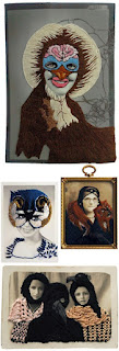
Stacey Page uses embroidery in her images and works by creating layers and layers of different colours to create an overall more interesting image:
Here is my version, which is related to my chosen theme of fashion:
I like this technique however I'm not sure how I would continue it or make it better for future work.
ENHANCED IMAGE PROJECT
We first learned how to vignette an image on photoshop using two different methods :
I really liked this technique as it gave a softer effect - I prefer the second one as the first one is harsher and bolder.
We also did this in the darkroom :
Again, I prefer the second and softer version.
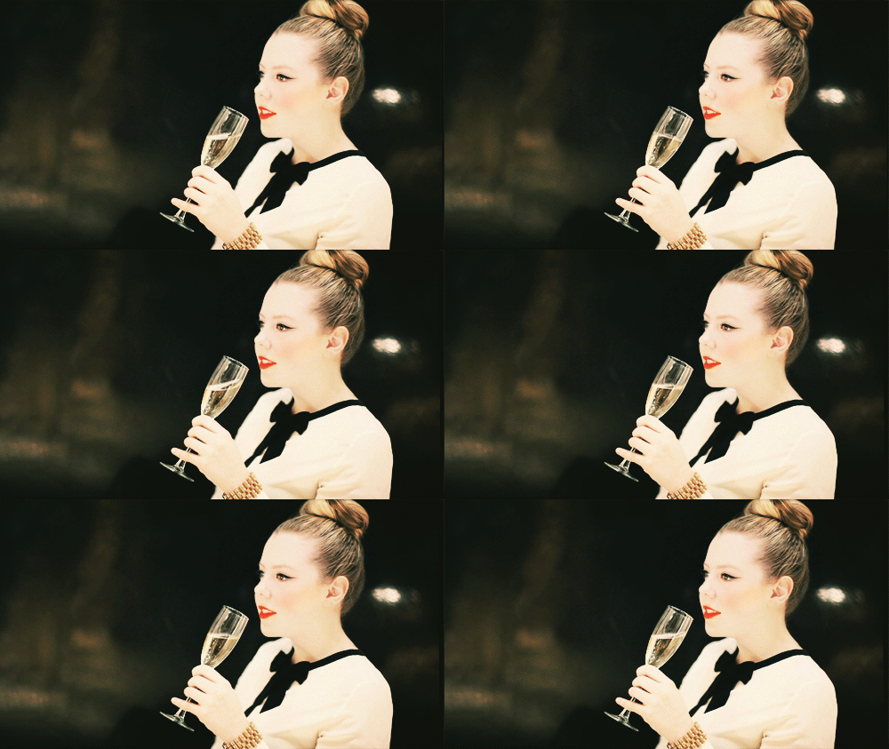
We then learned how to edit a photograph to give the Instagram Nashville effect, which I personally really loved :
I will definitely be using this technique in the future as I think that it looks really good and creative and I like the blue and yellow tones that it gives.
We also learned how to create an HDR effect on photoshop. I didn't really like this as I think that it made the image look really harsh, and I personally prefer softer photographs:
We were then taught how to highlight areas of particular interest in our dark room experiments :
I really liked this technique as I tried to create a sort of 'bubble' effect, which I think worked effectively. I would like to use this technique again when developing my photographs.
In the dark room, we also did press printing :
I liked this as it creates a blurry, dreamy and imperfect effect which I thought worked really well. You could use objects related to the photograph to press print with. I'd like to use this technique again.
We then used a technique called dodging :
I don't think it worked that well for me but I still liked the effect that it gave.
We looked at the work of Leslie David, who is known for layering paint on top of images:
I really didn't like how mine turned out as I think it looked messy, and the colours all merged together to create a murky brown green colour which I didn't really want. I don't think that this work is that good.
Man Ray's work involves solarisation - a technique that I really enjoyed doing:
My version :
I really think that I'll be using this technique again in the future as it creates an almost x-ray effect which I found interesting to look at.
As part of our photoshop experiments, we learned how to tone the images :
I actually think that this technique is a bit boring and simple, so I didn't really find it that inspiring.
In the darkroom, we learned how to create handmade negatives which I think would be interesting to layer over photographic negatives to add more texture and depth to the images:
I think that they look good in both positive and negative.


.jpg)
.jpg)
.jpg)