For my final outcome, I plan to recreate my own photobooth style photographs but also mix them with the gothic techniques that I have been researching throughout this project. In terms of presenting them, I want to create lots of different styled photobooth 'strips' of images and present them on a pinboard, perhaps with a few of the best printed larger on a mounted sheet. They will be placed randomly on the pinboard to make them more interesting. I will edit the digital photographs on photoshop and will pay specific attention to making sure that there is a boarder around the images - perhaps inpsired by polaroid images. This will make them look more authentic as photobooth images, and will also make them look more interesting to the viewer.
Although I've moved away from my original idea of gothic fairytales, I still plan to keep with the gothic theme to make the images different and unique as apposed to just the normal expected photobooth/polaroid images. For each strip of images, I plan to create a new 'persona', for example in one image, the clothing and props could be quite girly, but in another gothic, and in another something else. I want to experiment by taking lots of different images and picking the best ones to go on my mounted sheet. On photoshop, I know that you can make the photographs look like a film strip, which could be an interesting presentation technique that I will have a look out to see if it works / looks any good with my photographs. I plan to mix colour photostrips with black and white and sepia photographs to make the pinboard look more interesting.
On some of the images, I might decide to scratch into them - to create the creepy, gothic feel, for example scratch over the eyes or the face or the props, etc... I could also mix some real negatives into my photographs and scratch onto those aswell. This will create a subtle yet interesting effect onto my images that will cause the viewers to look more carefully at the images individually.
Another idea is that I could tone some of the images with different coloured food dyes which will also create an unusual effect. I could tone images on photoshop as well. I think that overall, my outcome will look interesting and reflect the work that I've been studying throughout this project in some way. I think that the idea of creating different personas in the different photostrips is a unique idea and it will make the viewers pay more attention to see that it is me in all of the pictures.
(image from google).
Mock up of final outcome :
Showing posts with label Fashion. Show all posts
Wednesday, 16 January 2013
Cindy Sherman
Cindy Sherman is an American photographer and film director best known for her conceptual portraits. Some of her work has been displayed in French Vogue and also Harper's Bazaar. I personally like her work as it is interesting and unique. Some of photographs are self portraiture yet she looks different in each of them, so it really makes the viewer think about the photograph. I like this specific photograph above as the background is fairly basic - a brick wall and a lamp, however the model is looking away and it makes the viewer think about what she is looking at. In a lot of Cindy Sherman photographs, she is looking away from the camera at something beyond the camera, which is an interesting and repeated technique throughout her work. This photograph is from a collection called 'untitled film stills' in which she is the model in all of them. She didn't title the photographs to preserve their ambiguity. They are all shot in black and white and were taken between 1977-1980.
For my final outcome, I think that her work will be inspirational as I am planning to do self portraiture combined with Andy Warhol's photobooth technique. I particularly like the idea of the black and white images as they create more shadows and tones within the image, making them more effective. I also like how the model in the image seems distracted, or perhaps doesn't know that the photograph is being taken - or it is supposed to look like that to the viewer. This makes the photograph look more like a snapshot rather than a posed image, and I personally really like this technique.
What is interesting about Cindy Sherman is that she does everything for her photographs - the photographer, the model, the makeup artist, the wardrobe 'director', hair stylist etc... so the work is purely her own with no help from others, which I find very inspiring. This is what I have been doing for my own photographs this project. Some of her photographs are high fashion, yet some of hers are more classic like the photograph above - this shows interesting variety for the artist.
Monday, 14 January 2013
Photobooth Photographs
I took these photographs which were inspired by the Andy Warhol Photobooth photographs. These are self portraits, which were also inspired by Mariell Amelie. I used different props to create the effect of different personnas, even though you could tell it was me in all of the photographs. On photoshop I created the effect of a photo strip (a line of 4 photographs) to make it look like the photographs were taken in a photobooth. I also made the photograph black and white (above) and also in sepia :
to create a vintage effect. Overall, I think that I like the slight sepia effect is the best as it creates a vintage feel but also keeps the colours of the clothes and props - which is important relating to my chosen theme of fashion. I also like the polaroid camera prop, as I think that this adds to the vintage theme for the sepia images.
I then decided to experiment with using a traditional photobooth border the the images, and made them more portrait than landscape - it also looked more professional :
to create a vintage effect. Overall, I think that I like the slight sepia effect is the best as it creates a vintage feel but also keeps the colours of the clothes and props - which is important relating to my chosen theme of fashion. I also like the polaroid camera prop, as I think that this adds to the vintage theme for the sepia images.
I then decided to experiment with using a traditional photobooth border the the images, and made them more portrait than landscape - it also looked more professional :
Andy Warhol Photobooth
Andy Warhol was an artist who was a leading figure in the visual art movement known as pop art. The photographs above are from a series titled Andy Warhol Photobooth. I think that this idea is interesting as the setting looks natural and can be recreated fairly easily. I think that these photographs look simple making the people in them the main focus of the image. I could recreate similar photographs that relate to my theme, by dressing up and taking photographs of different styles for example gothic. As I'm doing fashion photography, I'd need to focus more on the details in the top/dress, the makeup and the hair/accessories as you wouldn't be able to see the trousers/skirt/shoes. I'm also doing self portraiture, so I think that for each image I could replicate different styles and photographs, so that the viewer would have to look closely to be able to tell that it was me in every picture.
These images are in black and white (although they appear slightly yellow toned here), which I think creates more shadow and tones to the photographs. If I were to recreate the images I think that I would use either black and white or sepia to replicate the vintage feel. However, I could keep them in colour to keep the photographs feeling modern. I could even have a mix of both for a vintage yet modern approach - something to think about. For these photographs, I create fashion/makeup/hair looks that are typically vintage to go with the idea of a photobooth.To relate it to my final outcome for this challenge, I think that I could mix the gothic fairytales with this idea of presenting my images. What I like about these images is that they're simple and basic, with the plain background and the lack of colour, but each photograph is interesting as there is something different happening in each of them. The viewer pays attention to each individual photograph rather than just the photo strip as a whole. It makes you wonder what the model was thinking at that exact time that the photograph was taken, and why they did a specific pose etc...
What I like about these images so much is that you get to see more of the personality behind the models in these photo strips. Although I plan to take on slightly different personas in each photo strip, I could refer back to these images to look at the poses. Something that I think about when I look at these pictures was were the models somehow listening to music? Sometimes music can affect your mood and perhaps inspired them for their poses, however this is just a thought.
Saturday, 12 January 2013
Friday, 11 January 2013
Mariell Amelie

Marielle Amelie is a London based photographer who focuses on self portraits. I personally am really inspired by her work, as my recent work has been fashion mixed with self portraits. I think that I could relate this style of photography to both gothic and fairytales whilst combining them to create a contrast. For example, I could find an idylic setting - but wear all black, or I could take the photograph in a graveyard when it's dark, but wear all white. I think that this would be interesting as it would make the viewer really think about the whole photograph and the elements within it. This artist also sometimes does ghost photography, which is also what I am inspired by, so perhaps I could combine that also.
I think that this work is particularly interesting because of the settings that she uses as well as the outfits. For example, in the third image, the sheer cape that she is wearing is being blown to the right, but as it is sheer we can see the background through it - making it again appear ghostly and mysterious. Throughout the pictures I've noticed that although it is the same person, she has taken over different personas in a subtle way, especially over the years of her self-portraiture.
In the first two images, they are set at night, so you can't always see the background, however the artist has picked what she wants to be lit in the image, so she almost has more control over the what is shown in the picture, whereas the third picture is set during the day and is therefore lit, however it makes the photograph seem more 'innocent'.
In the second picture I think that it would be fairly easy to recreate with the technique of light painting, which is something that I might try. I think that it looks interesting and effective, and adds colour to the shot. It could be interesting the make the photograph black and white and to have just the light painting in colour. I think that you could combine both the gothic and innocent fairytale effect to the same image.
Overall, I really like the work of Marielle Amelie as I think that it is unique and interesting. I find it inspiring for self portraiture and plan to take inspiration from this for my final outcome.
Monday, 7 January 2013
Ghost Photography Experimentations
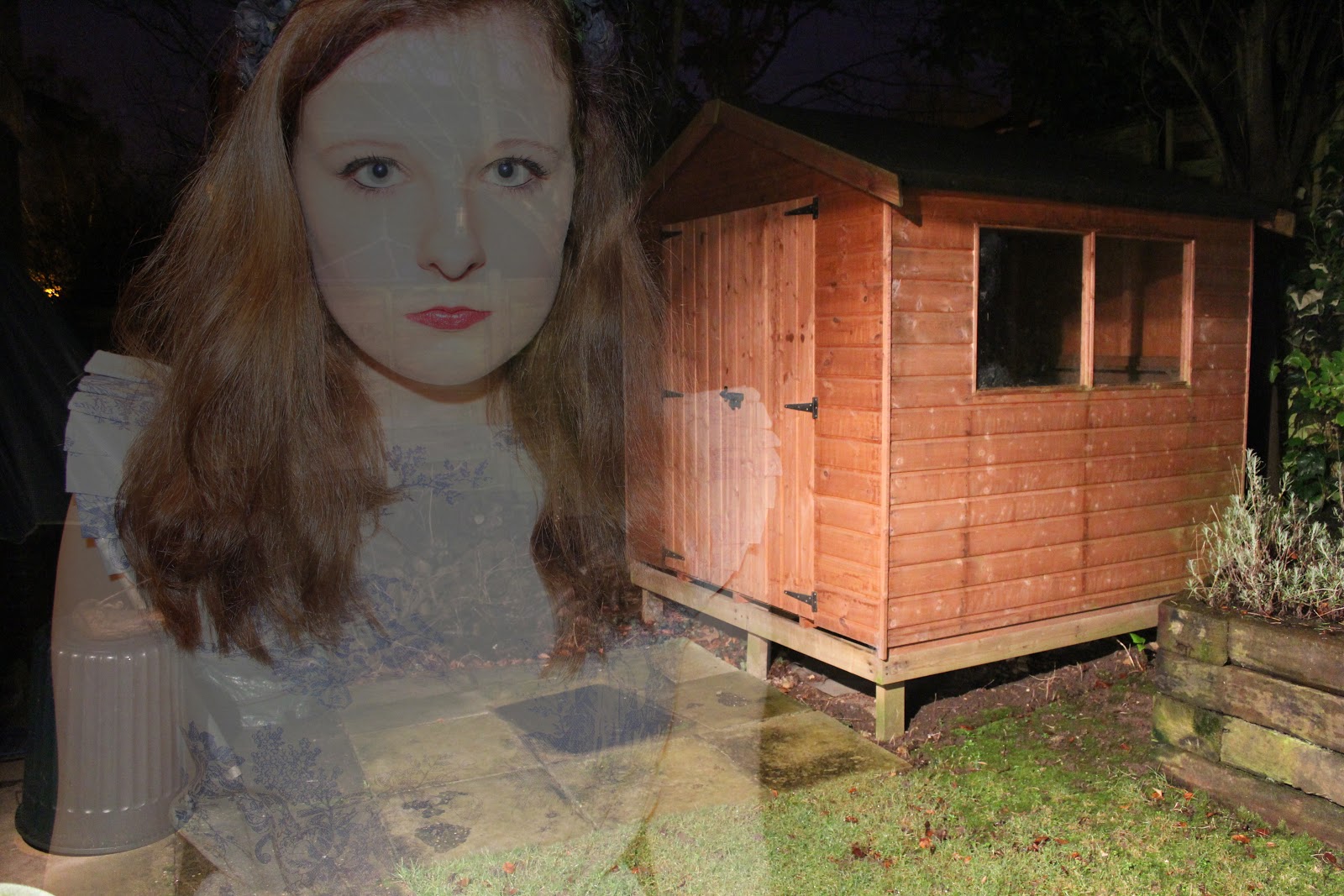
For this experiment, I decided to try out the ghost photography
technique. I took photographs and created a double exposure technique in
photoshop. Some of the photographs I took were over exposed as this
helped to give a more 'ghostly' effect when I double exposed the images:
For the three photographs above, I took the pictures outside at night time. I thought that this added a unique and mysterious effect as well as creating a more gothic feel to the photograph. I played around with using the flash on my camera - which did give a ghostly effect, however I preferred using the outside light, as this gave a slightly softer effect.
To create this effect in photoshop, open up your two images, and copy and paste one into the other as a new layer. Then change the opacity to around 50%, however this will change depending on your chosen photographs. For some of the images I also changed the layer type to screen, as this gave a more over exposed effect which I think made the ghost effect better and more interesting, as it was harder to see the 'ghost'.
For the two photographs above, I took this photographs inside using softbox lighting. I put them quite close as this gave a harsher effect - which made everything look slightly more doll like - relating to the fairytale idea. The second photograph is more faint which I think creates a more ghost like effect - it also creates the idea of two separate ghosts rather than just one in the background, which I think is interesting.
For the photograph above, I again blended the two images and then added a dark blue layer on top, and changed the layer type to overlay, for a vintage effect. I also then played around with the curves which created a bit more of a blue tone to the image:
This photograph above is simple and is just of the flower headband that I was wearing. I thought it was a contrasting image as it combines both the black and gothic feel with the plain and 'innocent' white background and porcelain skin.
For the three photographs above, I took the pictures outside at night time. I thought that this added a unique and mysterious effect as well as creating a more gothic feel to the photograph. I played around with using the flash on my camera - which did give a ghostly effect, however I preferred using the outside light, as this gave a slightly softer effect.
To create this effect in photoshop, open up your two images, and copy and paste one into the other as a new layer. Then change the opacity to around 50%, however this will change depending on your chosen photographs. For some of the images I also changed the layer type to screen, as this gave a more over exposed effect which I think made the ghost effect better and more interesting, as it was harder to see the 'ghost'.
For the two photographs above, I took this photographs inside using softbox lighting. I put them quite close as this gave a harsher effect - which made everything look slightly more doll like - relating to the fairytale idea. The second photograph is more faint which I think creates a more ghost like effect - it also creates the idea of two separate ghosts rather than just one in the background, which I think is interesting.
For the photograph above, I again blended the two images and then added a dark blue layer on top, and changed the layer type to overlay, for a vintage effect. I also then played around with the curves which created a bit more of a blue tone to the image:
This photograph above is simple and is just of the flower headband that I was wearing. I thought it was a contrasting image as it combines both the black and gothic feel with the plain and 'innocent' white background and porcelain skin.
Sunday, 6 January 2013
Progress Review
1 - Which materials and techniques have you experimented with during this project?
Throughout this project, I have experimented with several different techniques both in the dark room and digitally. In the dark room, I have done double exposure, the 'bokeh' effect and also toning, and digitally I have experimented with 'the vintage effect', light and layer blending techniques and just generally changing colours on photoshop.
2 - Have you explored and developed your ideas imaginatively? How have you demonstrated this? (Give examples, links to posts or include images).
During this project, I think that I have explored and developed my ideas imaginatively. I've demonstrated this by trying out quite a few techniques (as mentioned above) and researching about them for example I found the 'bokeh' technique and then researched how to do it and tried it out in several ways that I think were imaginative and creative for example I changed the shape of the bokeh effect for my photographs -
but then I experimented with the idea further and used double exposure to create another outcome using the same image as above -
(for the image above I also decided to crop it in the dark room, which I think shows that I have developed my ideas and continued to experiment with the same image).
3 - Have you researched a diverse range of photography and completed this on your blog? Who have you analysed? Are your analyses in-depth? (Again, give examples and link to posts).
For this project, I have researched several different artists that inspire me, but they also have different styles of photography. First, I analysed the work of Tim Walker whose work relates heavily to fairytales, as does the work of Kirsty Mitchell. These two artists inspired me to continue my work to the theme of fairytales, but I didn't want to do the traditional fairytales, so when I analysed the work of Joe Gall who used the ghost photography technique, I decided to create gothic fairytales. I also analysed Mark Hunter and Norman Jean Roy whose work also relates to the idea of fairytales. I feel that my analyses are in depth and explore different elements of the photographs, as well as discussing how I could recreate these techniques in my own photographs.
4 - Have you explored a range of ideas around your theme within your experiments? What are they? How have they informed your ideas?
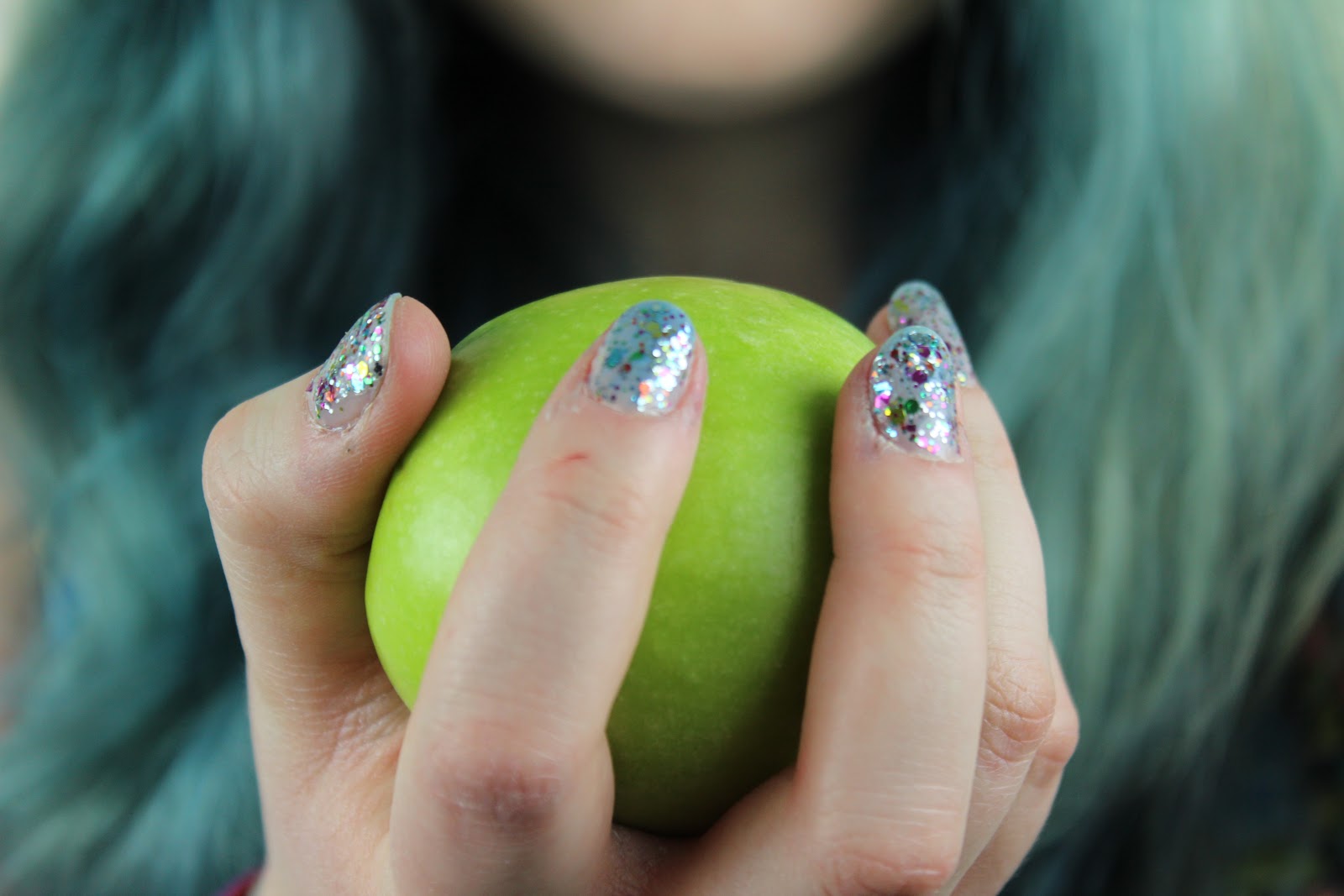
I think that I have explored a range of ideas around my theme within my experiments as I have taken an idea and experimented further with it. For example, I took a picture of me holding an apple (like Snow White) :
so you can see the nail varnish and the hair in terms of my chosen theme of fashion, but then I took a picture of just the apple:
and then to relate it to my theme I put the lipstick mark on it. I think this is also a subtle reference to Snow White, which is an interesting effect. I think that this shows that I have explored a range of ideas around my chosen theme of fashion.
5 - Have you refined / developed your outcomes through experimentation? How?
I think that I have developed my outcomes through experimentation, for example after I'd done double exposure in the dark room with this picture :
I then took the experimentation further by toning the image with a drip like effect - making the photograph more gothic:
6 - Have you annotated, in detail, your experiments and developments on your blog and used this information to help you improve?
Yes, I think that throughout this project I have annotated all of my images and explained how I created this technique and what I would do differently next time.
7 - Which techniques / experiments have been most successful? Why?
I think that the double exposure technique has been the most successful as I found that it worked quite well and would be useful for ghost photography styles. I also think that the bokeh experiment worked well as it made my photographs more unique.
8 - Which techniques / experiments have been least successful? Why?
I think that bleaching was the least successful technique (as shown here) as I found that it made the image harder to see and I didn't think that it made the photograph better.
9 - Which techniques / experiments will you be developing further for your final outcome? Why?
I think that I will develop the double exposure technique more so that for my final outcome I can create ghost photographs. I also want to experiment more with the idea of presenting my work to create an interesting and more unique final outcome.
10 - What else can you do to further develop the techniques / experiments you want to use for your final outcome?
I think that if I experiment more with the techniques that I've been looking at throughout this project, then I will be able to use them better in my final outcome and the outcome will be of a higher quality.
Norman Jean Roy
Norman Jean Roy is a fashion photographer whose work has been included in Vogue numerous times. This is a photograph of Florence Welch, from the band Florence and the Machine. I like this photograph as it reminds me of the fairytale theme - with the lace on the dress, and the sword as well as the cape. I think that this is a more gothic feel to the fairytale theme, as the horse is black, instead of the typical white, and the clouds are grey instead of there being a clear sky. I love the use of gold and black accessories, as this shows that there is a recurring theme throughout the image.
The background is simple, and the sky is shown more than what's on the ground (such as trees, grass etc...). You can tell straight away that it has been shot for a high fashion magazine, just from looking at the shoes and the dress. There isn't a specific or obvious light source for this image, however I think that the light is from the left hand side, as this there are signs of light on the horse's chest/face, rather than the on the whole horse or the model. As the horse is rearing, it makes it seem more powerful - and the fact that there is a sword included in the image suggests power as well.
I like how there is intricate detail within the clothes, as this makes the fashion part of the image stand out more. The cape has been moved so that the viewer is able to see the dress clearly, as that is part of the advertising technique which is something to think about in my future photographs - showing the whole outfit. Also, the fact that the cape has been moved and the horses mane and the models hair are blowing suggests wind has been used for the photograph - adding to the idea of power. This technique also makes the photograph more dramatic.
Overall, I personally really like this photograph, as it shows the dress clearly which is feminine and lace which is mixed with the dramatic use of a sword and a horse. The photograph is interesting as the outfit works particularly well with the rest of the image. I like how just the model (and the horse) is lit and the background is dark. I find the background to be quite mysterious as you can't really see the ground (as I mention earlier this makes the model and the horse seem more powerful) and the clouds are dark.
Friday, 14 December 2012
Experiments : Toning
The photograph above was covered in blue and red ink, which I then decided to bleach as it had covered the entire picture - making it harder to see the image. Although the bleach took away a lot of the detail, you can still see the image a bit better than when it was covered in ink.
I liked this one above as it looks like blood, which I think relates well to my theme of gothic images. I think in future I will put less ink on to make it more subtle which I think will actually be more effective.
For this one, I decided that I wanted to colour the star shapes in, as I thought that this would look interesting if there was a blend of colours, as this would add more detail to the image.
This one is similar to the blood- like drip earlier, except this colour is a shimmery green. I think that this technique works better than the one before, except I prefer the red colour.
I liked this one above as it looks like blood, which I think relates well to my theme of gothic images. I think in future I will put less ink on to make it more subtle which I think will actually be more effective.
For this one, I decided that I wanted to colour the star shapes in, as I thought that this would look interesting if there was a blend of colours, as this would add more detail to the image.
This one is similar to the blood- like drip earlier, except this colour is a shimmery green. I think that this technique works better than the one before, except I prefer the red colour.
Wednesday, 12 December 2012
Darkroom Experiments : Fairytales
For my first roll of film for this project, I decided to experiment with the bokeh technique that I had previously researched. The majority of my film was involving the lights so that I could see if I wanted to use it in my final outcome for this project, as well as general experimentation. I tried taking the photographs using different shaped filters, such as hearts and stars so that you would be able to clearly see that the lights had been changed.
For these two photographs, I created the double exposure effect in the dark room. These are both the same image, except the exposure on them in the darkroom is slightly different, creating two separate outcomes. I personally really liked how the double exposure worked, and I will definitely be using it in some way within my final outcome, perhaps by using a different shape to mirror the gothic theme that I am following.
For the third image, I decided to try out the solarisation effect, as it was something that I liked from the previous project. Although this one didn't work out too well, I think that the overall effect is interesting, especially with the lighting that I used - light only directed to one side of the face. This reminds me of the gothic theme, so I will try and experiment more with this technique on other photographs.
The final image is the same as the first and second one, however I decided to crop the image so that it really focused on the person and the clothes, as well as the stars. I think that this technique works well, but sometimes I prefer to have more of the background showing. Overall I think that it is an interesting technique to keep in mind.
Tuesday, 11 December 2012
Experimentation : Light and Layer Blending
I recently found a tutorial for different lighting effects for photoshop which you can find here.
I first tried it on a photograph from the Wildfox Couture photoshoot and also I think the first edit looks interesting, it's not something I think that I would try again. The second image was blended with another photograph from the same shoot, and I think that it turned out quite well and reminds me of the ghost style photographs I've looked at previously. Below is one of my own images, where I used some drip brushes (found on google) to create a contrasting effect of the black and white drips. I also think that this relates well to my gothic theme that I am doing.
Monday, 10 December 2012
Experimentation : The vintage photograph effect
I decided to experiment more with the vintage effect as I think that it works really well on photographs. This technique is similar to the Instagram Nashville effect I did a while ago, but is slightly different and creates a unique outcome.
To create this vintage effect, I used the tutorial from here and my version actually turned out slightly different to the example the tutorial used, but I actually like that my one is darker, as it adds to the gothic fairytale theme I am following. There were several different layers used to create the technique, but overall the outcome was easy to create and didn't take a lot of time to do. You could play around with the amounts of each layer to create something unique each time.
Overall, I really like this effect and I think that I will use it for my final outcome. I like how it can relate to the gothic fairytale theme that I have chosen and I also like the vignetting technique that I included in this photograph. I found it easy to create and I think that it is an simple yet dramatic effect to add to any photograph.
I then decided to turn the outcome into black and white and have just the green of the apple showing, which I thought made an interesting effect. I think that it would look better if it was more subtle, however. I did this by duplicating the layer and made the top layer black and white. I then used the eraser tool and rubbed out the image where the apple is, so that the colour showed through. I think that I will use this technique again as it draws more attention to a specific part of the chosen image.
Thursday, 29 November 2012
Digital Photographs - Fairytales
Above is the original image, and below is the edited version, where I added blue tones and mades the apple a slightly darker, more vibrant colour. I prefer the edited version as I think it makes the image look 'dreamier' and more fairytale like.
Above is the original image, and below is the edited version. Like the first photograph, I prefer the edited version, as the colours are more vibrant and again the outcome is 'dreamier'. I also like how the blue of my hair is more vibrant.
For the photograph of just the apple with the lipstick, I didn't edit it too much, I just darkened it a little to see if the colours would be more vivid. I think that it looks a little better, but I still like the original one as well.
The three photographs above were inspired by the fairytale Snow White - where she bites into the poisoned apple. I wanted to relate this to my chosen theme of fashion, so I wanted to show the lipstick, the hair and the nail varnish - although these aren't clothes, they are related to fashion. I think that this is a subtle reference to both fashion and fairytales, so it makes the viewer think about what the photograph is about, and what the meaning behind it is.
This photograph was inspired by Rapunzel - where she leans out of a window with her long hair flowing over the window sill. This one didn't work as well, mainly because my hair isn't very long! However, I think that this also has a subtle reference to both fashion and fairytales. This one is more related to hair and clothes, rather than makeup, unlike the previous photographs in this post.
This photograph I edited to make it look like there were lights orbs in the photographs - to symbolise fairies for my fairytale theme. I personally really like how this photograph edit turned out.
Subscribe to:
Posts (Atom)


.jpg)
.jpg)

.jpg)
.jpg)
.jpg)
.jpg)