I find this photograph above interesting, as it is another form of distortment, playing with shadows and how they can completely change the image. It would be interesting to see the photograph without the shadows, to see how they differ. I think that this photograph would have been made with double exposure, as the vibrancy of the flowers are slightly faded. The flowers and leaves also look dead, which gives a gothic feel to the image. The faded effect is interesting as it also looks like the technique from the previous image with the water/texture filter/layer. The photograph below relates to the first photograph more and makes the photograph look somewhat spooky, and what I really like about his photographs is that they look like oil paintings, and this can be created simply. Out of all of the images, I prefer the last photograph (below) as the cool blue colours give it an interesting look with the sun peaking out and bringing a vivid white lighting to it. I think that to further my own experiments and to develop my ideas more, I could try taking the photographs of the sun and clouds at different parts of the day to see how the lighting and cloud patterns differ, as I think that this could make quite a good collection/series of images.
Monday, 18 March 2013
Jorma Puranen
William Eggleston
William Eggleston is an American photographer who was born in 1939. To begin with, he photographed only in black and white, but began to experiment with colour films 1965 and 1966 after being introduced to the medium by William Christenberry. Eggleston's work has been used for advertising for Marc Jacobs, as well as for album covers for bands such as Primal Screams album 'Give Out But Don't Give Up' as well as Jimmy Eats World's famous album titled 'Bleed American'.
I chose to analyse this particular photograph above as I found the shadows and reflections interesting and inspiring. I love how the light (which would appear to be natural light from the sun) shines through the window and we can see the colours of the drink on the table. This photograph looks like it was taken on an aeroplane from the shape of the window and the clouds outside. The models hand looks interesting in this photograph as we are not as to weather it is a man or a women - could it be the photographer himself? It creates an interesting shape as a shadow and this is a form of distortion, which I'm currently experimenting with myself. It wouldn't be too difficult to recreate either, and you could change the setting so for example on a bus or in a car that has one of those fold out tables.
This photograph has a vintage feel about it, probably because it is not a particularly modern piece, however this would be a technique to research and use in my own photographs - making the photograph look more vintage with the colours slightly faded. Below are some more examples of the faded effect:

I think that his photographs are interesting and unique, and can relate well to the theme of the everyday, which is what I plan to continue with. I also like how when there are people in his images, such as the ones above, you never see their faces, so there is a sense of anonymity about them, making them open to interpretation.
Photography Trip Photograph Experiments
When on the photography trip, I decided to take some photographs inspired by the portraiture theme. I really experimented with the depth of field, using a 50mm lens, with an aperture of f/1.8. I think that this worked well and created an interesting overall effect, and also makes the photograph look more professional.
Friday, 15 March 2013
Exhibition: Juergen Teller
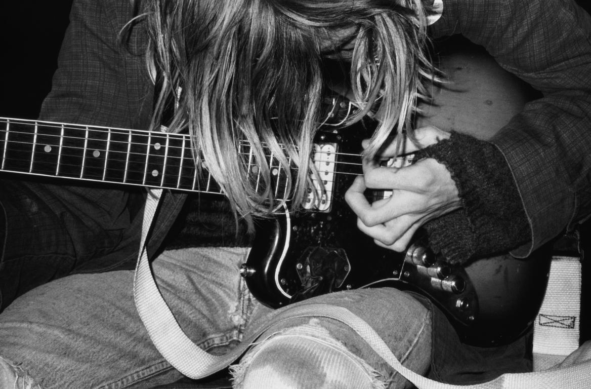
We visited the ICA gallery in London this week, to see the exhibition of Juergen Teller. I personally really liked this photograph above, which is of the famous musician Kurt Cobain from the band Nirvana. This photograph was taken in 1991 (a few years before his suicide) and is a digital c-type print. I particularly like how this photograph is in black and white, and I think that this could in someways refer to the singers depression. This is a medium close up shot so it shows mainly the guitar, which could also be symbolising the importance of music to Cobain and how the only thing that matters is his guitar. I like how his face is covered with his hair, as it makes it relatable for other musicians/guitar players.
I think that this shot was planned, however it looks natural and therefore spontaneous. It doesn't look too posed which I like, as I think that that would look too formal and that wouldn't create the same effect. I liked this photograph also because it relates well to my new chosen theme of portraiture. This photograph gives me inspiration to experiment with medium close up shots, so I'd be focusing on the person/people rather than them and the background as well, as I think that this would bring something new to my work. I like how the background isn't particularly visible, as it makes the viewer focus more on the musician himself, and again, this is something that I want to try and experiment with.
Throughout the exhibit, there were a variety of photographs, but I personally liked this one the best, as I thought it was simple, yet it was dramatic and effective, and seemed to tell a story. It makes you think about what song he was playing at the time - I would imagine that the artist used a fast shutter speed to capture the image as Cobain was playing the guitar. It makes you think about what he was thinking at the time that this photograph was taken - was he playing a song that expressed his emotions at that time?
The lighting in this photograph is fairly dramatic. I think that if it was a colour photograph, it wouldn't look as dramatic, however in the black and white, the tones are strong and effective. It helps to simplify the image itself, as there aren't any bright colours taking away the attention of the photograph of the whole. The print itself is contrasted and bold and I personally think that this technique works really well, and is something that I could replicate in both the darkroom, and digitally on photoshop.
Overall, I think that this piece is particularly expressive and unique, and it really makes the viewer think about the image itself, rather than the background being a distraction, etc... I like how it is in black and white, rather than colour as it makes the photograph really stand out, especially as the other photographs in the same room were bright, bold and vivid colours.
Labels:
A2,
Analysis,
Artists,
Exhibit,
Gallery,
Guitar,
ICA,
Juergen Teller,
Kurt Cobain,
Music,
Portraiture,
Trip
Wednesday, 6 March 2013
More 3D Experiments
I decided to try and create the 3D effect using my film photographs. I scanned them into the computer and then opened them up into photoshop.
Friday, 15 February 2013
3D Photoshop Effect
original photograph
3D photograph outcome
step by step guide is here.
This was inspired by two artists. I decided to pick the skeleton photograph inspired by Carsten Witte and the 3D effect was inspired by Brad Carlile. I think that this 3D effect works particularly well with the skeleton makeup as it makes it look more interesting and 'ghostly'. I also think that it works with my two chosen themes - 'movement + light' and also 'inner character'.
Carsten Witte
Carsten Witte is a 48 year old photographer who attended the Bielefeld school of photography. He really experiments with the use of shadows in his photographs. The photograph mainly relates to the starting theme of the five senses, however I think that it also relates well to the inner character theme.
This photograph is very different from work I've seen before, as it incorporates the skeleton into the photograph. I created my own version below using makeup, but this one looks like it could be either double exposure with an image of a skull, or could have been drawn on to the model - either on set or edited in. I think that this would be an interesting photograph to add the 3D photography effect to. This photograph is from a collection titled 'Intuition', which features several photographs of women with this skeletal effect. What is interesting about this series, is that the skeleton art work is only on their faces, rather than continuing onto the rest of their bodies.
With these images, I feel like there is a juxtaposition between the innocence of the models - the fact that their hair is away from the face, and that they are not clothed, with the harshness of the skeleton pattern on their faces. I like how these shots are all close up head shots, as it creates a flow within the series, showing that there are similarities between each photograph, rather than just the skeletal features, as the models are different in every picture. With the harsh lighting, there are lots of shadows created, and the face has a strong contour to it. The lighting almost creates distortions to the face which is an interesting technique and something that wouldn't be too difficult to recreate myself. The use of the black background is interesting as the model's face appears to fade into the background, with the use of the lighting.
Overall, I personally really like these images and I think that they are effective and unique. Although they are mainly related to the theme of the five senses, I think that they can relate to portraiture/inner character also, and in some ways they could also relate to my other chosen theme of movement and light, due to the extreme lighting conditions.
For my personal experiments, I used black eyeliner and eyeshadow to create this skull effect. Although it doesn't quite replicate the work of Carsten Witte, I think that it works well. I think that to improve this, I should have used harsher lighting to create the effect of shadows and distortion.
my own experimentations :
black and white
colour
Wednesday, 13 February 2013
Eve Arnold
Eve Arnold (April 21, 1912 - January 4, 2012) was an American photojournalist who is best known for her photographs of many of the iconic figures who shaped the second half of the twentieth century, including Marilyn Monroe (pictured above). She has also photographed people such as migrant workers and disabled Vietnam war veterans, so there is a range of styles throughout her work. The majority of her work is black and white, however in the early 1960s when she moved to London, England and was working for The Sunday Times, she began to make use of colour photography more and more. I personally really love her work, especially her collection of photographs of Marilyn Monroe as I think that they really capture her expression and mood at the time. The photograph above was taken behind the scenes on the set of The Misfits (1961). Although the photograph is in black and white, it still captures the details of the image. I also particularly like how Marilyn is the only thing in focus in this image, as it makes the viewer think about the setting and what it is and where she is - I think that this is an interesting technique that Arnold has used.
This photograph doesn't seem too posed either. It looks like it was taken when she was walking, or just looked up to the camera, rather than the photograph being set up and staged. It appears more natural which I think is something to think about when taking my own photographs. The black and white effect also adds to this. These photographs really work with the 'inner character' theme as you get to see her as herself, even though she is dressed to play the part of somebody else. In this photograph (and the collection as a whole also) the lighting is very soft, which again makes the photograph seem more natural, because if the lighting was harsh and bright, the photographs would seem staged, as if the artist had spent a long time setting up the outfit, setting, lighting, camera angle etc... instead of it being a snapshot. Snapshot photography also makes it work look more like photographs that are taken for memories rather than a magazine or a portfolio - which, again, makes them appear more natural.
I think that it would have been interesting to take pictures of the same actor/actress but over a long period of time where they're in different costumes for different roles, as you would be seeing the same person in each of the pictures, but they would look different in all of them. It would also be an interesting way of documenting their time on set when they were being filmed. It would also be showing all of the different types of roles that they portrayed in that time frame of their career.
Throughout the collection, the artist has used different camera angles for different picture. For example, the photograph shown above is a portrait from the waist up, but there is also quite a bit of space above her head. In the first photograph below, it is a close up, and the background is dark so that you only see Marilyn (I also like how in this photograph, her hair appears to be fading into the darkness as this makes the photograph seem more dramatic and perhaps even slightly gothic).
I think that inner character is an interesting theme to explore and I plan to combine it with the movement + light theme to create a unique final outcome. If I were to recreate photographs like this, I would perhaps double exposure the image with colourful lights, such as fairy lights, to combine both the black and white portrait with the colourful light (perhaps using the bokeh technique). Overall, I think that this collection is very inspirational for work that I want to create for this project.
More photographs from the same collection:
Tuesday, 12 February 2013
Inner Character
- Why have you selected this starting point?
I selected this starting point as after experimenting with portraiture and self portraiture in the previous project, I decided that I wanted to continue it in some way for this exam theme. I'm thinking about combining this theme with the movement + light theme also.
- What are you planning to look at for primary/secondary research?
Take photographs / contextual research .
- Which artists/designers will you be looking at (you must select a minimum of 3 from the theme)
Eve Arnolds, Bruce Davidson and also Inzajeano Latif.
- What materials/techniques would you like to experiment with?
Double exposure.
- Which experiment(s) are you planning to make?
Experimenting with colours and how they affect the images.
Monday, 11 February 2013
Brad Carlile
Brad Carlile is a contemporary photographer, who is most well known for his extreme use of colour in his photographs, such as the one above. His photographs almost have a 3D effect, which is something that I'd like to try and recreate and experiment with in my own photographs. The extreme use of colour is interesting and grabs the attention of the viewer. It appears unnatural yet it is appealing to the eye. In this photograph (as well as the other photographs from his collection), there appears to be some use of double exposure, if you look at the chair. This could be because of a slow shutter speed when using the different lighting, or he could have just used double exposure to create an interesting effect.
In a lot of his photographs from this collection, he uses a mirror to show the rest of the image. I think that the use of the mirror is important as it reflects more light - rather than just taking the picture of the bed. It also makes the room appear bigger and more colourful, and we can also see more of the room. It's almost like an illusion. The photographs are from a collection titled Neon Hotel Interiors, and there are several different styles of interiors, but they still all have the interesting lighting - making them relatable.
"Each image takes two or three days to create from three to nine exposures at different times of the day. All work is done in camera on film and no colored bulbs or gels are used"
Although these photographs are dramatic, intense and bold, I feel like they are still quite simplistic in what is actually in the photograph. They would be quite easy to recreate as the room is fairly normal. If you were creating it in camera, you could use different coloured lights, and if you were creating it in photoshop, you could add in colours and change the layer types so that they look more 'natural'.
I also really like how in the room, although there are several lamps/lights, only one is turned on (in the mirror reflection). This brings a warmer glow to the photograph and makes the setting appear more real, even though there are lots of strong and vibrant colours everywhere.
Overall, I personally really like his artwork. I think that the use of colour is interesting as well as unique, and can make a fairly boring and basic setting detailed and will captivate the viewers' attention. I think that you could incorporate this technique into any setting, and change the colours if you wanted a particular theme or make it reflect the surroundings in the photograph. I think that it is an interesting new way to do light painting, rather than just photographing traffic at night on a slow shutter speed, or using a laser pen to draw or spell out words. It is something that I am interested in recreating myself, and perhaps even going on to explore 3D photography.
It would also be interesting to experiment with different settings using this effect, and perhaps even looking at portraiture with either just the model with all of the colours or just the setting. I think that it would also be worth experimenting with different colour palettes - perhaps one using bold colours and the other using just pastels, or something like that.
More photographs from the collection:
Saturday, 9 February 2013
Movement + Light
- Why have you selected this starting point?
I chose to start exploring the movement + light theme, as I have a strong interest in experimenting with light painting and how light can affect and enhance images.
- What are you planning to look at for primary/secondary research?
Take photographs / contextual research.
- Which artists/designers will you be looking at (you must select a minimum of 3 from the theme)
Wolfgang Tillmans, Uta Barth and Brad Carlile.
- What materials/techniques would you like to experiment with?
Double Exposure, Light Painting and 3D Photography.
- Which experiment(s) are you planning to make?
A collection of double exposed photographs that influence light painting into portraiture / self-portraiture, experimenting in the dark room with perhaps solarisation.
Friday, 8 February 2013
Thursday, 7 February 2013
Thursday, 31 January 2013
Final Evaluation
For this project, we were allowed to choose what we wanted to do, as long as it related to our chosen theme for the year - my chosen theme was fashion. This allowed us to be more creative with our work, as we were choosing something that personally really interested us. It was also interesting as it meant that nobody's work would be the same / or similar. It was a little bit difficult at first to think of ideas, because we had complete choice and control, but once I started to research artists, I began to think of possible outcome ideas. I started off by researching artists who had taken pictures for magazines, and looked at the techniques that they had used to create their photographs. An artist that I particularly liked researching was Joe Gall who incorporated 'ghost' photography (double exposure) with fashion :
I first experimented and explored with the idea of gothic fairytales, but then I started to look more at portraiture work, and decided that instead of going with my initial idea of double exposure and the gothic fairytales, I chose to incorporate my theme of fashion into portraiture work, as I felt like this would be something different and more unique from my previous outcomes. Throughout the project, my ideas evolved dramatically, but I'm glad they did as I did fairytale photographs during my AS year, and wanted to do something different, which is why I was more inspired by portraiture photographs. I feel that if I had stayed with the idea of fairytales, I wouldn't have experimented much or looked at new techniques and artists as I had already done it, so because I changed my idea, I have more variation on my blog now.
My main inspiration for my final outcome was Andy Warhol, and his collection of photobooth pictures:
I thought his work was really interesting, as he captured peoples expressions and thoughts (as well as fashion sense) at that exact moment and I took inspiration from this for my final piece, as well as from the work of Cindy Sherman, who is famous for her self portraits where she takes on the persona of other people, which also inspired me for my final piece as I decided to do self-portraiture for my final outcome:
Overall, these were the two artists that inspired me the most throughout this project.
I think that for this project, I presented my final piece in an interesting and unique way - on a pinboard full of photo strips, so that it looks like a memory board. I'm personally happy with how it turned out and I think that visually it looks really interesting, rather than being on a mounted sheet, as it looks more personal.
I think that I should have done a bigger variety of images and dressed up in more interesting outfits to take on different personas, as I think that this could have related more to the theme of gothic that I was exploring at the beginning of the project. I also think that I should have done more facial expressions, or set the camera to a timer where it takes several pictures in a row, like an actual photobooth would do, as it would capture the real feeling of a photobooth and wouldn't look as posed or 'staged'.
Overall, I really enjoyed this project, however I found it difficult to begin with as there were no set rules that we had to follow, it being the personal project. Also at the beginning, we were asked to think of final outcome ideas, which I found slightly difficult as we'd just begun the project, however overall I enjoyed it. Although when I started exploring different techniques and artists, I found it enjoyable and interesting. In the future, I think that I would like to incorporate portraiture into my fashion theme and combine them as I really enjoyed that.
The photographs above are how I originally displayed the photographs, however I decided to change it as I felt that the way that it was currently presented was almost too crowded, and perhaps it would look better if it was displayed in a simpler way, such as what I decided to do below :
Overall, I think that this way turned out much better than the original way of presenting my artwork. I used thin pins to pin the photographs to the foamboard, as it doesn't take away from the photographs which heavier pins would, such as the typical gold pins.
The photographs above are how I originally displayed the photographs, however I decided to change it as I felt that the way that it was currently presented was almost too crowded, and perhaps it would look better if it was displayed in a simpler way, such as what I decided to do below :
Overall, I think that this way turned out much better than the original way of presenting my artwork. I used thin pins to pin the photographs to the foamboard, as it doesn't take away from the photographs which heavier pins would, such as the typical gold pins.
Subscribe to:
Posts (Atom)