

Hello! Welcome to my photography blog! This blog shows my work from AS as well as A2. Enjoy!
Tuesday, 13 November 2012

Friday, 9 November 2012
Final Outcome - Evaluation
The brief for this project was 'enhanced image'. This meant that we had to be creative with our photographs and experiment and change them to make them more interesting and effective. We started the project by finding out about the different possible ways in which we could enhance the image, such as double exposure and bleaching. When I started this project, I was unsure as to how I would use my theme of fashion as well as enhancing the images themselves. I started by researching different fashion photographers for inspiration, and then started researching more about ways in which I could enhance my images, such as the vignetting technique. I experimented a lot with the technique of double exposure, and examples are shown in my final mounted sheet.
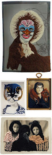
For my final outcome, my teachers recommended the work of Julie Cockburn, and also Maurizio Anzeri, who incorporate fabric into their work:


For my final outcome, my teachers recommended the work of Julie Cockburn, and also Maurizio Anzeri, who incorporate fabric into their work:

(Maurizio Anzeri)
I found this an interesting technique, and made the photographs more interesting. It also related well to my chosen theme of fashion, as I was able to make certain parts of the outfits stand out. Overall, I think that my final outcome turned out okay, as I had the same image, but had something different stitched in each, making the changes subtle, however I think that I prefer the technique of double exposure, as shown on my mounted sheet:

(my mounted sheet of experiments)
I think that I also should have included photographs where the stitching was created using brighter thread, however I chose the pale thread so that the changes would be subtle, and harder to see, making the viewer look at the photographs in more detail. Overall, I found the enhanced image project interesting as I was able to learn more techniques whilst also developing my skills in the dark room. In the future, I can see myself using the techniques again to give a more creative and effective view to my photography, such as the double exposure technique which was my personal favourite. For my next project, 'The Personal Project', I will be continuing with my chosen theme of fashion, and I think that I will continue to use to double exposure technique as I did in 'The Enhanced Image Project'. I am interested in perhaps combing several ideas - such as Fairytales crossed with Ghost style photographs which I think will create an interesting outcome. I think that I need to practise in the darkroom more so that I can improve my techniques, such as solarisation and double exposure.
Tuesday, 6 November 2012
Curtis Mann - Bleached Photographs

Curtis Mann is a photographer best known for his creative technique of bleaching photographs. I think that this specific example of his work is good as the bleaching gives an almost tie-dye effect to the image, which I think works well at highlighting different areas of the photograph. I love how the orange and yellow colours bleed into each other but seems to stop around the person in the picture, which looks as if the picture was designed this way, rather than being spontaneous. I think that this technique would look really interesting on a double exposure photograph, whether it was done in camera or in the dark room. It would make the viewer pay closer attention to the photograph itself and would have more of an effect on them.
I also feel like you could try this technique whilst experimenting with different patterns when you paint the photograph with the nail varnish. To relate it to my theme of fashion, one idea is that you could take a colour picture of a particular fabric, and then bleach it using the technique below to make it harder for the viewer to see what the fabric/pattern is, which I think could be a particularly interesting technique and is something that I might try for my next project.
How to bleach a photograph :
Below are my own versions of the technique of bleaching photographs. I took some clear nail varnish and painted on to the photograph where I didn't want the bleach to go (allow the nail varnish to dry before bleaching the prints, otherwise the effect won't work as well.). On the top photograph (the flower) I experimented with different patterns and shapes to see how this would turn out, on the bottom photograph (the red carpet photograph) I covered the outfits/people so that you would be able to see the details in the dresses, and I also painted other parts of the photograph to create an interesting effect. I then placed the photographs into a tray of bleach, and allowed them to soak in there for about 30-40 seconds, before rinsing them under water. If the bleaching isn't as strong as you want, you can wipe the bleach onto the photograph (make sure you're wearing gloves!). I then let them dry. The bleaching techniques work best with coloured photographs, but you could experiment with black and white photographs too.


Overall, I really like how they turned out, and I will definitely think about using this technique again in The Personal Project next half term. I think that it adds an interesting twist to a photograph, and can make a simple photograph look more creative. I think that for some photographs - perhaps old ones that have faded, it could give them a slight antique or vintage effect. It also makes the viewer think about what the photograph is actually of, as sometimes it makes it more difficult to see, which I think can actually be an interesting technique.
Monday, 5 November 2012
Double Exposure
Photoshop:
 Open up your two images.
On one of them, and create a new layer.
Copy the other image that you want to use and paste it onto the new layer on the other image.
Play around with the layer types - I went for screen, but overlay often works well too.
You can also play around with which image you want to be faded etc.
These are a few examples of my double exposures from the dark room:
.jpg)
.jpg)
.jpg)

On one of them, and create a new layer.
Copy the other image that you want to use and paste it onto the new layer on the other image.
Play around with the layer types - I went for screen, but overlay often works well too.
You can also play around with which image you want to be faded etc.
These are a few examples of my double exposures from the dark room:
.jpg)
This photograph is a photograph of a collar from an outfit, crossed with a photograph of some trees taken when it was getting dark outside. I think that this combination looks really interesting as well as mysterious. I also think that it gives a clouded effect.
.jpg)
.jpg)
These two photographs are of the same combination of photographs - the same tree taken at different angles, when it was covered in snow. I think that the contrast is better in the first photograph, however the double exposure technique is more visible in the second photograph.
Thursday, 1 November 2012
Final Outcome Idea and Plans

Above is the mindmap for my final outcome.
Below is the moodboard I created for my final outcome:

For this moodboard, I collected images that I had previously looked at and researched throughout the project. Although my final outcome idea is not exactly going to be like any of these pictures, I have taken inspiration from certain aspects of each image. For example in the first image, (the black and white one), I paid particular attention to the use of the depth of focus - how the model is the only thing in focus in the image, and the background is very blurred which is an effect that I like. A lot of the images are closeups of the models face and also shows the top part of the outfit (often a collar) which is something that I think looks effective as well as interesting.
Links of artists from left to right.
1) Emily Soto
2) Peter Schiazza
3) Tina Patni
4) Julie Cockburn
5) Tina Patni
6) Emily Soto
7) Emily Soto
8) Jonda Spurbeck
9) Tina Patni
10) Jonda Spurbeck
11) Curtis Mann
13) Tina Patni
14) Tina Patni
15) Tina Patni
Tuesday, 30 October 2012
Julie Cockburn
Julie Cockburn is a 46 year old modern artist based in London whose work involves working on top of photographs either with sewing, painting or illustrations:

The photograph itself is planned - a typical portrait photograph, but I also think that the threading was planned also. It looks too detailed and set out to be spontaneous. I think that the mask makes the photograph seem more modern, also because the photograph is in black and white. It could perhaps be referencing to a memory that she had of a particular piece for an event, for example, the mask reminds me of carnival mask. I think that the different colours in this photograph will remind people of something of that colour(s) in their own lives, which is interesting and shows that her work can influence others. The majority of the photograph is obstructed by the stitching, but it seems that the photograph is just a head shot portrait that was taken a while ago. I personally feel like there is too much thread work as you don't get to see the significance to the whole photograph.
Overall, I personally like the technique and the idea behind stitching the photographs to enhance it, however I don't really like the overall outcome of it. If I were to stitch my own photographs, I would make the stitching much more subtle, so that the viewer had to look closely and carefully at it to notice the change in the image. I would also experiment with paler and softer colours to also make it look more subtle, but it would be interesting to try the same pattern with brighter and bolder colours to see how different they look.

This photograph above is an example of her stitching into photographs. I think that this relates well to my chosen theme of fashion as the artist has made the stitching look like an elaborate head dress or a mask. I think that stitching is an interesting way to completely change a photograph. It started off by being a vintage portraiture photograph, and has become an interesting piece of artwork with intricate detailing. The bright colours at the side of the face draw your attention to it, but then your eyes notice the other softer colours and also notice the detailed pattern of the blush pink thread.
Overall, I personally like the technique and the idea behind stitching the photographs to enhance it, however I don't really like the overall outcome of it. If I were to stitch my own photographs, I would make the stitching much more subtle, so that the viewer had to look closely and carefully at it to notice the change in the image. I would also experiment with paler and softer colours to also make it look more subtle, but it would be interesting to try the same pattern with brighter and bolder colours to see how different they look.
Monday, 29 October 2012
Maurizio Anzeri

Maurizio Anzeri is an 43 year old Italian artist whose work consists of stitching directly onto vintage photographs that he has found. His elaborate patterns create costumes, accessories and decorations in the photographs, so relates well to my chosen theme of fashion as you can incorporate it into any image. I think that perhaps the use of colour over the persons face in the image above could be suggesting the personality that the artist thinks they have.
This photograph could also relate to the theme of portraiture, as well as fashion. It is a medium close up shot and the background is fairly simplistic. The photograph is of a young child, who seems to be sitting on some sort of box, that has patterned fabric (like lace) on it. The image is quite faded as it is so old. It is a posed photograph, but the photographer didn't take it, so it is probably a 'family' photograph shot. It was most likely taken on a film camera, perhaps with either black and white or sepia film.
Overall, I quite like this technique. I like how there is a great amount of detail to the stitching with the use of colour, the pattern that the artist has stitched, as it makes it unique and different. You could also take the same image, make copies of it and try out different patterns and colours. You could also try out stitching different pictures with the thread, such as flowers.
Friday, 12 October 2012
In-depth review of experimental work so far
AS to A2
When we started the AS to A2 project, we were looking at all the possible themes that we could choose from : Landscape, Architecture, Contemporary, Fashion, Portraiture, Victorian, Figure Studies and Documentary. We researched different artists within these themes, such as Cindy Sherman for Contemporary, and Helen Starkey for Contemporary. We then had to choose which theme that we wanted to continue with, so I decided to pick the theme fashion, as I have a strong interest in fashion photography.
I started looking at artists such as Annie Leibovitz:
 I found the work of Annie Leibovitz very inspiring, as I like how the main theme was Disney (for advertising) but fashion is/can be incorporated into it.
I also looked at the work of Emily Soto, a photographer that I found whilst researching for the project:


Next, we looked at the work of Lin Osborn:

I liked the use of similar colours as well as objects, but I found it difficult to relate it to my chosen theme, so I used images related to different seasons, rather than fashion. This is my version:

If I used this technique again, I would probably pick images related to the theme such as images of similar fashion accessories, however I don't think that I'll be using this technique again.


I thought that this technique was interesting, however it doesn't particularly relate to my chosen theme of fashion, therefore I probably won't be using this technique in my future work.


 I didn't really like this technique either, as I didn't find it particularly interesting or effective. To me, it doesn't seem like the artist spent very much time on it. Here is my version :
 Next, I looked at the work of Abigail Reynolds, which I personally really liked :

I found this technique really interesting as you could use contrasting images to create an overall creative effect, and you can play around with the positioning of the cut outs.
Here is my version using images related to my chosen theme : fashion
 Although I don't think that this version is that great, I think that if I used better pictures it would have a better outcome.
SUMMER ASSIGNMENT
The first artist that I looked at for my summer assignment was Quentin Jones. This work involves different images made into a collage:
 Here is my version where I got several images from magazines and put them together on paper and then added galaxy textures on top in photoshop:

Overall, I like this work and might be inspired to use this in my final piece.
The next artist we had to look at was William Hatch Crosby. I really liked his work as I found it interesting experimenting with different colours, brushes and patterns. :
 I created my own version by using a hair care advertisement in a fashion magazine :

I think that I'll definitely be using this technique in the future.
Then, I looked at Amy Friend who uses a pinhole technique in her work with lighting behind the image to create a star-like effect:
 Here, I tilted my image slightly as you can see the light shining through better:
 I really like this idea as it creates almost a fairytale like effect, which I want to include in my future images.
Then I looked at Greg Sand. who uses a weaving technique in his work:
 I think his version looks really interesting and effective, but I think that I picked the wrong images to weave together. I probably wouldn't use this technique as I didn't really enjoy creating it:

 Here's my version :

 I really didn't like this as I thought it made the images look ugly and I much preferred them in their original format.

 I think that her work looks creative and effective, but on mine you can't really see the image. Perhaps if I used a different image it might have worked better, but it didn't this time:

 Here is my version, which is related to my chosen theme of fashion:


 I really liked this technique as it gave a softer effect - I prefer the second one as the first one is harsher and bolder.
We also did this in the darkroom :

 Again, I prefer the second and softer version.
We then learned how to edit a photograph to give the Instagram Nashville effect, which I personally really loved :

 I will definitely be using this technique in the future as I think that it looks really good and creative and I like the blue and yellow tones that it gives.
We also learned how to create an HDR effect on photoshop. I didn't really like this as I think that it made the image look really harsh, and I personally prefer softer photographs:


 I really liked this technique as I tried to create a sort of 'bubble' effect, which I think worked effectively. I would like to use this technique again when developing my photographs.
In the dark room, we also did press printing :


 I really didn't like how mine turned out as I think it looked messy, and the colours all merged together to create a murky brown green colour which I didn't really want. I don't think that this work is that good.
Man Ray's work involves solarisation - a technique that I really enjoyed doing:
 My version :

 I actually think that this technique is a bit boring and simple, so I didn't really find it that inspiring.
In the darkroom, we learned how to create handmade negatives which I think would be interesting to layer over photographic negatives to add more texture and depth to the images:

 I think that they look good in both positive and negative.
When we started the AS to A2 project, we were looking at all the possible themes that we could choose from : Landscape, Architecture, Contemporary, Fashion, Portraiture, Victorian, Figure Studies and Documentary. We researched different artists within these themes, such as Cindy Sherman for Contemporary, and Helen Starkey for Contemporary. We then had to choose which theme that we wanted to continue with, so I decided to pick the theme fashion, as I have a strong interest in fashion photography.
I started looking at artists such as Annie Leibovitz:

I also looked at the work of Emily Soto, a photographer that I found whilst researching for the project:

I also found her work very inspiring, as I liked the fairytale feel to her images, which is something that I would like to reflect in my own work (which I did for my AS final outcome - Alice in Wonderland).
We then moved onto a photoshop experiment called Typography. This work wasn't inspired by anyone in particular, but was interesting to learn. I used a photograph by Annie Leibovitz, (like above but a different disney image):

I thought that this idea was interesting, but it didn't really work for me. You couldn't see too much of the image, just the mermaids which although makes the viewer focus on them, it wasn't the desired outcome. Overall, I probably wouldn't use this technique again.
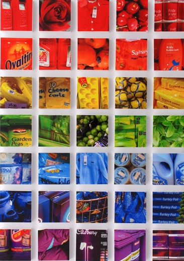

We then looked at a technique called 'Painting Nature' inspired by Norm Magnusson:
I created my own version:

We then learned how to make GIFs on photoshop. This was a technique that I personally really enjoyed and can see myself using this technique in the future, however I would like to do it more in the style of a cinemagraph, inspired by the artist Jamie Beck.
My GIF:

Jamie Beck's cinemagraph:
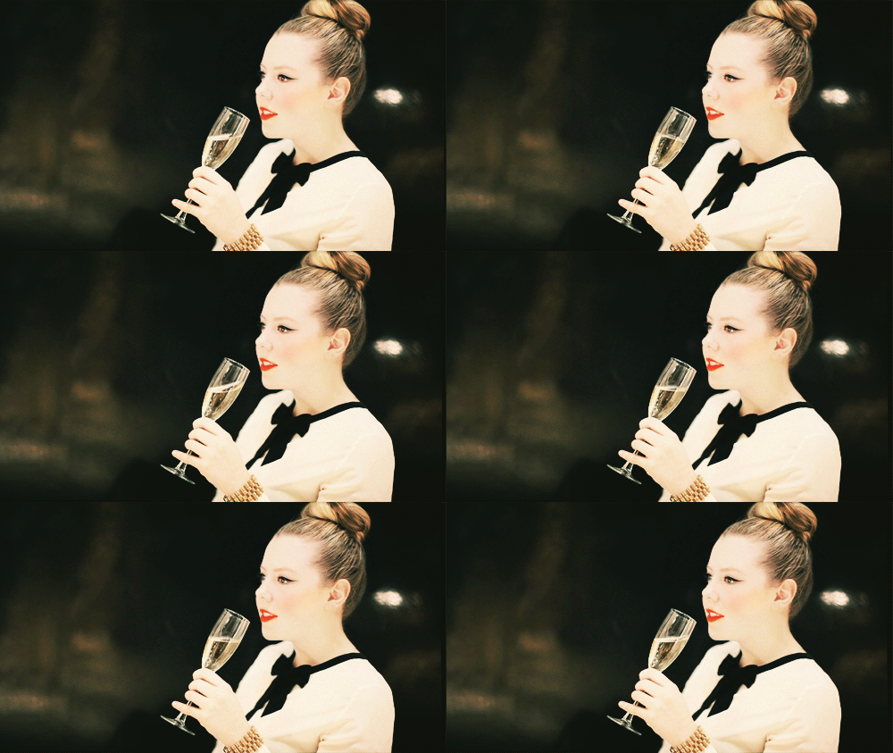
Then, we looked at the artist Geraldine Georges:

I personally disliked the work of Geraldine Georges as I didn't find it particularly inspirational. I won't be using this technique again. I recreated my own version on photoshop :

I also created one not on photoshop:
I also looked at the work of Jan Von Holleben who is famous for his photographs that are shot from above (aerial views):

In groups during class we created our own versions :

I don't particularly like this technique so I most likely won't be using this technique again.
We then moved on to looking at the work of Markus Kisson, and his collection titled 'Dissecting Polaroids'


I found this technique really interesting as you could use contrasting images to create an overall creative effect, and you can play around with the positioning of the cut outs.
Here is my version using images related to my chosen theme : fashion

SUMMER ASSIGNMENT
The first artist that I looked at for my summer assignment was Quentin Jones. This work involves different images made into a collage:

Overall, I like this work and might be inspired to use this in my final piece.
The next artist we had to look at was William Hatch Crosby. I really liked his work as I found it interesting experimenting with different colours, brushes and patterns. :
I think that I'll definitely be using this technique in the future.
Then, I looked at Amy Friend who uses a pinhole technique in her work with lighting behind the image to create a star-like effect:

Then I looked at Greg Sand. who uses a weaving technique in his work:
We then had to look at the work of Michelle Thompson, who incorporates graphic design with photography :


I thought that this technique was really fun as well as interesting and I will think about using it in further work.
I then researched the work of Stephen J Shanabrook who distorts his images to give them a new look and feel :

Rebecca Chew's work is mainly based on changing the shape of an image, for example by using origami:
Stacey Page uses embroidery in her images and works by creating layers and layers of different colours to create an overall more interesting image:
I like this technique however I'm not sure how I would continue it or make it better for future work.
ENHANCED IMAGE PROJECT
We first learned how to vignette an image on photoshop using two different methods :
We also did this in the darkroom :
We then learned how to edit a photograph to give the Instagram Nashville effect, which I personally really loved :
We also learned how to create an HDR effect on photoshop. I didn't really like this as I think that it made the image look really harsh, and I personally prefer softer photographs:
We were then taught how to highlight areas of particular interest in our dark room experiments :


In the dark room, we also did press printing :
I liked this as it creates a blurry, dreamy and imperfect effect which I thought worked really well. You could use objects related to the photograph to press print with. I'd like to use this technique again.
We then used a technique called dodging :

I don't think it worked that well for me but I still liked the effect that it gave.
We looked at the work of Leslie David, who is known for layering paint on top of images:

Man Ray's work involves solarisation - a technique that I really enjoyed doing:

I really think that I'll be using this technique again in the future as it creates an almost x-ray effect which I found interesting to look at.
As part of our photoshop experiments, we learned how to tone the images :
In the darkroom, we learned how to create handmade negatives which I think would be interesting to layer over photographic negatives to add more texture and depth to the images:
Subscribe to:
Posts (Atom)